Duke4.net Forums: Blast Radius WIP/discussion thread - Duke4.net Forums

Jump to content

  • 17 Pages +
  • « First
  • 4
  • 5
  • 6
  • 7
  • 8
  • Last »
  • You cannot start a new topic
  • You cannot reply to this topic

Blast Radius WIP/discussion thread  "while it's brewing"

User is offline   ck3D 

#151

View PostNinety-Six, on 11 May 2021 - 01:41 AM, said:

I'm pretty sure I would be addicted. I rather have a strong thing for lighting in general. In games, and in real life too. Hell, even with an ancient map like Bowels of Hell Space Station, that one single part where the wall grating is redrawn on the floor as shadows is still the standout part to me. It's so simple but I am just really big on lighting details like that. I'd probably run out the sector count on obsessive lighting detail for quite a while before eventually convincing myself to cut back.


Thank you for reminding me about this map, I hadn't even thought about it in forever and it actually looks like one that would be right up my alley these days to play and study. This type of ceiling always reminds me of Last Pissed Time, by the way (yes I know I keep plugging it) - now I know it's a rather classic (and funny) FPS level design trope and Lezing didn't invent it, but his example is one of my favorite instances of execution of it. Can't remember whether or not he had event-triggered lighting effects going on in that room, though; knowing his style he most likely did and it's just this version of the room on the screenshot that's empty, anyway you're right in that such designs not only very well lend themselves to, but inherently call for some efficient shading I'd say.

I reckon it's downright a human thing if lighting is fascinating, it's the most basic form of visual stimulus and so as such it will always hit hard in any given setting, as something associated with environmental recognition and primal, survival instinct, even more so with contrast that's bound to alarm your senses. That's also why simple is usually best (but I guess even more so on an engine that's relatively rudimentary in that department, thinking Classic mode in particular of course).

And nah you'd probably be just fine with sector count, that one limit is so high it's mathematically impossible to reach because you'd run out of walls first, and you need walls to draw more sectors. But even there really, only the most ambitious mappers really struggle with the allocated limits. Remember most early maps from the base episodes bear 200 sectors on average which is less than 10% of a user map exploiting most of the resources (as far as wall and sprite count they bear probably even less than that), and they're still more than acceptable-looking and actually very immersive levels also due to their use of strong lighting/shading. Rough estimation but I figure a map on that same scale with very detailed lighting and shading would only be double or triple that. Plus, I've done it before but these days I also find that breaking down walls and sectors in really tiny fractions (so mindlessly using up resources) for very fine, progressive gradient lighting doesn't necessarily look as good as, say, doing the same thing but in increments of 3 or 6 - when not 9 or 12 in extreme cases - as then you actually start losing the very contrast that works so well, so resource-hungry lighting really looks sweet in some specific situations but otherwise you're better off with some restraint and that definitely impacts your allocated resources in return.

It's all space management, picture making an empty room with the mission of making it look good/particular/interesting. One could go ahead and spend 1000 sprites/walls or 250 sectors crafting arguably unnecessary visual clutter for 'detail' or, instead, mark one wall as a light source and then just split the room with a couple of lines accordingly to finally add contrast and more often than not, the latter will hit stronger than the former all the while relying on 1/10th of the resources if that. Just saying to give you an idea of the scale and of how you'd be more comfortable with resources than you think if you mapped, those are only a struggle if you really choose to go the extra mile basically. That's how I'm managing such large scale maps for Blast Radius, too; a lot of the space is actually rather empty with reliance on the right eye-candy just where it needs to be (or so I try), and minimal detail unless for specific, recognizable constructions that are spread far apart from one another. This is also due to my current direction of focusing on allowing player movement that's as free of clutter as possible as to not get in the way of the fun of the game's physics, but I find that both approaches happen to complement one another there.

This post has been edited by ck3D: 11 May 2021 - 03:02 AM

3

User is offline   ck3D 

#152

View PostAleks, on 11 May 2021 - 02:49 AM, said:

I've already discussed most of these screenshots with you, but just a little nitpick regarding the most recent one - have you considered changing the floor texture there (or maybe is it just temporary)? That texture is cool and I personally like it, but it definitely doesn't absorb the palette too well, turning a bit into a pixelated mess in the blue pal sector. Maybe try one of these Atomic textures with diamond plates that I've been always abusing the fuck out of (they also come in different colours, so you could see which one looks the best with palette) instead or something else?


Sorry Aleks, just saw your post on the previous page. I've been experimenting with floor textures there including a few clearer ones but to me this one really looks the best, the garbled mess look with a darker blue tone than some tiles could generate actually fits the surrounding grime, this is going to be one rusty floor. But I know that tile inherently looks a bit ugly, and so this is the only hallway that, exceptionally, has it (otherwise the effect wouldn't work). I think I naturally would avoid it in a more pristine-looking environment but here in particular I find that it actually fits the coldness of the tone better than something clean would. I'm also trying to use as few Atomic edition tiles as possible in these maps minus the most practical ones, such as the wall with the fullbright yellow line (this one and its blue counterpart qualify as a tool to me at this point, they really are the strongest visual markers for directions), or some of the big tech ones near the start of the set because their resolution is the largest in the game and so sometimes you just need them for certain big scale things to look right. Now Atomic is a cool add-on with an interesting tile set but I really do prefer the vibe of mostly 1.3D and come to find that the pairing of both styles with their different tone can really break some visual consistency if you're not careful, and so I'm always wary. I like Atomic art but from personal experience I find that it shines best when used somewhat sparingly as opposed to mindlessly.

This post has been edited by ck3D: 11 May 2021 - 03:21 AM

0

User is offline   ck3D 

#153

Just emerging from another of those always welcome 630 sector sprees. Map 7 is now 2275 sectors / 12776 walls / 3688 sprites. 'Side areas' I was bringing up earlier are done in design and just need some polishing, I wasn't even consciously planning on tackling them yet but I touched them and then it happened and I did everything, when I thought I would finish my second floor first. Still got good progress on that one, I'd say I still need to build half. Map might actually be a wrap by the end of the week, I'm stoked. Here are two WIP shots, one more segment of the new floor and one little treat that's not a hallway.

Attached thumbnail(s)

  • Attached Image: screen1.png
  • Attached Image: screen2.png


This post has been edited by ck3D: 11 May 2021 - 08:29 PM

5

User is offline   Ninety-Six 

#154

okay you have my attention.

I mean, you did before, but now I really wanna know where this map is going.
1

#155

Nice ship, is that dukes party ship? :D
1

User is offline   ck3D 

#156

View PostWilliam Gee, on 11 May 2021 - 10:57 PM, said:

Nice ship, is that dukes party ship? :D


Thanks! And I reckon you could call it a party where no one brought gum. I'll probably retouch the design heavily in the end, right now it's in quite the beta state with texturing I improvised right before calling it a day and going to sleep. But I'm happy the player will be able to leave through that one door down below and jetpack around.

And Ninety-Six, that's the spirit, hopefully you'll know soon enough!

This post has been edited by ck3D: 12 May 2021 - 03:56 AM

0

User is offline   ck3D 

#157

Map 7 is done with 2407 sectors, 14006 walls and 4389 sprites, it's funny how a level's theme and design style will impact resources sometimes, here the wall limit was never a problem as opposed to in bigger city maps. I have some detail here and there left to refine (mostly OCD status and misaligned stuff I'm just now seeing) but no more construction nor effects. This one hits different but as such will work as punctuation in the map set like I intended it to and it's not a short level either, I'm quite happy about how it turned out. Here are a few last glimpses, 1/ is automap (zoomed in, you can explore around), 2/ is a place influenced by one I saw in Sigil with a room that acts like an elevator and a puzzle to solve, 3/ is another big area with a few puzzles, 4/ is a room that employs a bunch of Cyclers (this map uses a lot of light effects, not much that you see is fixated) and 5/ is a slightly less beta ship but I think I'm good with how simple it looks. Kind of in the mood for a whole other theme now but this one was good practice and made me want to make a legit space map even more.

Attached Image: SCREEN01.png Attached Image: SCREEN04.png
Attached Image: SCREEN03.png Attached Image: SCREEN05.png
Attached Image: SCREEN02.png

This post has been edited by ck3D: 14 May 2021 - 09:15 PM

5

User is offline   Ninety-Six 

#158

View Postck3D, on 14 May 2021 - 09:05 PM, said:

2/ is a place influenced by one I saw in Sigil with a room that acts like an elevator and a puzzle to solve


I admit, I'm not sure which room you're talking about.
0

User is offline   ck3D 

#159

View PostNinety-Six, on 14 May 2021 - 09:29 PM, said:

I admit, I'm not sure which room you're talking about.


The layout, set-up and puzzle here are of course different, but there's one particular instance in an early map in Sigil - I couldn't tell you which one off the top of my head, I've only watched videos but in general I really liked what I saw - that I thought was smart, where you enter a room and see nothing but a fence that appears to mask nothing but a plain wall and then, just as you're done pondering what the heck the set-up is and consider starting to look around, the wall behind the fence starts lowering and turns out to be a platform with monsters shooting at you from the other side. And then IIRC the principle gets reused a bunch, and Doom always had floor play anyway, but that one specific time I thought especially worked. Basically a glorified monster closet, but with a twist and some old-school FPS design flair, maybe of a rather fair kind too because once it hits you then you know it's on you who should have seen it coming; in that Sigil map the execution was perfect and the effect of surprise on the player exactly as (I can only imagine was) intended, and so I wanted to recycle the basic principle.

Here I'm just repurposing the mechanism, except it's not particularly an ambush, behind that red elevator texture and masked wall is actually not just a monster trap but a furbished room (comprising an Easter egg that is meager and yet tested my patience to make) that goes up and down, similarly to that platform and in order to progress, one has to 1/ figure out how to get there then 2/ play around with the different elevations for half a minute (it's paired up with a time element too). I don't think I had ever built a whole room with furniture and detail that acted as an elevator before (using different SE 31 and 32's for each individual sector floor and ceiling), that was actually really fun to do although figuring out the right math to work with all the sloped sectors inside so that nothing would look off in terms of timing or distance drove me crazy for a good hour (thankfully it's so easy to just input Z-axis values in Mapster32, but I needed to find the right ones). I also had a pretty cool-looking effect going on at one point with the display on a monitor scrolling up and down with the room's elevation but I couldn't perfect that one and so I scrapped it, although whenever I feel brave it might make a comeback because the set-up is still there.

Recently I've also caught a few Blood videos that have been inspiring me to work with moving sectors more. But since we brought it up, I was very impressed by the art I sensed in Sigil. Romero managed to craft something super impressionistic, the raw design of each level suffices to evoke all kinds of nasty tensions in the player and wherever most mappers would supply the occasional moments of relief, Romero also dips those in frustration and so there's always underlying torment and pain. That section with the running along narrow cliffs (and of course Lost Souls) left a mark on me as oppressive and haunting as well - all simple stuff, sometimes almost Sandy Petersen-esque (by the way, is it just me or did part of one of the levels straight up remake The Chasm, meaning Romero actually took a clue from Petersen?) just in the midst of crazy visual delirium and so the effect is optimized and the picture complete. Dude knows his psychology.

This post has been edited by ck3D: 14 May 2021 - 11:23 PM

1

User is online   Aleks 

#160

I must admit these are so far my favourite screens from the plane map, they look great - I especially dig screens 2 and 3. On 2, it all feels so simple, yet the play with red lights is just perfect. And in 3rd screen, it looks all massive, but very consistent (plus do I see a forklift that can be operate there? Keen to see how that would be utilized!). The alien-infested cockpit looks neat as well. The texture used for wings is much better than previous one, not sure if you experimented with also flipping it, so that the lines would go along the length of the wings. Also I take it you made all the progression/puzzles in this one on the go, right?
0

User is offline   ck3D 

#161

Thanks Aleks, well in fact the wings haven't changed one bit since that former shot, I didn't touch them but I still might at least to fix their texturing which right now isn't symmetrical and I'm taking that personally (I forgot to flip the textures on one and only realized when posting, same about some misaligned vents on screen 2). The wings aren't exactly straight and so I think the texture sort of needs to run parallel to the length of the ship for the suggestion to work, but I might end up splitting some sectors and involve floor relativity in the end I don't know. For now they serve their basic purpose, the rest will be looks on a level I'll mind when I'm implementing the gameplay and retouching this kind of detail when realizing whether or not it does work in context.

Appreciate the appreciation for the lighting/shading, these days I reckon it's all I do. About progression and puzzles it's a mix, since I don't build without a clear idea (that day or for a whole level altogether) I usually know what I want from the start and then just execute, but sometimes it's lightning in a bottle with the layout of the rooms and floor plan dictating what needs to happen and so I implement that right away, but when it's a bit ambitious I prefer letting it sit and mature on the back of my mind for a week, advancing on the rest of the level and only finalizing that segment when I'm certain it's ready to come out as a whole. For instance room in screen 3, what was clear to me pre-execution was 1/ the general goal, features and purpose of the area and 2/ the type of scripted events I wanted to go down there, so I waited until my vision was accurate enough to know which effects I wanted to resort to involve to tackle anything there. For such areas that are especially bound to be gameplay-oriented in particular, I never start them until I know where they're headed otherwise I would naturally introduce elements of randomness that would distract from the main objective and dilute the general intent of the area (even if I try not to, that's what happens with the more you involve luck into the equation as far as purposeful design). Progression goal from A to B is the most fundamental idea that needs to be set, and then when spontaneity kicks in is when I start sketching out the layout in 2D mode and realize which set-up exactly would give the best results depending on context, for instance here I thought it was working both with and against the symmetry of the room (but you'll see, I don't want to spoil more). But in general what I keep in mind there is the fun factor aiming for maximizing basic movement possibilities considering every axis, all the while (ideally) optimizing every wall and element of detail either for cover or platforming. Usually what comes in the most improvised fashion is the Easter eggs because those are secondary. But Easter considerations aside, it's actually pretty funny pondering what comes first between the chicken and the egg in mapping for sure, in the end it's definitely a mix though. Execution with no planning results in mostly cosmetic maps that either work or not gameplay-wise by sheer luck, with no improvisation you lose the flair. I'd say good level design the way I see it has a lot to do with that ideal balance of exploiting the pros of both approaches all the while trumping the cons.

This post has been edited by ck3D: 15 May 2021 - 08:57 AM

1

User is offline   Merlijn 

#162

Great screens, I especially like the way you handled the alien infestion scene! Looks very different from the other maps, which is a good thing!
Funny how all the veteran mappers have rediscovered the pros of strong sector based shading and lightning effects. ;)

Quote

Execution with no planning results in mostly cosmetic maps that either work or not gameplay-wise by sheer luck, with no improvisation you lose the flair. I'd say good level design the way I see it has a lot to do with that ideal balance of exploiting the pros of both approaches all the while trumping the cons.


Definitely agree with this, it's a mixture betwen planning and improvising for me as well.
1

User is offline   ck3D 

#163

Positive feedback on the alien infestation means a lot coming from you Merlijn, this map also features a few scripted events going with it (think The End of The World pt. 1) and so in turn the level kept getting creepier with the more I was working on it, started out pristine with just the basic concept for the progression in mind and then in the end some places spontaneously turned anxiety inducing, so I orientated part of the vibe that way, a few times towards the end I felt like I was making my own mini-Red 4 when to begin with that wasn't quite the conscious intent. I got reminded of Ninety-Six (IIRC) who once said a lot of my maps indirectly qualified as 'true horror maps' - that comment always stuck with me since before that I had never realized and since then I keep seeing it. One thing I've scrapped is I wish I could have implemented a crash sequence (I mean, Build logic) where the ship would be nosediving and dropping vertically, perhaps allowing the player access to certain controls but that would have forced some linearity in the progression and thus defeated some of the compatibility with multiplayer the way I ideally see it. So instead I favored a different sequence somewhere else that better keeps the flow going. Sometimes things are better kept simple but I still like the idea and it would probably work in the context of a one-off map. You yourself already did something similar with the end of Red 4 anyway. Another idea I scrapped was Duke inhaling gas from broken pipes in a secret place and then teleporting for a fight above a giant paper plane, would have been a trip as an optional zone but I couldn't really get that to look right. All those abstract ideas I should just find an outlet for.

Also I've fixed whatever detail needed to be fixed in map 7 and started map 8. Since people are regularly asking about my mapping process and I'm doing things in an interesting manner for this one in particular, I started taking screenshots of the basic stages and will probably post a mini diary of the early progress on that one (and then much less of the map in its later inceptions). My intent is to motivate the people on here who fancy taking up mapping but never dared leaping the gap of trying to maybe start their own new map too as I illustrate my process, so that they can take up on the techniques and patterns I've found in my workflow and realize how easier it all is than they might think.

This post has been edited by ck3D: 15 May 2021 - 12:03 PM

1

User is offline   ck3D 

#164

Perhaps I spoke a bit too soon last night and really don't quite feel like continuing that new map I started (at least not in the context of this project, I'll just start another map 8), but I still went far enough ahead to be able to cover the basic gist of the map design technique I wanted to explain. I think this technique is the most optimal for efficiency at least for structured or big scale maps, but it also may be a better way for beginner mappers to learn from scratch than trial and error while painfully designing individual rooms in succession with little overall perspective on what they are doing. The basic idea is that carving into positive space is a lot easier and more intuitive than drawing into negative space, and so basically you turn as much of the grid as you'll need into a simple sandbox. Even 'non mappers' are welcome to give this a try as it all starts with making just one square empty sector using the space bar and the way I'm going to break it down, you don't even need Build knowledge but some of the most basic keys (Mapster32 key list can be found here: Mapster32 keys on the Infosuite). In fact I will try and break things down in a way that even the most unfamiliar with the editor should be able to follow.

Attached Image: tutogrid.png

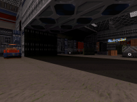
First row of images - so you make that square sector with nothing in it. It's important for it to be square (just use the existing grid as reference but most importantly Mapster32 tells you the exact values anyway, keep in mind that those are always crucial to look at in everything you do), and it should be significantly big but not huge as Build notoriously struggles with sectors that are too large (you can get some weird unwanted behavior in-game e.g.. bullets stopping in mid air if not general corruption). So far I find 16387 (which is one of the distances automatically handled as a unit by the default Build grid) for each side to be the sweet spot.

Boring side note as to why: I find it important in Build when it comes to sector and wall dimensions and axis to employ powers of 8 as much as possible, because that's essentially what the game runs on and understands best. Again, remember Mapster spontaneously tells you the length value of any wall you're currently drawing (also meaning that you can fake start drawing a wall just to use the tool as a measuring stick in between distances before canceling). Working with grid lock off or diagonally can introduce some confusion at first, yet even in the most awkward situations I'd recommend to make sure to at least come as close to the next power of 8 as possible. This applies to the horizontal axis (width of say, a crate) but also the vertical axis (height of said crate) or so I find because that generally allows you to optimize distances and cover over more random happenstance (e.g.. city streets or hallways that feel the wrong kind of long but you have no accurate reference to shorten them by, most powers of 8 are the best indicators of what's going to work depending on which scenario you want). Ctrl + Pg Up/Down is especially great to work with for elevating surfaces in 3D mode because as opposed to just PG Up/Down it allows you to add or subtract to sector height in blocks of 4 of the usual 'ticks' which I've come to find is actually ideal for most practical situations (for reference, see: Dimensions on the Infosuite, and still respects that in-game equation that in the end even player behavior abides by.

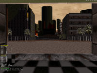
Anyhow, now that you've made your basic square, enter 3D mode with Enter (screen 2) and elevate the ceiling/sky with (Ctrl +) Pg Up as high as you intend the highest point of your map to be (screen 3, make sure to select the sky with the mouse and then hold left click the whole time you're actively elevating it or it will quickly rise out of reach wherever you're otherwise pointing the mouse, whereas holding click will keep it selected). Personally I tend to go by the logic that spontaneously, wherever ground level is by default on a newboard.map will do for now, so I don't lower the ground. At this point it's a good idea to pick your sky texture for the whole map, because you're just about to draw it. So point at the ceiling with V and make your pick, parallax with P if you want a sky anywhere in your map (strongly recommended if you intend even just one outdoor area anywhere, if that's the case then don't even think about indoors yet), give it a palette value with Alt + P if so inclined. In my case (screen 4), here I knew I wanted a mountain type of location in my map, and had had too much coffee and hash that day so I made the sky obscenely high, somewhere in the negative 1 million range. But half that is tall enough for most big cities with skyscrapers realistically. Mapster32 tells you the exact Z coordinates of the floor/ceiling your cursor is currently pointing on the side.

Once your basic sector is ready, you're going to clone it. So in 2D mode (Enter key again to flip in between both modes), you hold Right Alt all the while going over the entirety of your square with the mouse and then let go, if done right your square should be flashing green (or whatever color it is in the current Mapster32 snapshots - row 2 screen 1), meaning that it's been selected (note: this works on individual sectors and groups of sectors once you have several). Now hit Insert to clone the sector, the new copy will appear atop of the original as your new selection so you must drag it out of the way before you unselect it. Here in particular, you want to move it right next to the original so that one side of each exactly matches - the editor will then consider that wall to be a split wall in between both and now you'll have a rectangle consisting in the assembling of two same-sized squares with a red line marking the middle.

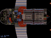
Now, repeat the cloning process except with that whole structure this time; you'll be copy pasting the whole rectangle and then easily able to attach the new one to the former one, in order to get a bigger square formed of four of the original squares. See where we're going with this - you want to keep cloning more and more squares all over to cover a considerable chunk of the available Mapster32 grid (remember that you can easily extend it to make larger maps than by default by retouching the value for editorgridextent in Mapster32.cfg). On row 2 screen 2, I'm at the stage of having cloned the square-comprising-four-of-the-original-squares four times, forming an even larger square of square that I then cloned again (next two screens), etc., etc.. Keep going until you cover as much physical space as you think your map will ever extend to. And even then, when you think you're done, clone the entire thing again but this time, do not attach it to the side of the original structure and keep it separated from it like I'm doing on the last screen of row 2. This is because you'll be editing the actual structure of your map into the first grid of squares that you made, but you want a blank copy of the exact same pattern as a resource if you later plan on editing individual sections that are eventually meant to overlap (think sector over sector/different floors within one same apparent physical space), clone more of empty the grid in, or if you ever regret changes in certain sections of the map in particular and wish you could start a whole region again, you can easily nuke the corresponding squares and re-import the corresponding empty ones, in general it's just super handy for all kinds of otherwise deemed advanced layout manipulation. Now, if you ever regret your original pick for the sky texture (which actually happens to me a lot at that stage), remember you can always replace the parallaxed skies and grounds (individually) in whole specific sections of your map by caching the texture with the properties you actually want with Tab then pasting it over any sky/ground there with Ctrl + Alt + Enter (undocumented in the Infosuite).

At this point, for convenient editing in 3D mode, you might want to boost the visibility in your map as well, which you can do by selecting all of its sectors and then switching to 3D mode to use Alt + Mouse wheel up on any sector or wall to instantly manipulate it at will everywhere. You can always adjust that again at any given point later, by the way, just make sure you're always doing it to the whole pack of sectors, to avoid the possibility of future inconsistencies from area to area.

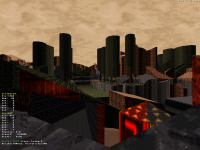
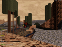
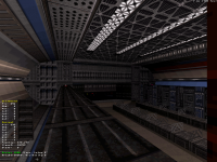
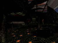
Now row 3, basic principle of my map was that I wanted it to be divided by a large canyon with a river. So, clearly this basic concept was bound to dictate the fundamental design and thus, where it makes sense to start from. So on row 3 screens 1, 2 and 3, I'm drawing what's intended to become the outlines of the canyon/river. Note that I'm not inserting new vertices onto any wall yet and just starting and ending in the pre-existing corners of each square. This is because right now is still too early to mess with the basic outlines of the squares, and in fact once the actual structure of your map is in place you'll want the squares to go eventually so you can have all the resources back so you shouldn't rely on them, instead just consider them visual indicators and their walls remaining bare of anything intricate is what allows you the current flexibility in manipulation, selection and copy-pasting - whereas the more vertices you insert, the less likely this or that wall will be to join with the rest or affect in any way that doesn't also affect something else in the map. As much as possible for now, those red walls should be considered as non-functional in the design, they just structure one big space but don't count in it as such.

Row 3 screen 3, outlines of the river are done (note a certain focus on nooks and crannies as just as many gameplay elements) and so time to represent that visually in 3D mode, I mark any sector floor wherever the river is supposed to be with the water texture, cache'd it with Tab and then pasted it to every sector corresponding to the river with Enter (row 3 screens 4 & 5). And then marking the verticality right off the bat is also important, and so I easily adjusted the height of my whole river by combining two ways, one being selecting the sectors in groups in 2D mode before lowering all of them at once in 3D mode (row 4 screens 1 & 2) - determine one specific uniform Z value early and keep it in mind, watching numbers on the side is a lot quicker and easier than painfully keeping track of equal height everywhere visually - and the other being by directly inputting that value in 2D mode by hovering over the desired sector and pressing F7. A couple of minutes later, you get row 4 screen 3 where one fundamental aspect of the basic geometry of the level is already clearly dictated, and more elements ready to be determined.

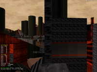
And so now is time to use texturing to better clearly mark all the surrounding space. On row 5 screens 1 & 2, I had already determined that this particular pole of the map would be a town and so I textured the ground of each square for a rough guideline of where could later be a potential road, or dirt, but since at this point it's too early to dictate specifics and we're still working on the background structure I'm mostly using the available squares as a literal palette of tiles and tones that region of the map could use later. The surrounding space really allows for more perspective on this type of stuff than if you just followed the tiles menu with little to no actual hindsight and decided more haphazardly. On row 5 screen 3, I'm texturing the canyon in a way that more or less matches visually with the corresponding ground textures I picked for the neighboring sectors, although what I mean by that is better seen on the final screen on the list. Ctrl + Enter allows you to paste the currently cache'd texture (with some of its properties) onto several of the next walls at once, which makes tasks like these a lot quicker. Note that everything is still at shade 0 at this point, options exist to auto-shade walls but I prefer deciding on my own shading values depending on orientation and proximity to light sources and, since those haven't been established yet, for now I'm leaving as many values as possible untouched.

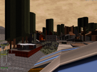
Next 3D shot and two 2D shots are me realizing that the original space I had allocated myself no longer sufficed and more importantly, according to the few basic elements in place so far I was starting to get a clearer idea of the actual form the layout could be taking, and so I'm extending it by cloning more squares in those directions. At this point I figured I basically wanted a very large forest type of region on the other side of the river, and so I elaborated on the scale a bit there.

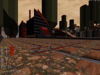
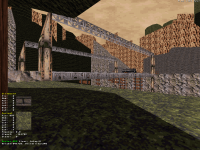
Row 7 I'm starting to play with sector elevation most everywhere with Ctrl + PgUp/PgDown, again elevating squares to mark a basic outline that's later bound to be broken down in detail, sloped to form hills and what-have-you but for now only really need to just stand there for me to take them in consideration as I keep designing new stuff. Next two shots are special in that for the first time on this map, here I'm actually retouching the outlines of some of the squares, inserting vertices, moving them around and breaking some of the regularity; that's because those are intended to be the outlines of the map and as such, some exceptional liberties can be taken early on, although you don't exactly have to; it's just that since they are destined to border next to nothing, they are easier to just nuke and remake altogether in the case of a change of mind or problem without interfering with anything; in a way, one could say the boundaries are actually the first thing you're free to sort of finalize within a new map already. Here I think I personally wished for a visual marker to better set a tone for that corner and so I thought I'd make some quick cliffs. I built one row of them (row 7 screen 3), and then used one of the perks of my sector grid system to easily clone them and copy-paste them around the corner, with no issue despite having retouched some of their boundaries by just including the next squares they were joined with with my selection of sectors to clone, making the resulting structure easy to re-insert at will anywhere in the map in place of the corresponding number of empty squares (you'll need to think ahead and delete those first though - select in 2D mode, hover over selection with mouse then Ctrl + Del, which I'm just about to do in row 8 screen 1). Cool thing is, the whole thing already being selected, for no monotony when compared to the first set of cliffs it's also very easy to alter the height of the new bulk, and also flip horizontally with X (remember that also flips the orientation of the texturing in every selected sector, which might mess with alignment, so you might have to manually reset the textures in all flipped sectors when you're done).

Last screen is what I got after about an hour of work, weighing around 850 sectors but that comprises all the red walls forming the structural squares that are bound to go eventually and from experience, that's over half the current wall total. The modern limits are so high, that kind of resource buffer early on in the design process should be no problem in most cases, basically the more you progress on the level the more you'll end up joining (with J) and shaping the square sectors into more detailed work and earn everything back. In a sense, gradually, the squares are supposed to dissolve around the subsequent design of the map as you keep shaping it. Like I was saying I'm not certain I'll keep working on this one as the scale wouldn't really work but for a one-off user map I don't think, but I think the demonstration of the process is good enough. The idea is you then keep designing more tangible environment and structures out of a structured space that's already there vs. blindly extending into the obscure and non-existent, and digging deeper and deeper into detail and area micromanagement as the bigger picture progressively forms instead of improvising randomness (which is fine too, by the way, just not what everyone always wants). I find that it allows more complete creative control over a map as one coherent piece (including instances of focal points, 'regional' themes and the extent of their presence and scope, symmetry, etc.) in addition to making many of the editor's otherwise relatively intricate workings a lot more flexible and fluid (area deletion, copy-pasting, sector-over-sector, perfect diagonals for ideal sloping-prone geometry... making it particularly optimal for tech-themed maps that tend to follow stricter patterns than the more abstract ones).

I sort of found myself really following that approach and workflow for the past two or three maps I've been making for Blast Radius I'd say, resulting in surprisingly efficient results. Since it's sort of a Minecraftian simplification of the grid, too, it's probably very accessible for unexperienced mappers to try and follow since what most need isn't necessarily technical knowledge but creative perspective - and it's a lot more exciting to be working on a level you know exactly is headed somewhere specific than on endless successions of improvised rooms with no real horizon in sight, whereas when there already is a set purpose for those rooms before they even need to exist then those tend to come out much more spontaneously.

This post has been edited by ck3D: 16 May 2021 - 08:38 AM

4

User is offline   ck3D 

#165

I in fact kept working on this map and the pace of the progress is ridiculous, although counting the grid I'm at 8000+ walls with all the surroundings enclosed (meaning I can focus on the actual gameplay with the rest) and I'd say half the forest area, which is a third of the map and hopefully the most resource-consuming one, done. I also built a literal mountain that's as tall as the map and the player will be able to explore hopefully in full. The grid technique honestly makes cloning then altering huge parts of the level in seconds so easily, I'm surprised myself. Changed sky texture to something less obscene. Been getting a few glitches here and there due to I'm guessing drawing distance and the editor generally not being a fan of all the triangular intersections, but I've successfully been handling all of them with plays on perspectives and occlusion (which actually helps spice up the feel of the map too, making it so that the player discovers stuff as they go). Also so far managing a design style and gameplay pace that's way faster than I thought for a map so large and so open exploration-wise, contrary to my original fear, speedrunners would probably enjoy that one in particular. I've been taking more screenshots of this and that funny trick moments in the process, too, perhaps I'll post them later as well as up to date shots. Map will fit right into the set after all so long as it doesn't glitch on me, so counts as progress.

This post has been edited by ck3D: 17 May 2021 - 02:06 PM

1

User is offline   ck3D 

#166

Map 8 (very) WIP shots (it's still early), 9800 walls. This is closer to the true look of the level, I've pinpointed the general feel I want out of it and become addicted to adding more. First scenery (still unshaded) is the first location so far where the map uses sprites (which was funny looking at the resource counter, advanced numbers everywhere for a long time but there, zero), second shot is from the first area where I just started catching up on the shading (yes so far I had 1600 sectors with shade value 0 everywhere, nothing but a nightmare) and in fact, originally I was a bit scared I'd have to adapt my usual strong shading style due to the overall brightness of the map but no, sharp contrast actually works really well and so refining it everywhere will be a pleasure and not a pain. Screen 2 actually shows the difference with the left side still unshaded for now and the right side being shaded, perhaps a good representation of the importance of wall shading and the depth it can add, although because of the openness of the map, I'm forced to work with 240 of visibility and so the final product might look a bit less extreme than that. I almost spoiled my mountain but changed my mind, that'll wait until I add shading to it as well. But it's bigger and basically conveys the same strong sense of location as the amphitheater in map 5. Working with big sectors and doing terrain work is a blast as well, good change from the city theme although I want this level to be part city as well. Will probably finish the forest section over the next mapping session or so and then maybe get to tackle that, actually.

Attached thumbnail(s)

  • Attached Image: map8-2.png
  • Attached Image: map8-3.png


This post has been edited by ck3D: 18 May 2021 - 05:03 PM

2

User is offline   Ninety-Six 

#167

Even incomplete, that still surprisingly conveys that it's a broken bridge.
0

User is offline   ck3D 

#168

Thanks, that's reassuring to hear especially since it's still at such a basic stage - usually I find that if you mean to represent a real-life object in Duke 3D and your results don't at least resemble the real thing as soon as its basic silhouette then no amount of fine texturing or additional sector work will save it, in fact there really is something artistic about the simplification of objects to recreate them in something as antiquated as Build within a certain amount of restrictions, think the police cars on the beta screenshots and whatnot. Sure those were especially primitive and most everyone has made better-looking cars since, and yet still you could tell they were cars and they equally stood out as such, despite the abstract look, because the same amount of human thought and effort had been put into them in one given direction, I'm easily fascinated by this kind of stuff. And now I just started wondering if those cars were ever meant to be moving and so the layout around Hotel Hell meant to be a full loop at one point instead of two dead-ends, which is a clear sign that I'm really just rambling now.

By the way, that bridge shot I posted not just to showcase the current established mood of the level but also so that I can post comparison screenshots of the more advanced revisions later on, I'm sure it will look different with proper shading and some more detail all the while remaining essentially the same structure. I also still saved step-by-step screenshots of my construction of the mountain I was talking about in case people want to see more of my process and how useful this way of building things I'm experimenting with can be. That first 'tutorial' post was already quite time-consuming though, so I'll wait to hear if there's any more interest (speaking of which, I'm curious: did you read it? If yes, did it inspire you to give it a try, or did it still sound like mapping is too intimidating? Curious as to whether or not people would be receptive if I shared more stuff like that). But it's cool, for the first time I'm getting such fast progress on a map I actually can't even keep up with the usual rhythm at which I drop screenshots, because the whole place is basically evolving in real time and so there are no dull moments where I can sit and think OK, this is ready for show, this isn't yet. Feels like one big WIP piece all at once that will suddenly come together at one same time as opposed to fragment by fragment. That's also why I don't mind showing even more of the step-by-step progress here, I'm pretty comfortable knowing the whole ensemble will only keep feeling a lot different and I'm spoiling next to nothing of the eventual experience by just showing design.

Also I think I forgot to say, but all these cliffs will be accessible or at least as many of them as possible, which is part of why I think speed runners will dig this one in particular. Whole bunch of options for progression. I want as much emergent gameplay as possible in this episode in general and that's always been a focus in the design in all the maps, but this is a particularly straightforward representation.

This post has been edited by ck3D: 19 May 2021 - 04:24 AM

1

User is offline   ck3D 

#169

Yeah, not surprisingly, another demonstration that shading really makes a remarkable difference. Also spoiling a bit of my mountain on screen 2 before I shade it, as that's probably smarter than spoiling it after, in fact.

Attached thumbnail(s)

  • Attached Image: 8_1.png
  • Attached Image: 8_4.png


This post has been edited by ck3D: 19 May 2021 - 02:29 PM

2

#170

Wow! Nice huge areas!
1

User is offline   NNC 

#171

I love the first screen. It shows the scale from the ground, that's impressive. The second is an aerial shot, that's automatically disqualified to get a rating (unless you promise the player can see this :P).
1

User is offline   ck3D 

#172

Thanks Will, I like to think your recent releases subconsciously motivated to me to start this map, it had been on my mind for a while but because of how unusual the theme is for me I was never certain of when I should tackle it and then the next thing you know, I did just after you dropped your new levels without realizing the timing until now. I've been having fun with scale for a while, most of the levels done so far are the biggest I've ever made, but here I'm really having tons of fun with just giant blocks of stuff and all kinds of crazy slopes everywhere. This section of the map in particular I would like to feel like a little exploration-based adventure or journey.

The Watchtower thanks and yeah, like I was saying you can actually get on top of every cliff you see, nothing is blocked but the invisible wall actively blocking the player within the map's boundaries. Most of the platforms are accessible with the right jumping sequence and for the few that aren't, I'm thinking of throwing a jetpack in a late secret place somewhere (next level in the episode uses it anyway) so that upon completion of the map, even the most basic Single Player enthusiast can roam around the whole level at will but for a limited time. In general for this episode, either the maps are articulated around the perspectives and views, or the perspectives and views are articulated around the maps, if something looks good then of course as an author you should want to exploit it so that it actually shines as such in effect and not just on a random static screenshot. You can't really see it on those shots but even the placement and size of the bushes and trees here follows certain paths and patterns, to encourage this or that destination in the landscape. I'm also trying not to build places that look accessible but aren't; so far the whole map set only has two little exceptions in total, I know exactly what they are, they bug the hell out of me as unoptimized and so I will address their existence with my next pass on the maps eventually. Just going to mean even more secret places.

This post has been edited by ck3D: 20 May 2021 - 12:01 PM

0

User is online   Aleks 

#173

Love these shots, also agree with Watchtower about the ground level one with the bridge being my favourite. The scale looks damn intimidating, also I really dig how the vegetation looks (probably could use some more sprites hanging around the tree canopies, but I guess you'll be adding that later?). Now the only thing I would be nitpicking about would be how unnaturally "sharp" some of the edges look (for my OCD at least :D ), while some others seem too "roundish" maybe. Again not sure how much polishing you'll be doing there or how you'll go about the resources, maybe even some balancing in between roundish and squarish shapes would be a good way not to eat up too many walls. For example, that tallest rock with grey atomic rock texture around the center of the final screen strucks me with that almost perfectly rectangular edge sticking out. Not sure how noticable it would be mid-game and from a player perspective in the end of course.
1

User is offline   ck3D 

#174

Yeah honestly I'm pretty happy with the surreal feel of the sector trees too, I wasn't really convinced at first and then I started using them to structure the landscape and slope them for perspective as though elements in a painting and eventually I think the wall shading really made them, I do plan on adding some more basic detail in those areas but I also don't want to oversature the look, in a sense I'd rather have the player feel like nothing at the bottom of big structures with a certain emphasis on the sky than focused on anything unnecessary at ground level. Trees and bushes are only already present because they mark the directions in the landscape with vertical lines and smaller and bigger dots respectively, in the end I also want to add the right size cacti on the right cliffs, and only then I will consider actual decoration wherever I feel like it is needed. But I'm also inclined to keep things clean and classic and just all the trees and bushes (plus that sprite bridge) already take up 2000 sprites in just one corner of the map (albeit a large one), which encourages me to keep scattering them for now.

Walls are very much the same, you know this is the kind of map where eventually every single wall counts but the whole point of the technique I'm using is it's really easy to manipulate things on the go and thus the whole piece is always adjusting as a unit and changing in real time. Just going around in 3D mode fine-tuning stuff you realize which walls could use more angles and you only progressively add them after you've earned resources back from to joining redundant sectors somewhere else, as such the whole picture is never really fixated and bound to only keep looking more and more optimal as advancement progresses. I basically keep diluting everything squarish as I go, but can't do it all at once. I'm already past 10000 walls here and there's lots of stuff I still want to build, so for now I'm mostly focused on getting the rough basic picture established before the limits can even come close to trying to bite me in the ass.

This post has been edited by ck3D: 21 May 2021 - 03:23 AM

1

User is offline   ck3D 

#175

More WIP randomness, as I just started the city segment and Duke continues ahead on his eternal quest for the 16385th wall. So far map 8 is a bit under 1700 sectors/11000 walls/2000 sprites.

Attached thumbnail(s)

  • Attached Image: MAP8_5.png


This post has been edited by ck3D: 22 May 2021 - 06:16 PM

4

User is offline   ck3D 

#176

Just beat 11000 walls, the limit is definitely going to try and bite me here given I've only built half of what I want in this map so far but since a portion of the terrain is still blank squares with tile 0, getting resources back all the while shaping the gameplay area into something a little clearer shouldn't be that hard and thus I'm not overly sweating it (yet, part of me is almost certain I will get barely 1000 walls back at best doing that and whatever is left of the square sector joining). Pretty much completed the transition into the city bit and now I'm ready to tackle it for good, I don't want a lot of indoors so should be quick. Perhaps the map with the most jumping around in the set so far. Couple of extra sleepers just to show it's starting to form, second screen is particular is bound to grow a bit.

Attached thumbnail(s)

  • Attached Image: map8-6.png
  • Attached Image: map8-7.png


This post has been edited by ck3D: 24 May 2021 - 09:15 PM

3

User is offline   ck3D 

#177

More satisfying progress on map 8 with the two thirds of the city done, pretty happy I've been managing results I'm happy with in spite of trying to be savvy on resources, I'm already at 1822 sectors/12293 walls/4466 sprites though so time to wrap things up with the urban part as soon as possible because there's a whole other section I also need to make. I'm actually using way more of the allocated space than I thought I would, too, so even though I can cut back on some sectors and easily move the cliffs around I'm definitely not getting 1000 walls back with that operation which means as soon as the next mapping session is when I should do it, and then be seriously watching my ass. Should be just barely manageable but still manageable, I'm used to that kind of sweat in my eye at this point.

Here are more WIP screens, 4/ is from some cliff in the forest area to show perspective on the growing city, 1/ is from the top of a roof on the opposite side with a view on about one fourth of the city (I have yet to build the areas on the bottom left and center right which is why they're empty/square), and also on a little gadget I built that I can spoil (it's a bit reminiscent of one segment I've shown of map 3 and of the arena in map 5) which is a two-story building plus accessible roof entirely made of sprites (on top of red wall on 1/, screen 2/ is the view from the front door - still absent - and 3/ the same angle but out of the window on top floor), I thought I would freestyle it out for fun but in the end it took me three attempts from scratch to figure out the right workflow and I must have lost over an hour on that one. At the end of the day it's not even a feature I like that much, it's cool that it's there now that it's there but mostly everywhere else in the city I've been having fun with big scale stuff that personally I find so much more interesting.

I'm quite stoked on the general progress on this episode project this year, I feel like things are really starting to shape up. Even started having fun with .con code on the side for the enemy variants and episode order the other day. I still have so many ideas for more maps, enough to know that I still want a few in particular but sooner or later I'm going to have to call it an episode and slowly but surely that time is closing in. Before 2022 would be great.

Attached thumbnail(s)

  • Attached Image: MAP_8_1.png
  • Attached Image: MAP_8_2.png
  • Attached Image: MAP_8_3.png
  • Attached Image: MAP_8_5.png


This post has been edited by ck3D: 27 May 2021 - 03:50 PM

2

User is offline   Ninety-Six 

#178

View Postck3D, on 27 May 2021 - 03:41 PM, said:

Even started having fun with .con code on the side for the enemy variants


i am the excite more even
1

User is online   Aleks 

#179

Really love the combination of nature with city theme, executed in such a large scale like that! Also some really interesting texture choices, like the red "The Abyss" brick things and especially the building with balconies - gotta admit I love how this alien "scales" texture is used for the side of that building :o
1

User is offline   ck3D 

#180

To be honest, at first I was fearing the theme might be a bit out of my comfort zone but yeah, no, I'm having tons of fun exploiting it, sort of similarly to how designing my latest CBP part felt, just not restricted to 2000 walls to craft a little in-game universe and in the end I'm surprised with the results I'm getting myself. Every new map I'm making for this tends to suck me into its own little mental world exceptionally intensely, if not as soon as the first mapping session then not any later than just a couple in, thinking about it now in fact it's funny how much this project or mapping in general has to do in people's varying levels of escapism over time and if anything that's great fuel for progress.

I'm glad you liked the texture picks, really there are a few all over the map(s) that I've been leaving out of shots and whatnot but I think work really well, be it per se or with the theme. But this type of stuff is also why I post so many screens mostly showcasing sceneries from afar - wandering around the maps at ground level actually feels a lot better in general than just seeing the big picture, they really make you feel like a tiny ant in the midst of 10x (hopefully) classic Duke 3D action, but for now I don't feel like spoiling that cinematic aspect and all the specific detail - I'm thinking that should have to wait until release w/ video trailer. Plus that would be literal spoilers as the maps are so open, you get different interesting views and paths with every different angle anyway, the in-game immersion doesn't really translate over fixated images. I'm happier showing the general stage dressing for now and then it's you guys who will by yourselves explore those new playgrounds and collect all the candy.

Feedback is getting me fueled up to map today when I should be doing other things, damn. I appreciate anyone following this so much, without all of you I'd seriously be questioning what I've been doing with my life for the past two years (!) so hard. I'll do my best to justify that trust!

This post has been edited by ck3D: 28 May 2021 - 04:18 AM

2

Share this topic:


  • 17 Pages +
  • « First
  • 4
  • 5
  • 6
  • 7
  • 8
  • Last »
  • You cannot start a new topic
  • You cannot reply to this topic


All copyrights and trademarks not owned by Voidpoint, LLC are the sole property of their respective owners. Play Ion Fury! ;) © Voidpoint, LLC

Enter your sign in name and password


Sign in options