Duke4.net Forums: Blast Radius WIP/discussion thread - Duke4.net Forums

Jump to content

  • 17 Pages +
  • « First
  • 3
  • 4
  • 5
  • 6
  • 7
  • Last »
  • You cannot start a new topic
  • You cannot reply to this topic

Blast Radius WIP/discussion thread  "while it's brewing"

User is offline   pavigna 

#121

looks amazing! I was wondering, how is performance doing here? i'm seeing the open area that consists only of red walls and i'm a little worried that it might impact the framerate a bit. Other than that, it looks amazing, some screenshots look better than the others but it's all great. I'd suggest changing the underwater metro's ceiling texture though. Keep up this amazing work
1

User is online   ck3D 

#122

Thank you - frame rate is smooth, that's a part of my focus actually (since I'm aiming for good gameplay and smooth frame rate is part of that), in general I'd rather cut back on scale/detailing than end up with a massive curiosity that's unplayable. My Duke PC is some 2009 machine that's not optimized for gaming at all, too, which helps keep things in check anyway. This map so far only starts lagging a significant bit when going way out of bounds and then turning to face the whole level, otherwise there is close to zero drops. Distribution is key to large maps, the more you make them the more you realize it's OK to use a lot of resources as long as they can't all be displayed at the same time; white walls are one way of controlling that but if you want open sights, you can just play with placement and angles and general articulations of the layout itself, in that sense it's kind of like SOS. Oftentimes that results in 'clutters' of more detailed areas sprinkled here and there (think different individual plazas for instance), which is cool because you (or at least I here) actually want recognizable landmarks and sub-sections in the levels for the player to navigate through instinctively. Textures on that one screen are staying, whole area in-game plays with the combination of blue and yellow lights to result in greens but I get you on what looks off in that image right now, whole area is still a bare, empty hallway so far with nothing but the train so it's easy for what's there to look odd; also there are some forgotten leftover palettes here and there (some of which I just noticed, e.g.. top of those walls in the foreground isn't meant to be green) and I caught the screen mid Cycler cycle, too; cleaned up with a bit more detail and complex looks, eventually it should be fine I reckon.

This post has been edited by ck3D: 03 February 2021 - 01:10 AM

0

User is online   Aleks 

#123

That's some completely sick scale, man! It's crazy that even looking at the 2D screen, it doesn't look that big, but then the scope seen in other shots is wicked immersive (like the piers look like some small corridors in 2D shot, but the first shot shows how huge they are). Looks like there's a lot of destruction all around, which is great, also I'm always a fan of some bare construction like these reinforcements sticking from the demolished building in 7th shot or the steel core of a building being visible in the 8th one. The creative use of textures is remarkable as always, some combinations I can see already from here make me want to just study the shit out of this map and guess/dig as to which tiles you're using where.

If I were to nitpick on something, then maybe some of the terrain geometries are drawn too sharp, but that's understandable due to limited walls - one thing I'd do here probably is reduce the "sharpness" of the pointy parts, like that grass part near the pier in 1st shot - nature generally prefers forms with less "peaks".

Great work, good luck with the final touches on this one!
1

User is offline   Merlijn 

#124

Looks fantastic and the scale is very impressive! I love the red sidewalks combined with that sky texture. Really strong theme.

Quote

Jokes aside, I'm curious if can anyone figure out what I did there, as that structure on the left should ring a bell to those of you who are familiar with my past user maps.


Just putting this in spoiler tags in case other people want to guess as well.

Spoiler

1

User is online   ck3D 

#125

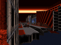
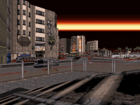
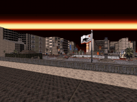
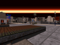
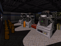
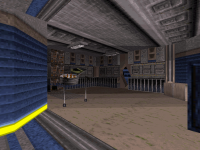
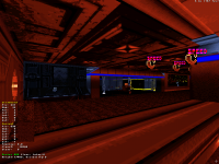
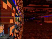
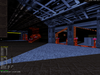
@Aleks dzięki - hmm, you're right about a few cuts that should probably look a bit less sharp, at least this one in particular could use a few more walls. I'm going for a destroyed terrain vs. natural design look here, but even explosions shouldn't look like they happen in octahedrons. That whole area is the main one that still requires some work, to be fair; I want more similar ways for the player to be able to get back up on land from the piers and not just that one chunk of grass. So far I've made sure to provide at least one that corresponds to every subsection of the map, since the ocean covers everything and is so big, but like you guessed I'm quite mindful about wall use and so that takes us back to working in layers and priorities. Now that all the rooms are built and the map's most basic functions implemented, though, I'll definitely focus on that aspect before I add slightly less useful detail like cars, which really come last here as I feel like the map needs them a bit less than the others as the streets in this one naturally offer more options for cover to the player. Ideally I would like more 'islands' and constructions protruding out of the water, too but I'll probably end up with only so few resources left for those. I'm kind of finding myself having to work in successive stacks of tasks here to make sure the map eventually features at least a tiny bit of everything I'm envisioning for it. Side note but re:terrain design, when it comes to sector angles and whatnot, in general I'm mostly trying to cram as many nooks and crannies in there, to make for semi-hidden item caches, surprise enemy encounters, or useful cover and in situations like this I'll prioritize that practical function over the realism of looks, but that's not to say I shouldn't watch that altogether. Only bringing that up because I feel like that's one aspect that should pretty much dictate the layout of even the most average room; every corner you draw should serve a purpose.

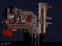
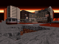
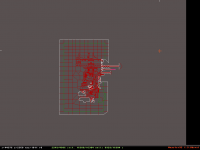
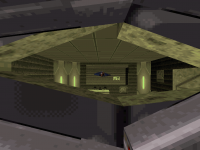
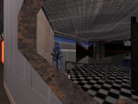
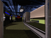
And yeah automap doesn't do the scale 'justice', probably because of Duke's sprite being so big in that shot too (I was probably using the jetpack or standing on something), but it's OK, I meant to convey a general idea and am counting on how players will only get the full experience once they're actually in anyway. But if you're trying to get an estimate, a good reference is looking at the size of the few buses and cars that already are in there I guess; especially the cars almost look like little dots. Editor 2D screenshot should be more interesting for this one, if only to show how I built the ocean in big blocks on a grid - which I recently realized is the optimal way to approach this type of design for encircling the map if you don't want to struggle with big, potentially buggy sectors and later additions to those areas. Makes it super easy to touch up the ocean area too as you can then easily expand it by adding more blocks or moving them around.

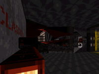
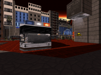
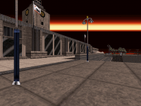
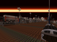
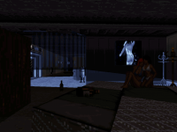
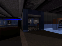
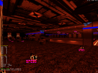
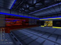
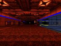
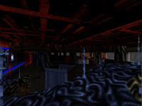
@Merlijn thanks! And yeah, you guessed just right. Episode isn't directly related to that one map thematically, but this train is a big nod and I guess literally underground reference to it, I'm basically remaking that part most people seemed to like at the time but with a twist. I shamelessly copied the train here because it's still more or less exactly how I would have rebuilt it; I want a few more alterations though, like I was saying earlier this room is bound to change quite a bit in the end. I'm glad you're into the color theme and what's funny is I realize in retrospect that those big scale urban demolition scenes resemble SG quite a bit (although here you're cleaning up the aftermath vs. in the middle of the main destruction as it happens, which is less ambitious and maybe more arcade-ish vs. scripted). I really want to make something different that's not a city next - six solid urban maps in the set should be more than enough, and although so far that's all I've got, my true vision for the final product bears a bit more variety than that.

Also one last thing I don't think I ever mentioned, but I also want to optimize the whole episode for potential speedrunning in addition to the original layer of gameplay.

This post has been edited by ck3D: 03 February 2021 - 12:25 PM

0

User is online   ck3D 

#126

My Internet has been down for a few days so I'm using some public wifi from my phone and can't post screen shots, but map 6 is done with around 2300 sectors and all 16384 walls used (which just about sufficed; I actually had to scavenge through a few old sections last minute to get some back). Some areas still need some minor cosmetic touches that I guess will have to be sprite-based, but otherwise it's all in there and it's quite satisfying that the level has most of what I originally had in mind for it in the end, feeling like I did manage to plan then build everything in the right order which really had to be key here. More soon - and now I gotta finish a map I started for AWOL.

PS. also encountered a funny glitch (remember I'm using an old build) where a sprite I had never inserted in the map suddenly appeared in between saves and would act as a vertical masked wall forming a tower of seemingly infinite iterations of itself and only ever visible from some very rare angles. Checking out its properties, it turned out to have crazy extreme coordinates, in the 5 million range. I deleted it in 3D mode which took away the entire tower at once and never encountered something similar again after that.

This post has been edited by ck3D: 07 February 2021 - 06:40 PM

3

User is offline   Maarten 

#127

Wow - seems some of your most active/productive mapping days are right here! Quite impressive to say the least.
Lovely shots - the episode will have enough variation as well. Maybe it's already been said, but this stays "vanilla Duke"?

I do agree about visibility thing & night sky, but I'm sure this will be okay WID.
The red sky looks refreshing.
1

User is online   ck3D 

#128

Thanks Maarten! I would actually like more variation eventually, so far the maps all look somewhat unique in comparison to one another but they're still grounded in the city style. I think this one I just finished will be the last one to really be city-themed though (unless some of the next maps choose to disregard my intent and turn into city maps by themselves anyway, which has happened with 'map 5').

And yes this stays vanilla Duke and is primarily developed with classic everything in mind. I would like some specific new monsters, too, but for those I'll need to learn how to mess around with new art and get better at coding - which shouldn't be an issue, I just need to do it. That department is just not the main focus right now (it's slowly becoming a bigger one though, now that a lot of the architecture is in place it's tempting to see how the full picture would work out). I'm trying to stay rather authentic to the base game's strengths anyway, including interesting layouts for Dukematch.

This post has been edited by ck3D: 13 February 2021 - 03:11 AM

0

User is online   ck3D 

#129

Map 6 final screenshots with full 240 vis. Two or three small rooms (not shown) still need some basic spritework I'm too lazy for right now but besides that and the monsters/items, everything is functional. Some areas might be redundant with what I've posted before but I had to fine-tune more little things than expected last minute throughout the whole map (including remaking a whole area that had gotten corrupted and some sprites that would delete themselves or lose their tags in between saves) so maybe some detail here and there has changed - anyway this should be representative of the final look and feel. Including an in-editor 2D screenshot to show the grid forming the surrounding ocean that I was mentioning earlier, as it may be a good approach to making large areas with no glitches or even just start a map altogether if you know you want a layout that's insular (although here I didn't build it first thing, I reckon doing so should work really well). Originally mine had a lot more regular splits as a lot of the blocks were copy-pasted but then I ended up having to join a lot of sectors to gain walls back, so it doesn't look as structured.

Attached thumbnail(s)

  • Attached Image: 0601.png
  • Attached Image: 0602.png
  • Attached Image: 0603.png
  • Attached Image: 0604.png
  • Attached Image: 0605.png
  • Attached Image: 0606.png
  • Attached Image: 0607.png
  • Attached Image: 0608.png
  • Attached Image: 0609.png
  • Attached Image: 0610.png
  • Attached Image: 0611.png
  • Attached Image: 0612.png


This post has been edited by ck3D: 13 February 2021 - 09:16 PM

8

User is online   ck3D 

#130

After a month I feel like I owe the people following my progress on this an update, work has caught up and gotten the rest of me for a few weeks now which has been keeping me away from the Duke PC altogether, and given the uncertainty of the current times I honestly have zero idea when my schedule is getting any clearer. Hopefully soon, either way this work is a longtime process and has been accepted and presented as such from the start, so the maturation time is to be expected and I would like to appreciate the players' patience. Also please rest assured that I am unquestionably bringing this project to completion eventually, in fact I'm only increasingly excited about it despite not actively mapping and won't sacrifice my vision one bit. Thank you for waiting.
4

User is offline   Dynamo128 

#131

Thanks for the update! Looking forward to when work on this resumes, and best of luck :)
1

User is online   ck3D 

#132

Had some hours and inspiration to spare tonight and so I started map 7, which is around 530 sectors so far. Progress on this project as a whole will remain mellow for a bit as I still have a bunch on my plate for the next few weeks at the very least, but this map in particular should be an easy one. Realistically I shouldn't even be touching Build, but fuck it for a night. Still kicking!

This post has been edited by ck3D: 21 April 2021 - 05:13 PM

3

User is online   ck3D 

#133

Found a couple more hours, now at 720 sectors on map 7. Blue moods:

Attached thumbnail(s)

  • Attached Image: 7-01.png
  • Attached Image: 7-02.png
  • Attached Image: 7-03.png
  • Attached Image: 7-04.png


This post has been edited by ck3D: 23 April 2021 - 02:14 PM

6

User is offline   pavigna 

#134

View Postck3D, on 23 April 2021 - 02:13 PM, said:

Found a couple more hours, now at 720 sectors on map 7. Blue moods:


Wow. just wow. your attention to detail is always great, especially noticeable in that beautiful lighting effect. really adds a lot to the scene, almost gives it a bit of an eerie vibe imo... Love it.
1

User is online   ck3D 

#135

View Postpavigna, on 25 April 2021 - 10:19 PM, said:

Wow. just wow. your attention to detail is always great, especially noticeable in that beautiful lighting effect. really adds a lot to the scene, almost gives it a bit of an eerie vibe imo... Love it.


Thanks for the kind words, out of the whole pack this map is the first one I intend to mostly take place indoors and so I'm having a lot of fun thinking of ways to utilize the space despite being restricted on every axis, as it's one of those ones where I've drawn the boundaries of the playable area first (which is a fixed structure) and now I'm just filling it in. I now realize I had sort of missed that feeling of being confined somewhere whilst working on the other maps, where the scale is so big indoor action can only consist in so much, here I'm enjoying designing funny hallways for once and navigating the player a different manner. If you remember that one time I gave you some basic tips on how to build a space level, here I'm basically applying exactly those except it's not a space map.

Shots are actually a very simple scene in terms of technical detail but I'm glad you can appreciate it nonetheless, little things with contrast oftentimes hit harder than elaborate sprite constructions and I've been working on simplifying and refining my style. Mappers used to commonly associate 'detail' with clutter but that's really not what it is. I've also been super into sloped lighting recently, nothing extravagant but it's so tempting to just throw diagonals everywhere. Areas in the map I'm planning to have color coded for progression (different colors corresponding to each key door color and green for health stashes), but it's indeed really cool to play with tones and see how they can alter the feel of technically the same scenery just under a different light. Colors have subconscious meanings, keeping them in mind in level design is one big fundamental.

Also when it comes to shapes, little things matter, for instance since those shots I've updated the square bottom of those lit up sectors in the first image with a rounded shape (to parallel the circular source of light off screen in the back - makes sense, yet I had forgotten to do it) and somehow it adds a lot of depth to the room with essentially nothing, just because then those shapes now echo the ones of the machinery and it especially works and looks coherent that they are perfectly aligned with it (hence the importance of always keeping an eye on the correct values on the grid).

This post has been edited by ck3D: 26 April 2021 - 03:12 AM

2

User is online   Aleks 

#136

The screens indeed have some classic style beauty in them, with the strong light/shadow contrasts (underlined even more with the blue pal lights), but still keeping your characteristic creative texture applications and combinations. I'm particularly interested about the vertical shadow on the snacks machine and how you pulled this one off - if there a tiny sector around with blue pal walls, or some more complex shennanigans to pull it seamless like that?
1

User is online   ck3D 

#137

View PostAleks, on 27 April 2021 - 02:47 AM, said:

The screens indeed have some classic style beauty in them, with the strong light/shadow contrasts (underlined even more with the blue pal lights), but still keeping your characteristic creative texture applications and combinations. I'm particularly interested about the vertical shadow on the snacks machine and how you pulled this one off - if there a tiny sector around with blue pal walls, or some more complex shennanigans to pull it seamless like that?


Thanks Aleks, blue tint on the snacks machine is exactly what you described with a tiny wall extending from part of the machine at the bottom, classic shenanigans really. But one could also achieve a similar-looking effect (with slightly different results) by using sprites and I'm sure in many other ways.

I remember your post on the LameDuke specific blue tint/palette, by the way and just the other day working on this map I found out a way to replicate it by accident. I was making windows with a double panel of glass (using the unbreakable/white tile) and noticed after a couple of overlays, the blue on the other side was starting to look exactly like that. So if you ever want a wall that color, you could always draw a few thin layers of extra walls in front of it, and add as many masked walls with the pure white texture and right level of transparency as you would wish and it should really work. I'm actually tempted to try that somewhere in this map actually.

This post has been edited by ck3D: 27 April 2021 - 09:37 AM

0

User is online   Aleks 

#138

View Postck3D, on 27 April 2021 - 09:36 AM, said:

I remember your post on the LameDuke specific blue tint/palette, by the way and just the other day working on this map I found out a way to replicate it by accident. I was making windows with a double panel of glass (using the unbreakable/white tile) and noticed after a couple of overlays, the blue on the other side was starting to look exactly like that. So if you ever want a wall that color, you could always draw a few thin layers of extra walls in front of it, and add as many masked walls with the pure white texture and right level of transparency as you would wish and it should really work. I'm actually tempted to try that somewhere in this map actually.


I was also experimenting with different "palette mixes" some months ago and main issue was, they look completely different under classic and polymost. I was mostly aiming to get more purple tiles by setting 2 transparent sprites, red and blue palled respectively - it worked well in Polymost, but in Classic it was kinda brownish. Also tried to create LameDuke cyan, but that didn't really work well, was just either blueish or greenish as there's no real colour bar that would be close to it.
1

User is offline   Seb Luca 

#139

Always paying attention to details and an excellent composition of large spaces. Well done ! ;)
1

User is online   ck3D 

#140

View PostSeb Luca, on 30 April 2021 - 01:34 PM, said:

Always paying attention to details and an excellent composition of large spaces. Well done ! ;)


Merci Seb, I especially appreciate the appreciation for the composition in general coming from a fellow visual artist!

Mapping sessions have been a bit rare but are a thing again and so progress is slow but steady. Map 7 is currently nearing 900 sectors and 4600 walls, here are a few screenshots that don't show much:

Room #1 from the previous screenshots (slightly) updated, for comparison purposes:

Attached Image: 7-06.png

People liked this scenery so here's a bit more of it the other angle was concealing, regardless of whether or not I spoil it that one mirror in the back will drive you crazy (I forget it's there in my test plays myself):

Attached Image: 7-08.png

And in general I'm pretty happy to see all my confined shenanigans starting to come together as planned, with interconnections in the layout and level-specific little events, puzzles and sequences progressively emerging. The first two screens are from a segment in the level where the player needs to figure out ways to cycle through rooms to be unlocked one by one, simple but fun for what it is (some detail is missing from the first screen, but you can notice how there's one focal point for each eye). Third one is some random destruction from later in the level after that triangle of rooms has been opened up. Hopefully this level will be especially good for Dukematch (all the while being fun in SP).

Attached thumbnail(s)

  • Attached Image: 7-09.png
  • Attached Image: 7-07.png
  • Attached Image: 7-10.png


This post has been edited by ck3D: 01 May 2021 - 04:08 PM

5

User is online   ck3D 

#141

Why do in-editor shots with Cyclers look so satisfying, is it purely a proud mapper thing or does the C + GPSpeed sprite duo just look that good in itself?

1320 sectors, 6900 walls, ???? fullbrights.

Attached Image: 7-11.png Attached Image: 7-12.png
Attached Image: 7-14.png Attached Image: 7-15.png Attached Image: 7-16.png

This post has been edited by ck3D: 02 May 2021 - 02:54 PM

6

User is online   ck3D 

#142

Satisfying progress on map 7 this week, now in the 1900 sectors and 9200 walls although the resources spent on this one aren't necessarily representative of much when it comes to its advancement, the layout is still evolving a lot and since this is no big scale city it's hard to predict whether or not the limits will even get in the way, I would also like a slightly smaller/more traditional level à la map 4 since this one is meant as a break after two big cities and so I'm not counting on (and for a change, nor worried about) using all the resources up, I'll just stop whenever I feel like it's done.

Here are some new areas, all caught in game mid-Cycler cycle (so far the level has 200+, I've been having fun) so the lighting/shading everywhere isn't fixed. Screen 4 (with one misaligned texture I just noticed) is just to show my funny idea of using the K from that neon NUKEM (same tile as the one over the doorway) as a light source on the ceiling for a spinning light effect, not sure if I've seen that done before, maybe I have and just can't recall. Also yes that P on screen 1 blinks.

Attached Image: 7-20.png Attached Image: 7-17.png Attached Image: 7-18.png Attached Image: 7-19.png Attached Image: 7-21.png

This post has been edited by ck3D: 07 May 2021 - 03:14 PM

6

User is online   ck3D 

#143

Significant progress on map 7, I've designed as far as the level's finale, generally speaking this one has a lot of interactivity and some little progression tricks and puzzles I'm quite satisfied with as I'm usually not a puzzle mapper. For now the level is basically one big floor and I guess would already play rather well as it is, reason why it's not done yet is I want a second (simpler) floor for vertical dimension/progression and also a handful of extra areas on the side, all of which combined may actually take some time to build (would still be cool to finalize within the next week or two). I also have some fine-tuning on design to do here and there but that really shouldn't take long in itself. Given the confined scope of the level, it's actually been easier than usual constantly keeping potential annoyances in check.

One more abstract screenshot of mostly palettes (red stripe on that wall on the left side is more than likely to be replaced with different trimming as soon as the next mapping session), was tough to take a screenshot there without spoiling much:

Attached thumbnail(s)

  • Attached Image: 7-22.png


This post has been edited by ck3D: 08 May 2021 - 04:35 PM

6

User is offline   Maarten 

#144

Love this use of palettes! It looks special (Y)
Nice to see you're still very active with mapping on this project :)
1

User is online   ck3D 

#145

Thank you Maarten, always nice to hear from you! Yeah, I took a little break from mapping for like two months till recently but then I started a new level two weeks ago and I'm already almost done with it, been having fun. Episode as a whole has been WIP for over two years now so it's good to make recognizable progress as time goes not to feel like I'm stalling or something, I hate it when stuff drags. Worked on map 7 some more last night, did a lot of heavy-duty sector work that tried corrupting the level about a dozen times but eventually I got it all good and stable, I'm just about to need to start coding in the new enemies too (just palette swaps at least for now) as this map actually looks like the perfect test room for many things including that. Current hope is to make it into 2022 with only very little work left to do on the episode as a whole and a release sometime within the first half of that year (ideally).

This post has been edited by ck3D: 10 May 2021 - 02:00 AM

1

User is online   ck3D 

#146

10200 walls, second floor is coming together slowly but surely, and this one I can make a lot more spacious in comparison to the other floor so it's fun to build and the variety will work, I'm psyched. Also figured out how exactly I wanted the whole of said floor to play and which effects and ideas it should feature, so now it's all about raw execution, and then once I'm done with that floor I'll tackle my little side areas and we'll be good with map 7. Those side areas shouldn't take long to make either after all the clean-up work I already did (which indirectly involved them and somehow managed to earn me 300 sectors back).

Wee bit of a new section:

Attached thumbnail(s)

  • Attached Image: 7-23.png

5

User is offline   Ninety-Six 

#147

For some reason the blues are really attractive on this level. Not sure why.
1

User is online   ck3D 

#148

Thank you! The blue and the red palettes in Duke 3D in general always tend to look good IMO, especially when applied to sharp sectors or large places; I remember tripping a bit as far as when we started Suburban Hive 2 way back and I was experimenting with that first all-red city segment, it was extremely basic and still felt special to make in the moment, and the same could been said about that whole map I reckon, so the quality is rather inherent. Not certain I'm doing anything particular with the blues here besides always watching how well they work with their surroundings, and that color being the main tone of the map until the later sections also (so the whole map sort of feels like it has blue has its fundamental, underlying visual theme, even in places where it's not there). And then it's probably my lighting/shading style, heavy contrast will boost the look of any location and is super easy to implement. Over time I've also developed my own little science in shade value increments where I know exactly which values and differences in values will generate my favorite-looking results in this or that given circumstances (more or less close proximity to this or that type of light source, etc.), and so before I even start making a new scenery I already know how exactly every value should be set for what I regard as optimal results.

If you ever give mapping a try like I remember we were bringing up before, I'd recommend making very basic structures (rooms with simple square stuff inside, etc.) and then playing with the lighting in there with colored light sources and walls, and drawing some long shadows, all of which is easy to make and most often a matter of a few key presses. Start simple for as long as you need to grasp the basic no-no's of sector construction, as lighting on the ground relies on its own sector (which comes quick, basically don't draw lines from the wrong places or in the wrong order) and I'm willing to bet you'd be amazed at your own results, and then consequently fall into addiction.

This post has been edited by ck3D: 11 May 2021 - 01:36 AM

0

User is offline   Ninety-Six 

#149

I'm pretty sure I would be addicted. I rather have a strong thing for lighting in general. In games, and in real life too. Hell, even with an ancient map like Bowels of Hell Space Station, that one single part where the wall grating is redrawn on the floor as shadows is still the standout part to me. It's so simple but I am just really big on lighting details like that. I'd probably run out the sector count on obsessive lighting detail for quite a while before eventually convincing myself to cut back.
1

User is online   Aleks 

#150

I've already discussed most of these screenshots with you, but just a little nitpick regarding the most recent one - have you considered changing the floor texture there (or maybe is it just temporary)? That texture is cool and I personally like it, but it definitely doesn't absorb the palette too well, turning a bit into a pixelated mess in the blue pal sector. Maybe try one of these Atomic textures with diamond plates that I've been always abusing the fuck out of (they also come in different colours, so you could see which one looks the best with palette) instead or something else?


EDIT:

View PostNinety-Six, on 11 May 2021 - 01:41 AM, said:

I'm pretty sure I would be addicted. I rather have a strong thing for lighting in general. In games, and in real life too. Hell, even with an ancient map like Bowels of Hell Space Station, that one single part where the wall grating is redrawn on the floor as shadows is still the standout part to me. It's so simple but I am just really big on lighting details like that. I'd probably run out the sector count on obsessive lighting detail for quite a while before eventually convincing myself to cut back.


<blatant self promotion> I think you're gonna really like my maps :P </blatant self promotion>

This post has been edited by Aleks: 11 May 2021 - 02:51 AM

2

Share this topic:


  • 17 Pages +
  • « First
  • 3
  • 4
  • 5
  • 6
  • 7
  • Last »
  • You cannot start a new topic
  • You cannot reply to this topic


All copyrights and trademarks not owned by Voidpoint, LLC are the sole property of their respective owners. Play Ion Fury! ;) © Voidpoint, LLC

Enter your sign in name and password


Sign in options