 Duke4.net
 DNF #1
 Duke 3D #1

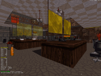
I remember playing Anorak City and Happy Hangover, very nice work.

 Help
Help

 duke3d.exe, on 12 January 2021 - 09:08 PM, said:
This post has been edited by ck3D: 13 January 2021 - 08:44 PM
This post has been edited by The Watchtower: 14 January 2021 - 12:57 AM
The Watchtower, on 14 January 2021 - 12:56 AM, said:
ck3D, on 08 January 2021 - 02:57 PM, said:
This post has been edited by ck3D: 14 January 2021 - 06:19 AM
Sanek, on 14 January 2021 - 04:11 AM, said:

This post has been edited by ck3D: 20 January 2021 - 04:48 AM
ck3D, on 20 January 2021 - 04:16 AM, said:
This post has been edited by ck3D: 21 January 2021 - 09:22 PM
This post has been edited by ck3D: 22 January 2021 - 09:05 AM
Ninety-Six, on 22 January 2021 - 09:36 AM, said:

Ninety-Six, on 22 January 2021 - 09:36 AM, said:
This post has been edited by ck3D: 22 January 2021 - 04:32 PM
Sanek, on 23 January 2021 - 05:29 AM, said:
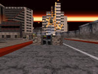
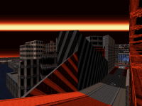
There are so many "Dukish" areas around really, I remember as a kid walking around with my older sister who showed me Duke in the first place and recognizing areas that look just like out of Duke. Also I don't think the scale is really off in Duke, if we take 8192 Z-units as 1 metre, then most doors in original game would be 2 metres high, same if 512 XY-units are one metre, most doors would be 1 metre wide, which is reasonable. The thing is, both IRL and in-game areas can be cramped or spacious and the second option is always better (last week I was super pissed off doing grocery at a market with super-tight aisles, large-ass carts and a fuckload of people crowding around, which is quite similar to cramped maps in Duke). Most of the time, the realistic scale is OK, just that not all types of areas are suitable as Duke is fast as hell, so no point doing tiny mazes. Never really thought much about Duke's weight and platforming though, that's an interesting aspect with how the windowsills or little hanging sprites would bear his load with ease. Also - did anyone genuinely ever encountered a Doom door opening either to the ceiling or floor IRL? Imagine how impractical that would be! 
This post has been edited by Aleks: 23 January 2021 - 11:25 AM
This post has been edited by ck3D: 23 January 2021 - 02:29 PM
This post has been edited by ck3D: 29 January 2021 - 09:25 AM
This post has been edited by duke3d.exe: 30 January 2021 - 09:25 PM
This post has been edited by ck3D: 31 January 2021 - 07:23 AM
ck3D, on 31 January 2021 - 07:03 AM, said:
This post has been edited by ck3D: 31 January 2021 - 08:30 AM
This post has been edited by ck3D: 02 February 2021 - 07:07 AM
This post has been edited by ck3D: 02 February 2021 - 07:22 PM


 GG !
GG !