Duke4.net Forums: Need feedback on WIP mapping - Duke4.net Forums

Jump to content

Page 1 of 1
  • You cannot start a new topic
  • You cannot reply to this topic

Need feedback on WIP mapping  "Stuck!"

User is offline   BestViking 

#1

I'm stuck on my map. I feel like I'm only creating filler content and not sure how to expand it. It's been on hold for a long time now without progress. I'm looking for an experienced mapper willing to take a look at it and perhaps give me some ideas and feedback. Please let me know if there is any such interest.
0

User is offline   oasiz 

  • Dr. Effector

#2

I can give it a spin.

My tip for when you're stuck in this kind of situation is to simply draw over the map in paint or draw the layout on paper.
It's much quicker to do layout iterations that way and the idea kind of fleshes out on it's own there.

Try prototyping with effects, even silly things. You can often build a concept around those and integrate those in to the overall design.
Also don't be afraid to delete areas, one way to go is to just create a backup map and ignore all your imaginary own restrictions that came with the original vision of the map. Start adding weird passages / radical layout changes can often inspire you to look at the map in a new angle and see the obvious way to do some things :rolleyes:

One approach is to start detailing one or two areas, maybe you will find a consistent style / story / goal you want to aim for with the rest of the map.
2

User is offline   Perro Seco 

#3

You can build a circular sector in the middle of the map with passages to the rest of the areas. That works for me when I'm not inspired and also makes the level's shape cooler.
0

User is offline   BestViking 

#4

Great ideas! Particularly cutting out the sections of the map that I like onto a new one. I think I'm going to be doing that. I have so many backups due to paranoia. I think I am at <mapname>25.map now, since in the past I had problems with sectors corrupting and destroying my map. I do know the guidelines for avoiding it by now, but you can never be sure.

I'm going to post some screenshots tonight so you can see the general idea.
0

User is offline   BestViking 

#5

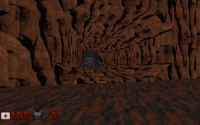
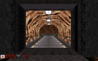
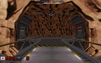
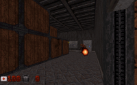
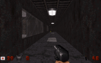
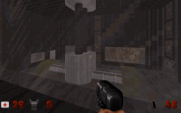
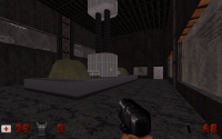
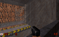
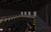
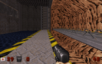
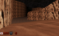
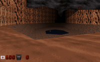
Here are some screenshots. Hopefully they show up in chronological order. The setting is in a desert where you start out before making your way to this underground facility, a bit inspired by Black Mesa. There is a storage area with crates, and a large generator room which so far everything is built around. To be honest, i'm not quite sure where I am going with this as I was mapping from pure impulse/inspiration and didn't plan very far ahead.

Maybe from the screenshots provided, I can get some ideas for how to develop this? That would be greatly appreciated!

Attached thumbnail(s)

  • Attached Image: duke0000.png
  • Attached Image: duke0001.png
  • Attached Image: duke0002.png
  • Attached Image: duke0003.png
  • Attached Image: duke0004.png
  • Attached Image: duke0005.png
  • Attached Image: duke0006.png
  • Attached Image: duke0007.png
  • Attached Image: duke0008.png
  • Attached Image: duke0009.png

2

User is offline   Perro Seco 

#6

Those screenshots look very good! The only thing I don't like much is that all rooms seem to be a bit squarish. I think using different shapes and non 90ยบ walls will improve the variety.
0

User is offline   BestViking 

#7

Thanks! I'll see what I can do about it. I'm unsure about the ceiling texture. I couldn't think of anything better than that black metal panel.

It's like a concrete, underground facility like Black Mesa, so I'm using textures that closely resemble that aesthetic. My mapping is rusty, as I'm haven't mapped regularly since around 2004, with some on-off mapping in the first few years after that. It's all muscle memory though. I messed around a bit and suddenly my hands knew where everything was on the keyboard :rolleyes:

I still had to reference some stuff with SE's and whatnot. There are a lot of new features that I'm looking to get into later. Mainly TROR. I'll see how that goes. First I have to get into a kind of workflow again.

EDIT: I forgot to add that the shading is only temporary approximation. It looks like shit now particularly in the rocky areas since everything kind of blends together and you don't see the outlines of the shapes very well. That will change later.

I also added a lot of earthquakes with seenine explosions in the walls and stuff which really adds to the atmosphere. Lights blow up and flicker etcetra...

This post has been edited by BestViking: 02 November 2017 - 05:10 PM

0

User is offline   oasiz 

  • Dr. Effector

#8

I'll try to provide feedback soon, I feel like that generator could be used as a central point that you need to destroy.
0

User is offline   Loke 

#9

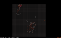
How big is the map currently? How many walls/sectors/sprites are being used?

I think the map looks cool, has a nice classic feel to it. I were going to comment on the lack of shading but I see that you're already aware of it. Remember that shading can really set the tone of the map, you don't even need to make a room particularly detailed as long as there is a strong shading present. Look at the official 3DRealms maps to see how they shaded theirs.

Have you tried playing any user maps? They can sometimes be a good source of inspiration too.
0

User is offline   BestViking 

#10

View PostLoke, on 03 November 2017 - 03:57 AM, said:

How big is the map currently? How many walls/sectors/sprites are being used?


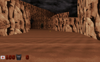
I'm attaching a screenshot of the build grid zoomed all the way out to show the whole map. Upper left area is what I've shown so far. The other large area is leading up to that, before you enter the facility. I'm also showing some shots of the outside area.

Sectors: 285
Walls: 1932
Sprites: 248

Attached thumbnail(s)

  • Attached Image: capt0003.png
  • Attached Image: duke0000.png
  • Attached Image: duke0001.png
  • Attached Image: duke0002.png


This post has been edited by BestViking: 03 November 2017 - 04:40 AM

0

Share this topic:


Page 1 of 1
  • You cannot start a new topic
  • You cannot reply to this topic


All copyrights and trademarks not owned by Voidpoint, LLC are the sole property of their respective owners. Play Ion Fury! ;) © Voidpoint, LLC

Enter your sign in name and password


Sign in options