Page 1 of 1
Full-res version of the 2001 DNF poster/box art?
#1 Posted 07 June 2016 - 02:38 AM
You know, the famous one. I think it came from the E3 2001 DVD of trailers of DNF and Max Payne, but I can't find clean, full-sized version of it.
imo this artwork captures the essence of Duke Nukem the best out of all the official DN artwork. Most other ones have him looking grumpy and blasting something instead, but this one shows off his attitude instead (while being more subtle than the retail DNF cover).

#2 Posted 07 June 2016 - 04:25 AM
This is the highest resolution I've ever been able to find of that picture
#5 Posted 07 June 2016 - 11:55 AM
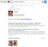
Yup, after a quick google reverse image search, I can confirm that Trikeen's image is likely the highest res version available. However, the results of the search itself yielded some much more interesting - and puzzling- results.
#6 Posted 07 June 2016 - 10:40 PM
Duke Rocks, on 07 June 2016 - 11:55 AM, said:
However, the results of the search itself yielded some much more interesting - and puzzling- results.
My guess is that was the planned year of release for DNF, but Gearbox ruined that for 3DRs.
#8 Posted 08 June 2016 - 01:38 AM
While I'm not 100% positive on this as this information isn't as readily available as I had previously thought, I believe the artist is Robert Grace who also illustrated the DN3D, Zero Hour, and Endangered Species covers along with (presumably) the Time to Kill cover and this magazine ad artwork.
#9 Posted 08 June 2016 - 05:17 AM
Marphy Black, on 08 June 2016 - 01:38 AM, said:
Wasn't this done by Robert M. Atkins at the same time as the Duke 3D title screen / box art?
EDIT: Nope, I see a "Morgan" signature in the image.
This post has been edited by Hendricks266: 08 June 2016 - 12:57 PM
#10 Posted 08 June 2016 - 11:26 AM
Marphy Black, on 08 June 2016 - 01:38 AM, said:
While I'm not 100% positive on this as this information isn't as readily available as I had previously thought, I believe the artist is Robert Grace who also illustrated the DN3D, Zero Hour, and Endangered Species covers along with (presumably) the Time to Kill cover and this magazine ad artwork.
I've also got that ad artwork in high res, if anybody's interested
http://i.imgur.com/okKhY4i.jpg
#11 Posted 08 June 2016 - 12:58 PM
Trikeen, on 08 June 2016 - 11:26 AM, said:
Not sure about "high res", given that it's muddy and probably was cleaned up with the clone tool.
#12 Posted 08 June 2016 - 01:12 PM
Hendricks266, on 08 June 2016 - 05:17 AM, said:
Wasn't this done by Robert M. Atkins at the same time as the Duke 3D title screen / box art?
I can't find the post, but I recall it being mentioned here (maybe by Frederik) that this magazine ad artwork was illustrated by Grace as a possible alternate cover for the game. Frederik mentioned Atkins as being the art director of all of the covers here.
#13 Posted 08 June 2016 - 02:57 PM
Trikeen, on 08 June 2016 - 11:26 AM, said:
That makes it look like Duke has a fat lower lip instead of his gritty teeth showing.
#14 Posted 09 June 2016 - 06:33 AM
HulkNukem, on 08 June 2016 - 02:57 PM, said:
That makes it look like Duke has a fat lower lip instead of his gritty teeth showing.
An alien hit him in the face and now his lip is swollen.
#15 Posted 10 June 2016 - 07:28 AM
Trikeen, on 08 June 2016 - 11:26 AM, said:
Why is the barrel of the gun is in different places on both guns? The left gun has the barrel on top, and on the right its on the bottom.
This post has been edited by icecoldduke: 10 June 2016 - 07:40 AM
Share this topic:
Page 1 of 1