Duke4.net Forums: [Release] ForeverDoom - Duke4.net Forums

Jump to content

Page 1 of 1
  • You cannot start a new topic
  • You cannot reply to this topic

[Release] ForeverDoom

User is offline   Sixty Four 

  • Turok Nukem

#1

A New map i made it started off as a "DM only" map but ended up taking much more shape then that and growing i couldn't stop building and i thought why should I stop if I can keep going. Anyway it's pretty much my Doom contribution.

Story : The Doom marine has left his hellified space base abandoned because he is out working on Doom4 those alien bastards know it is a good time to take over his base. While he is away his base is being attacked and if it takes to long the base will be Forever Doomed . So he contacts the one guy who fits the description of being able to save the day Mr. Duke Nukem. Mission: Explode the archives buildings so the aliens can't hack the computers system and clear out any aliens for a safe return of the Doom marine .

ForeverDoom eduke (i added some more ambience but the reason i didn't add that much was becuase the music i chose for it is better and some of the noises caused a small distraction to me. Also i did some minor changes that I was able to spot )

ForeverDoom on steam

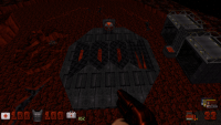
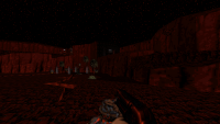
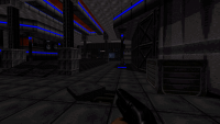
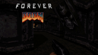
Screenshots
Attached Image: foreverdoom.png
Attached Image: duke0166.png
Attached Image: duke0182.png
Attached Image: duke0183.png

This post has been edited by Duke64Nukem: 22 August 2014 - 09:10 PM

10

User is offline   Paul B 

#2

Love these screenshots! Can't wait to try this out! Your mapping skills are amazing, you've come a long way in such a short period of time.

This post has been edited by Paul B: 22 August 2014 - 08:29 PM

0

User is offline   Sixty Four 

  • Turok Nukem

#3

Yo it's because of all the mappers before me man they paved the way here if i had to learn half the stuff that's already had to be learned i would lose my mind just read my text file.

Anything you want can be learned like a piece of cake because somewhere it has been done if not exact remotely close i just want to let all know that respect is given . It's the new ideas that spark the attention of Duke4 and i hope i can bring something to the table here i try at least but really i map just because i would rather map for Duke then play cod or halo or some new garbage i am lost in time

This post has been edited by Duke64Nukem: 22 August 2014 - 08:43 PM

3

User is offline   ck3D 

#4

screenshots look really nice. looking forward to playing this later today. congrats on a new release
0

User is offline   LeoD 

  • Duke4.net topic/3513

#5

Looks good. Will play later today. Note that two of your VOCs have the wrong file name: HOLYCW01.voc and HOLYSH02.voc should have zer0s instead of Ohs.
1

User is offline   JoJo the Idiot Circus Boy 

  • Steven Shitlord

#6

ForeverDoom By Duke64Nukem

2

User is offline   MetHy 

#7

Just played it, holy shit all those soundfiles... I recommend everyone to put everything into a subfolder and select that folder under "custom game content directory" when launching eduke32, this way all the custom files won't interfere with other maps/mods.

Speaking of the sounds, I think some worked and some didn't. For instance, the quality and sound of some of the quotes from DNF were obviously way too modern to fit with the rest.

Anyway this is probably your best map so far. You're developing your own style which is pretty good. The map looked pretty unique, and it's a fresh take on the "space/base" type map. My only complain is that, even though you are really improving in every aspect, the map is still kind rough on the edges, it's just small things really, but quite a good share of small things, like some textures issues (misalignement, overstertching etc), some places which shading isn't as good as the rest, some places which texturing looks very quick, etc
Also, minor things again but why putting a light switch in the bathroom if it doesn't work? Also, would have been nice to be able to have a pee in those toilets (you could put a toilet sprite 'inside' them for instance); and also later on in the map one of the viewscreen didn't seem to work...
Oh and, for the sake of everyone who plays in 8-bit, make the sprites of your 3D sprite structures one-sided!!! When starting the map, the first thing I noticed, before even starting to move, was all that sprite clipping on the lamp and the table due to the sprites not being one-sided, which really gives a negative impression to start with.

I played on CGS and when fighting the horde of pigcop, after using the bluekey and pressing the switch which disables the forecield, I almost ran out of ammo. All I had was 5 pipebomb lefts which I used against those pigpocs... Thankfully I got lucky and they dropped enough shotgun ammo for me. Before that I had to fight the commander with a pistol as well. That's my only minor complain as far as gameplay goes; on Come Get Some it was a little tight at this point. Even just one more shotgun shell pack would have been perfect. Also, considering the amount of cracks throughout the level, I would have liked a few more pipebombs as well (another 6-pack, maximum); because when you're tight on ammo, and you have to use a RPG rocket on a crack only to realize it only opens a path to backtrack, it feels like a waste...

Anyway in summary : good atmosphere, good gameplay, I enjoyed the setting which was a kinda fresh take on the space/base theme, the layout was effective, gameplay was enjoyable as well with a good feel of progression weapon and enemy wise. However the map is just a bit rough on the edges.

Hope to play more from you!

This post has been edited by MetHy: 23 August 2014 - 09:14 AM

2
User is offline   Sixty Four 

  • Turok Nukem

#8

Thanks, that's Fair enough though glad you liked it. My maps will probably have some rough edges still since i have mapped for less then a year i am still learning things daily. Yeah i should 1 side all the sprites i thought i did it to some of them, hard to remember sometimes when i play in 32bit. .
0

User is offline   Sixty Four 

  • Turok Nukem

#9

I was having some issues with dxtory lately but the video is decent enough but i know. Anyway shows all secrets and ammo spots because in the end you should have alot of ammo. Fresh hardware
Forever Doom youtube

This post has been edited by Duke64Nukem: 24 August 2014 - 07:58 AM

1

User is offline   FistMarine 

#10

edit

This post has been edited by FistMarine: 09 December 2016 - 09:57 AM

2

User is offline   MetHy 

#11

I didn't have a problem with ammo and had plenty left at the end. But at one point (the horde of pigcops after using the blue key) i had just enough ammo, and had to use pipebombs even though I believe giving a bit of choice to player in choosing what weapon to use is better, especially because I'd have liked to keep those pipebombs for the cracks found later on in the map. Also, secrets shouldn't be taken into account for balance.

This post has been edited by MetHy: 25 August 2014 - 03:45 AM

0

User is offline   Forge 

  • Speaker of the Outhouse

#12

View PostMetHy, on 25 August 2014 - 03:44 AM, said:

I didn't have a problem with ammo and had plenty left at the end. But at one point (the horde of pigcops after using the blue key) i had just enough ammo, and had to use pipebombs even though I believe giving a bit of choice to player in choosing what weapon to use is better, especially because I'd have liked to keep those pipebombs for the cracks found later on in the map. Also, secrets shouldn't be taken into account for balance.

^this
I'm pretty stingy with my bullet usage and i would have been in the same situation if it weren't for dead enemy ammo drops.
0

User is offline   Sixty Four 

  • Turok Nukem

#13

So probably one more shotgun shell inside the blue key card room probably would have been good enough but I was just aiming for a limit where it's just enough to get through some of the hardest parts.The pipe bombs were strictly for that part you can kill them all with only 3 pipes if done perfectly leaving you with 2 plus there is one more pipe in the vents part behind the blue room that should be enough to explode the cracks while also having to use the rpg for one or two of the cracks. Also i thought putting the devastator in a secret spot would be good idea because with it the map suddenly turns really easy to save all your RPG ammo plus Doom always had some secret way of getting a weapon. First it was to much ammo now it's not enough...well maybe i will get it perfect on my next map, i think i would. Honestly don't know when that will be though i have been consistently posting new maps this hole year :( i'm completely short on time and i'm pretty high on stress maybe it will just go away. I am glad it could be considered my best map though i picked up on a lot of sloping and different architecture during the making of it.
1

User is offline   Forge 

  • Speaker of the Outhouse

#14

View PostDuke64Nukem, on 25 August 2014 - 07:23 AM, said:

So probably one more shotgun shell inside the blue key card room probably would have been good enough but I was just aiming for a limit where it's just enough to get through some of the hardest parts.

or a couple more clips of pistol ammo if you want to keep that part a little more difficult. No need to over-compensate, but don't rely on the player finding secrets to provide their fire power and health - i for one didn't find the devastator - and hitting that switch (by the dev ammo) that did nothing but open a window shield and spawn a bunch of aliens was brutal on my resources


View PostDuke64Nukem, on 25 August 2014 - 07:23 AM, said:

i have been consistently posting new maps this hole year :( i'm completely short on time and i'm pretty high on stress maybe it will just go away. I am glad it could be considered my best map though i picked up on a lot of sloping and different architecture during the making of it.

don't get burnt out trying to release stuff as fast as you can. Start a new project and plunk away at it whenever you feel the urge without the pressure to get it done quickly. Take several months, a year or more if you like.
1

User is offline   ck3D 

#15

just played this. overall i liked it, thought the uncommon texturing / palette usage was intriguing and worked in a good way, resulting in lo-fi aesthetics that reminded me of slum noir-type of maps. shame some beginner design-related mistakes ruined some of the feel for me. namely misaligned textures (lots of them, and a lot that could have been fixed easily ie. by pressing O on them in 3d mode), lack of trimming and all kinds of odd-sized sectors (red and white) during the making of which i couldn't help but feel like you most likely had completely disregarded the grid (either turned it off or switched it to a very small scale).

not saying everyone always has to build according to the grid and make the same basic, square-ish structures all the time (in fact i like to see departures from that) but it makes for a good indicator of scale sometimes and here i sense that your level could have benefitted from using it more often : some of the inner bits of your rooms such as the pillars or the windows looked sketchy, were built in ways that contrasted with the rest of the level geometry, they were so narrow that they felt kind of weird and out of place (due to how hard it can get to trim very thin walls, let alone pulling them off in the middle of otherwise rather large, empty rooms with long, plain walls) and most importantly they also blocked my way more often than not due to how cramped they made the hallways and the action in general. one thing i liked about your map is that it had a lot of vertical action, which implies the likes of quick jumping action scenes and intense firefights, sadly the way you built some of the detail sometimes contradicted that decision, ie. in that very first central room of the base it could get really hard sometimes to navigate from floor to floor using the windows (especially while fighting hordes of pigcops and commanders at the same time), some of those narrow pillars would block my way when some wouldn't, sometimes they would catch the rockets as well... i felt like there were invisible walls everywhere due to how constricted i was feeling.

so yeah basically the one thing i would have to complain about would be the lack of space in some areas and the resulting claustrophobic feel due to the multiple, unnecessary narrow walls, nooks and crannies even though they were a nice addition to the level, they could have built in a more practical fashion. this is pretty much the same type of flaw that i was already addressing on this site about your turok map in the corresponding thread a few days ago. do not get me wrong, i like your style and you have a good eye for aesthetics... you just need to learn to make your levels more open, in my opinion.

besides this general suggestion i don't have much to complain about really, except the occasional unfair explosion / ambush here and there. my progression was pretty straightforward and i loved how you didn't just add random respawns, but also took the time to implement some scripted sequences and traps ie. enemies blowing up the walls, coming out of holes and such... very nice interactive touch that i wish more mappers resorted to.

i liked the fights even though they were kind of tough on me (i was once again using an old build, so all the palette'd enemies were tougher than they should have been, kind of left it like that on purpose though because i like the challenge), i thought the health was appropriately supplied to the player and i got low on ammo a few times but never ran out and again, that was due to how i played the map and the enemies were all stronger. liked the ending as well... even though i have to admit that i ran straight to the nuke button due to being way too low on health to handle so many baddies at once. otherwise i am sure it would have been fun...

took me 20 mins and i found a few secrets, i liked that you took the time to implement those as well, oh and the interconnected layout even though some of those new holes i was blowing up that led to earlier sections of the map seemed to serve no practical purpose seeing as little to no backtracking was ever required. overall a good map. i liked it and can't wait to see more of your stuff. my post may sound more negative than i really intend it to be, in reality i am just trying to give you pointers to make your next levels even better.

This post has been edited by ck3D: 28 August 2014 - 06:44 AM

1

User is offline   Sixty Four 

  • Turok Nukem

#16

Great feedback guys good to have a lot of that stuff in mind for my next, thanks for playing.
0

User is offline   LeoD 

  • Duke4.net topic/3513

#17

Finally got to play it...

View PostMetHy, on 23 August 2014 - 09:09 AM, said:

in summary : good atmosphere, good gameplay, I enjoyed the setting which was a kinda fresh take on the space/base theme, the layout was effective, gameplay was enjoyable as well with a good feel of progression weapon and enemy wise. However the map is just a bit rough on the edges.
Hope to play more from you!
I could hardly say it better. Thanks for making this map for us.
1

Share this topic:


Page 1 of 1
  • You cannot start a new topic
  • You cannot reply to this topic


All copyrights and trademarks not owned by Voidpoint, LLC are the sole property of their respective owners. Play Ion Fury! ;) © Voidpoint, LLC

Enter your sign in name and password


Sign in options