Duke4.net Forums: [RELEASE] Slum noir - Duke4.net Forums

Jump to content

Page 1 of 1
  • You cannot start a new topic
  • You cannot reply to this topic

[RELEASE] Slum noir  "Slums & tech noir"

User is offline   oasiz 

  • Dr. Effector

#1

Slum noir

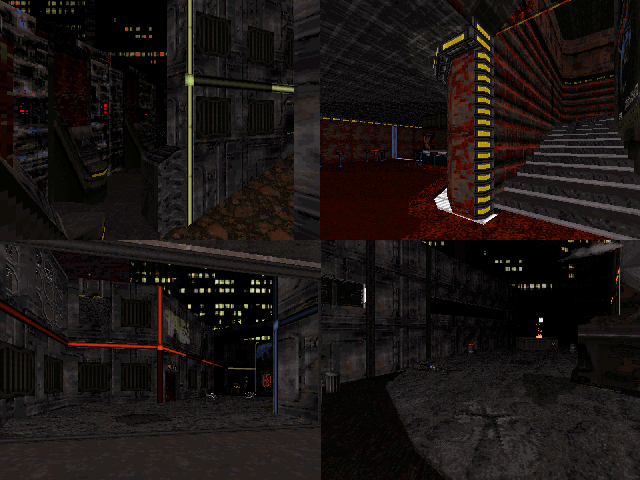
Welcome to the slums of of Neo L.A.
Home to the notorious addicts, keeper of the spike in crime rate.
A place where the alien infestation was just the extra needed bit of saturation to complete the picture.

Duke just got shot down again due to something that seems like an ambush.
Luckily, in the distance looms the quick escape trough the subway.

Posted Image

DOWNLOAD (v2 - no more dethtoll.mid)


No difficulty setting optimizing, has a overall low brightness for mood. (if you are in sunlight, jack up that gamma).
Tested and built with software renderer in mind, polymer does look pretty damn sweet due to glowing in the dark but seems to have slightly more bugs.


Spoiler


Thanks to all the testers and especially Daedolon for providing valuable feedback, a lot of the good stuff is in there because someone had to show me how stupid some things are.

ps. I think I managed to squeeze every annoying bug (aside from occasional sprite glitches) but if you see some nasty ones, let me know :P

This post has been edited by oasiz: 22 August 2014 - 09:31 AM

17

User is offline   MetHy 

#2

Really good map! Took me 15mins and found 5 secrets.

The best thing about it is its layout. I loved how you made the player go around and see the map open up little by little with everything being connected together, that's Duke3D spirit right there!
I also liked the original look you gave to the map, after looking at those screenshtos I was even surprised the map didn't come with custom textures! Though I believe some small things here and there could look better with only little work. I also think you could have given the map a better atmosphere, to me it felt like there was a lack of ambient sound, random sounds (and the lack of music also doesn't help)

Gameplay was good, but for the most part I think it's kind of gameplay you'd find in a map early in an episode (First or 2nd map) due to low number of enemies and weapons. This isn't bad, per se, though, but it makes me wish there was more maps after this one.
I really liked the fight at the end of the sewer. I didn't really understand what was going on during the part after that fight btw.

Some nitpicking :
Spoiler


Anyway, good job! Great layout and a look which is surpringsly original for a city map and which looks different than any city map ever made for DN3D (I never thought I'd say that ever again).
Some people aren't going to rate your map very high but that's because they give more importance to meaningless detailing than to good layout.

This post has been edited by MetHy: 22 July 2014 - 08:08 AM

1

User is offline   oasiz 

  • Dr. Effector

#3

 MetHy, on 22 July 2014 - 08:04 AM, said:

I really liked the fight at the end of the sewer. I didn't really understand what was going on during the part after that fight btw.

Some nitpicking :
Spoiler


Thanks a lot for the feedback, really appreciate it !
Spoiler


This post has been edited by oasiz: 22 July 2014 - 08:36 AM

0

User is offline   LeoD 

  • Duke4.net topic/3513

#4

Enjoyed it. Quite niceugly ( = mission accomplished :P ). I recommend putting the map into a ZIP archive and add the usual text file. My first downloads were corrupted and crashed EDUke32, maybe because the browser was in text more when retrieving the map.
0

User is offline   MetHy 

#5

 oasiz, on 22 July 2014 - 08:20 AM, said:

Thanks a lot for the feedback, really appreciate it !
Spoiler


The mid can also be named after the map in case you didn't know. Even though new textures are uncommon, midis are. For the secrets there are a few which don't feel like secret, like for instance one where you have to blow up the wall (to find the shrinker). Considering you also have to blow up walls for progression sake, it's taken for granted that the player will explode other walls, too.

But for the things that could use a little more work I didn't mean secrets, I meant things such some minor texture issues (some overstretched textures ; the top of a box not fitting with the box ; and even though I like the simplicity of the texture overall and it adds to the atmosphere of the map, some things are a bit too simple like for example the locked door leading to the sewer being the same texture as the walls).


Personally I don't think that stage event worked in the sewer, I only got the feeling that random shit was happening. The first time i even got squished by going to the surface of the water a 2nd time, and that seemed to be a glitch because the 2Nd time through I did the same thing and noticed nothing really happened to that surface.
0

User is offline   oasiz 

  • Dr. Effector

#6

 MetHy, on 22 July 2014 - 09:30 AM, said:


Ok, gotcha!
Point taken with the shrinker, I should probably patch that out and maybe add some texture contrast in some areas.

I agree that the event could have been done better, I had different plans in my mind initially but had to scrap those due to limitations. This was sort of the best I could come up with while keeping the original idea. Original idea was to go press the button manually, but this would be even more confusing as the water already 1-way linked to the area with the higher water.
I decided to make everything automatic in the end to get the water level higher.

Thanks for the feedback!

This post has been edited by oasiz: 22 July 2014 - 09:43 AM

0

User is online   brullov 

  • Senior Artist at TGK

#7

That palette. I love it!
0

User is offline   Forge 

  • Speaker of the Outhouse

#8

looked good, but could really use some trim work to break up those long stretches of one texture walls

you should rotate your touchplate sprtie tails 180.

the player can jump over the first "security" section which leaves the gate down - this lets the player go straight to the section with the yellow key

speaking of which, the player can walk up to the crack in the wall which shows the yellow key laying on the floor, crouch, and get the key - thus skipping that little section it takes to go through the vent shaft and those couple of rooms

your map can be finished and 90% of the level is skipped.
1

User is offline   Mark 

#9

Could someone zip the map and attach it here?

For some reason my browser gives me screen of gibberish instead of the download link.

Attached thumbnail(s)

  • Attached Image: downloadpic.jpg

0

User is offline   Forge 

  • Speaker of the Outhouse

#10

Attached File  slum_noir.zip (120.92K)
Number of downloads: 228

or try right-clicking on the link in the OP and select the "save as" option

This post has been edited by Forge: 23 July 2014 - 06:27 PM

2

User is offline   Shaq Fu 

#11

Wow that was one of the most atmospheric Duke 3D maps I have ever played.
I used Shift+F5 to change the song to LemChill.mid and it was a genuinely scary experience in the dark. Awesome map!

Spoiler


This post has been edited by Grounder: 24 July 2014 - 01:07 AM

0

User is offline   Sixty Four 

  • Turok Nukem

#12

Yeah I agree with it all, it's a good map for sure with nice fresh atmosphere. It was kind of hard finding my way but it wasn't a bother since the map was pretty and okay to look at while trying to navigate. Thanks for making doors non giant.
0

User is offline   MetHy 

#13

Dunno what's your thing with giant sized doors, but trust me it's unlikely you'll find some outside of Megaton's workshop :P
0

User is offline   oasiz 

  • Dr. Effector

#14

 Forge, on 23 July 2014 - 05:32 PM, said:


Oops, I forgot that one, generally I used downwards pointing ones but this one I forgot even while testing.

About breaking the textures, It could be improved in some areas like the sewers.
Although I don't want to start redoing major stuff just for a patch as I have already decided to release it in this state.
Maybe in the future.

Thanks for the feedback so far,
Gonna implement some of those minor fixes in about 2 weeks once I get home.
Meanwhile, don't jump over the force field :P

Also if you get text instead of the file, CTRL + S should force file save in browsers.
0

User is offline   FistMarine 

#15

edit

This post has been edited by FistMarine: 09 December 2016 - 09:55 AM

5

User is offline   Merlijn 

#16

Nice map! I enjoyed the gritty, worn down atmosphere. It's definitely different from your average city map and it has been pulled off very well. Especially the outdoor sections. I agree with Methy about the layout, it's cleverly done. Gameplay was solid as well, some nice fire fights. Not very hard, but I don't like huge amounts of monsters anyway. It usually gets old fast.

In short: thanks for the map, hope you create more! :P
1

User is offline   Cage 

#17

Hey, played the map and I can finally write something about it (no internet connection at home at the moment)

I like the looks of the map and the atmosphere is great, plays pretty well too, there's only one thing I don't like:

Inconsistency.

The map has both areas which are detailed as well as some which are very bland - the same thing with lighting.

Other than that, this is a pretty great first release!
0

User is offline   Paul B 

#18

For a first public release map - WOW! this map is fantastic! I found it very high quality and typically i'm not a fan of changing palettes but you've pulled this off flawlessly. I did unfortunately miss a lot of the secrets so I'm going to have to go back and do it all again. There has been an influx of high quality maps lately its nice to see the community is growing with new members and fresh ideas. Thanks for sharing! You definitely need a readme to go along with this map!
0

User is offline   Micky C 

  • Honored Donor

#19

I'd hardly call him a new member; he joined the forum around the same time I did.

Nice that he decided to make a map though.
0

User is online   ck3D 

#20

that map was really nice. took me 20 mins (i spent a while looking for that button inside the crate until i eventually found it by total chance - not a very logical location to operate a switch from), found 3 secrets. like MetHy, i thought the layout was the best part - everything is connected to everything in a fairly coherent maneer and a real sense of progression can be felt all the way throughout the map. in these regards, the gameplay felt very reminiscent of the original duke maps (especially the first maps of episode 1) which i really appreciated. the firefights were good - intense yet not overwhelming and the enemy placement and respawns were on point. i especially liked the timed respawns in the second street area, and the little scripted sequences in general.

i am also with MetHy when he says that the gameplay in this map feels like you are playing (one of) the first map(s) in an episode. the overall feel i was getting throughout my playthrough was that of a slow build-up for something else. maybe it's because of how the progression was orchestrated (low amount of baddies and weaponry at the start), maybe it's because of the ending which feels like it's leading up to some kind of sequel.

i loved the fresh look you managed to pull off with this map, too. the 'lameduke'-look and -feel is something i have tried to replicate in my own works for a while myself - pretty sure i have used the same label to describe some of my own levels on here before as well. for about a year i have been sitting on new city map that's about 80% complete and happens to look and play very similar to your level (except it's all in pal 7, old screenshot to be found here : http://forums.duke4....post__p__177560). it has the same type of blend of unusual hi-tech texturing and lo-fi aesthetics too (relying on shadows, atmosphere and minimalistic detailing). a few of my latest maps have been going down a similar route as well and i remember starting an industrial-themed map (i never finished) back in 2005 or so which had the same kind of texture and palette combinations as yours. so i could definitely relate to the style you were going for.
0

#21

Played this yesterday, but have been trying to find time since it first appeared.

I haven't ever seen another map quite like this one, very well put together. I am not about to say it was perfect, but it's hard to find fault and given that this seems to be your first release it's certainly well above average.

The texture choices are rather unique and they work well, also some of the architecture such as where there's an overpass near the end of the map work very well for me. This is the kind of thing I always wanted to build but can't pull off with my mapping style. Parts of the map made me think strongly of Duke II and LameDuke, others made me think of Dark Forces. I agree with ck3d in that it feels like the start of a series of maps rather than something on it's own.

Anyway, I enjoyed it.
0

User is offline   oasiz 

  • Dr. Effector

#22

Ok, was away for a few weeks. Finally back and some time to reply.

FistMarine: Ouch, I'll have a look on that! It's intended to be sort of an easy miss but it didn't work that well in the end, definitely not supposed to murder you. Glad you still enjoyed it !

Merlijn: Thanks! good to know that the balancing worked out.

Cage: That is something I was a bit worried about as well since I tend to be very linear with my map making, things and style tends to change a bit change as I go.
Overall, I think it turned out fine considering that I tried to create a bit of an unusual look.
About lights and details, I agree that something could be done in here. Don't really want to start changing stuff now that I finally settled on this, Now I've just gotta live with it :(
Especially the "backroom" on the bar and the top floor are something that stick out a bit in my eyes.
But thanks for the feedback!

Paul B: Glad to know you enjoyed it! I decided to have most of the readme stuff in the post itself (under spoiler tag).

ck3D: That crate thing is something I am not very happy with either, it sorta slipped by and I got too used to it. I think I'll patch it away.
Good to know that the combat worked well at least for someone! I was a bit worried if I went too overboard with the "Monster in closet" style, which is very useful when wanting combat on more cramped areas.
I guess these "part of series" comments really push me to make a sequel now, no promises but I have some initial ideas and stuff ready, a few things I didn't utilize in here :D
PAL7 and PAL24 master race! :( These actually work pretty well with low shades, normally easy to dismiss since they are otherwise too bright and saturated.

High Treason: Good to hear you liked it! I love parallax trickery so overpasses are always cool in my book, some times even a bit underutilized.


And to the rest I forgot to mention, thanks for playing.
I am sorry for the overload of red.
I'll do a v2 which introduces basic bug fixes, music and some sort of a readme in it. I know I could fix some other things but I want to stick by what I put out there.

I know I am always interested on how things evolve from start to the end, if someone wants to follow the revisions of this map then check THIS LINK
0

User is offline   oasiz 

  • Dr. Effector

#23

Double posting,

v2 has been uploaded.
I lied and updated a bit more than just two bugfixes, but this mostly just includes some ambient sounds as that was really lacking.
Also I think there was a showstopper bug at one point that could leave you locked behind, no clue what caused that.

DOWNLOAD

No more dethtoll.mid as it now has a custom .ogg made for this map.
Big thanks to 'Hot Multimedia / LHB' for his contribution.

Should be easier to download now as the files are inside a .zip
I suggest playing this version instead of you haven't played the original yet.
3

User is offline   LeoD 

  • Duke4.net topic/3513

#24

Rushed releases and lack of beta testers taken aside, I appreciate mappers who care about improving their work to increase the replay value. :(
0

Share this topic:


Page 1 of 1
  • You cannot start a new topic
  • You cannot reply to this topic


All copyrights and trademarks not owned by Voidpoint, LLC are the sole property of their respective owners. Play Ion Fury! ;) © Voidpoint, LLC

Enter your sign in name and password


Sign in options