Duke4.net Forums: [release] Sin Center - Duke4.net Forums

Jump to content

  • 5 Pages +
  • 1
  • 2
  • 3
  • Last »
  • You cannot start a new topic
  • You cannot reply to this topic

[release] Sin Center  "classic style city map"

User is offline   MetHy 

#1

Sin Center, a classic style city map by myself and Mikko Sandt

to be played in 8-bit classic mode

Download link : http://msdn.duke4.net/sincenter.zip
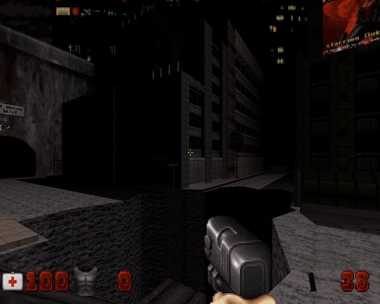
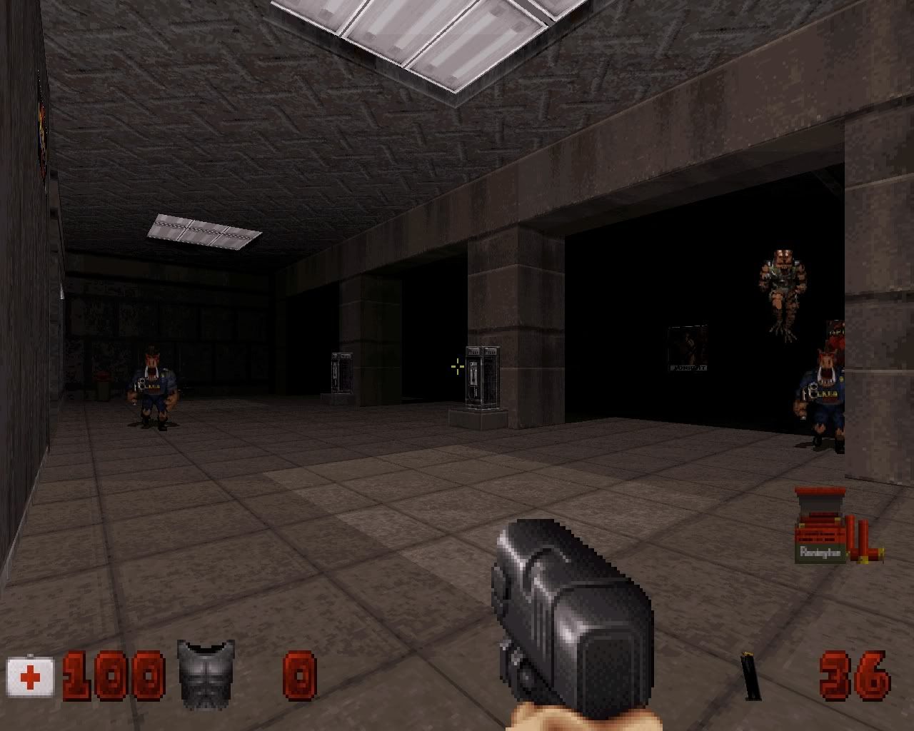
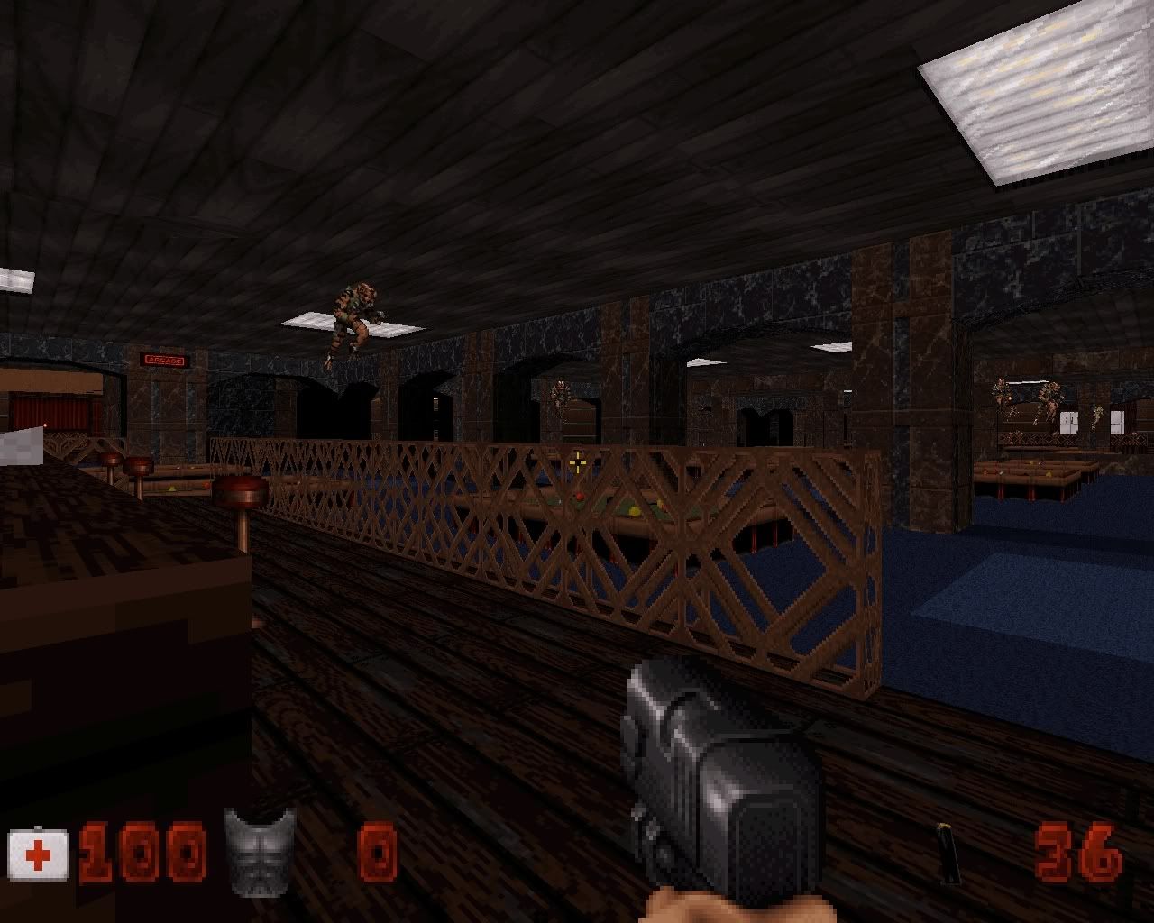

Screenshots :


Posted Image

Posted Image

Posted Image
7

User is offline   TerminX 

  • el fundador

  #2

Pretty sweet classic styled map. I like the abundance of secrets.
0

User is offline   Loke 

#3

Nice map. It's not terribly long but its fairly large scale made it appear really huge especially while on the street.

This post has been edited by Loke: 24 February 2012 - 12:15 PM

0

User is offline   LeoD 

  • Duke4.net topic/3513

#4

Thanks for releasing this! I hope that more unfinished contents will be made release-ready soon. As I said earlier: there is no need to raise the bar with each new release in order to please the players. Can't comment on gameplay cause I'm too drunk to survive atm.
0

User is offline   Mikko 

  • Honored Donor

#5

I'd love it if someone could contribute a review. I can't review maps I myself have worked on and this definitely deserves a spot and a rating in the Hot Maps section. The only requirement is that you use the MSDN scale when rating the map.
1

User is offline   Gambini 

#6

I can do it. After playing it*, of course. That would be my first review.

*I´m going to play it today.

This post has been edited by Gambini: 24 February 2012 - 03:40 PM

0

User is online   Lunick 

#7

I quite enjoyed the map although the scaling or something made the map feel really big in places. I liked the Poker Table and the Interact able Babe toys. I didn't like the billiards room much as it just seemed too large.
0

User is offline   Micky C 

  • Honored Donor

#8

It's a fairly good map, I thought health and ammo was a bit tight but then again I'm not a fantastic player so it might just be me.

The map does have some serious bugs though.

It has 3 level 3 corruptions, one of them can be gotten rid of with typing "corruptcheck tryfix" into the console, however the other two are curious; they're both red walls boardering void space (they should be white walls), and I can't see a way of fixing it beyond maybe deleting and remaking the effected sectors (shouldn't take too long).

I have some more bugs which have accompanying pictures.

Spoiler


This pic probably doesn't so much need a spoiler.
Posted Image

When playing in polymer, I consistently get over 50 fps on this map, usually 60, however, when facing these mirrors (even when as far away as outside the room by the yellow keypad looking in) the framerate drops to as low as 5 fps! Bloody hell! Makes me think if there's some kind of bug with eduke there, I hope plagman or helixhorned are reading this. Edit: I'm also having s similar framerate issue with my section in CBP 8. Which coincidentally also has a few mirror side by side (possible source of problem?)

And in the text file, it mentions a bug where if you break some of these mirrors, the others will start glitching. I also experienced this (when not in polymer), and why don't you give the mirrors a pal of 4? This makes the mirrors unbreakable hence eliminating the bug.

This post has been edited by Micky C: 24 February 2012 - 04:18 PM

0

User is online   Danukem 

  • Duke Plus Developer

#9

I was going to volunteer, but Gambini did it first. Good, that saves me the trouble.

Sin Center has that good old-fashioned user map feel. It's like a gem from 1998 that you forgot to play until now. And man, there is a big difference between a map that is "classic style" as MeHy says, and a map that is noobish. There is nothing noobish in this map: everything is carefully proportioned (deliberately oversized by a modest percentage), shaded and textured, with just enough detail to create the right atmosphere, and looks effortless. I did have to use the drinking fountain a few times playing on Come Get Some, but the difficulty seemed about right. I would give it a 92/100. The reason I would not go higher is that there is nothing original here, and this type of map is not very ambitious.

EDIT: I did notice the door glitch that Micky mentions above, although it didn't look half as bad on my machine.
0

User is online   Lunick 

#10

Also just to add to my post, in the Peep show sort of area the Paper Towel sprite is different in each of the rooms in which the second one seems a little stretched. But that's just me being picky :lol:
0

User is offline   Gambini 

#11

View PostDeeperThought, on 24 February 2012 - 04:09 PM, said:

I was going to volunteer, but Gambini did it first. Good, that saves me the trouble.

Sin Center has that good old-fashioned user map feel. It's like a gem from 1998 that you forgot to play until now. And man, there is a big difference between a map that is "classic style" as MeHy says, and a map that is noobish. There is nothing noobish in this map: everything is carefully proportioned (deliberately oversized by a modest percentage), shaded and textured, with just enough detail to create the right atmosphere, and looks effortless. I did have to use the drinking fountain a few times playing on Come Get Some, but the difficulty seemed about right. I would give it a 92/100. The reason I would not go higher is that there is nothing original here, and this type of map is not very ambitious.

EDIT: I did notice the door glitch that Micky mentions above, although it didn't look half as bad on my machine.


Well, you already reviewed it there... :lol: I was just trying to write mine but now I think it would be better for Mikko to use yours as it is clearly more optimist. I was going to rate it around 85, which is the lowest rating for the hotmaps section.

Speaking about the map, besides what i´m saving for teh review. I´d say I´m slightly dissapointed because this has nothing to do with the screenshots showed in the "unfinished content" thread.
0

User is offline   Micky C 

  • Honored Donor

#12

View PostGambini, on 24 February 2012 - 04:48 PM, said:

I´d say I´m slightly dissapointed because this has nothing to do with the screenshots showed in the "unfinished content" thread.


*Ahem* http://forums.duke4....post__p__120112

But apparently there's more to come.
0

User is online   Danukem 

  • Duke Plus Developer

#13

View PostGambini, on 24 February 2012 - 04:48 PM, said:

Well, you already reviewed it there... :P I was just trying to write mine but now I think it would be better for Mikko to use yours as it is clearly more optimist. I was going to rate it around 85, which is the lowest rating for the hotmaps section.

Speaking about the map, besides what i´m saving for teh review. I´d say I´m slightly dissapointed because this has nothing to do with the screenshots showed in the "unfinished content" thread.


No, you still have to review the map! :lol: If I were writing a real review, I would have looked at it more closely and come up with criticisms. I don't want to write a real review, I was only going to volunteer as a kindness if no one else did.
0

User is offline   Gambini 

#14

@Micky: Yeah didnt notice his second post showing this map. So, i hope the other one gets a chance in the real world too.

@DT: I didn´t say i wasn´t going to write mine (although i don´t have to nothing) What I said is that your post would´ve been a better review because the rating and because it looked like a casual and summarized, long enough, review nobody would complain of.
0

User is offline   Hank 

#15

View PostMikko_Sandt, on 24 February 2012 - 03:15 PM, said:

The only requirement is that you use the MSDN scale when rating the map.

What is the MSDN scale?
This is a good map. Is this the final release or are going the bugs to be fixed first? I certainly like some of the effects, I was a little withdrawn with the scaling but it is one of the better maps I have played. Posted Image
0

User is offline   Paul B 

#16

My review, for what it is..... without excessive sugar coating.

I've just finished playing the map. It took me 20 minutes to finish from start to finish. I left one enemy behind and I had to cheat when I ran across the first mini boss because of lack of ammo and health. The devastator wasn't enough to take on everyone and especially with those flying droids and gun turrets. I lose interest in a map pretty quickly when there aren't enough ammo cases. There were also lots of texture alignment problems from the vent systems to many wall textures & tiles not matching up properly.

Some of the sector glitches I noticed are:

1) The long road with the lifted asphalt near the end of the map where you jump from the lifted street into the building. You can tell because when you play the sector in game actually flashes with another nearby sector exposing the corrupt area.

2) Another damaged area is the bar with the women standing behind the counter near the yellow keycard vent to the back storage room. But the problem is actually around the bar table behind the women at the bar.

3) The third area that is corrupt and glitchy is the parkade area with the parked cars just before the first mini boss appears in that parking lot sector. (Well you'll get the general area).

These sector glitches are actually corrupt errors in mapster and I noticed them while playing the first time through. If you require screenshots I can definitely point out these obvious areas as mentioned above as well as the texturing and alignment problems which definitely deter from the maps overall quality.

There are some areas that had a nice design while other areas looked rather rushed making the map feel average. I did enjoy the moving bookcase secret as that was NOT how I expected it to open.

Another observation I noticed: One of the first sliding doors bordering the red key card seemed to expose a parallax floor and ceiling of the city landscape in the threshold of the door frame upon opening the door.

Overall, some textures weren't well used in some locations and just didn't fit. What I did like was the city street building architecture and how Duke starts out by facing the end. Yes, I did fall down the street hole to the toilet water below as I thought it was blocked like the starting area and I took my chances and I appreciated the comedy and the false sense of safety around that huge hole that I had to jetpack up because I was cheating by this point.

The mirrors in the pool hall really made that room seem massive and it was actually already pretty huge to begin with. I also have a feeling this room is probably the oldest room in the map during the creation period based on its design. I would also go as far as venturing a guess that this pool hall room was probably also built by Mikko, But the purpose of introducing mirrors into a place like this would be to make a smaller room look bigger. Not a big room look bigger.

You could have probably benefited quite a bit by actually making that area on a smaller scale and using the mirrors to add more depth to the place as it did take its toll on the frame rate probably because of all the reflective sectors that had to be redrawn backwards. I probably would have joined more sectors together to lower the sector count in that room to increase the frame rate & performance.

The pool cue rack was awesome and very creative in the pool hall. Neat use of texturing.


Overall, I think a fair rating would be 81/100 for what felt to be a very classic style map that could use more play testing and polishing before finalizing.

Thanks for sharing guys! I enjoy playing team based maps and I have a whole new respect for these type of maps because everyone always has a different way of seeing things and its neat bringing two different styles into one map. It really gives the map a lot more character.

What I've noticed is that it appears when most people play test a map, they play it to see how fast they can speed through a map blindly. Without paying too much attention to details. However since i'm fairly new to the scene of mapping I tend to pick up on these sort of things because I take a lot longer to play through a map then most. It definitely isn't a time trial for me. I enjoying blowing things up and killing every last alien bastard and unfortunately i missed one on this map.

-Paul

This post has been edited by Paul B: 25 February 2012 - 03:07 PM

0

User is offline   Jblade 

#17

I loved the big billiards room table; it was a cool take on the concept and reminded me of some places I've been when I was much younger (and as I was younger the places seemed HUGE to me then as well) :lol:

EDIT: also guys they said to run it in classic mode; if you get poor FPS or glitches in Polymer than it shouldn't really be brought into consideration. Some authors just prefer to stay with the old school renderer.

This post has been edited by James: 25 February 2012 - 12:30 AM

1

User is online   Danukem 

  • Duke Plus Developer

#18

After reading some negative comments, I took another look at the map to see if I was smoking something the first time I played it. Nope, I stand by my comments. There is a deliberate aesthetic consistency and coherence to the map which I think some people are missing out one, or are not weighting very heavily. It doesn't have jarring texture choices or random construction or any number of other factors that contribute to making a map feel "off". The locations are realistic -- within the context of the classic style -- and there is a nice flow to it as well. I'm not saying it's a masterpiece, it's just a very competently produced classic style map. But it's certainly not a flawed thrown together quickie map, which is the impression that some comments are giving.
1

User is offline   Micky C 

  • Honored Donor

#19

@ James: After I noticed the glitches in polymer I checked out those areas in both polymost and classic and the glitches were still there, I'm talking about the sectors moving into other sectors glitches mainly. I mentioned the low framerate polymer mirror thing because I've also noticed it in another map with multiple mirrors side by side, and if it's a bug causing low fps that can be fixed then mentioning it is a very good idea, otherwise no harm done. The glitch in the first shot in the spoiler is a result of sectors moving due to an earthquake.

@ Paul B: From what I can tell, in polymer sectors crossing into other sectors sometimes causes the floors and ceilings to stop being rendered, resulting in the paralax you mentioned, but in the others it results in clipping issues because it seems the renderer isn't sure what should be drawn in front of what. BTW I checked your edit and make sure I haven't already covered the glitches you're coving in the spoiler in my first post before you post any pictures.

This post has been edited by Micky C: 25 February 2012 - 01:29 AM

0

User is offline   MetHy 

#20

View PostJames, on 25 February 2012 - 12:28 AM, said:

I loved the big billiards room table; it was a cool take on the concept and reminded me of some places I've been when I was much younger (and as I was younger the places seemed HUGE to me then as well) :lol:


The club is inspired by a real place that I used to go to 5 years ago. It's intentionally huge because the real place is huge and has got giant mirrors everywhere as well (adjacent walls even have mirrors which make the place seem infinitily huge, which is something that can sadly not be done in Duke). A friend told me it was the biggest pool club of the entire country when I first got there, although I don't know if it's true.

That place left a great impression on me and I wanted to try to recreate that.

Posted Image

As far as ammo&health ratio are concerned, Mikko did that and I thought it was fine (the only change I did was put a bit less health in the pool club and a bit more in the underground parking at the end before the BLord fight).
I had enough ammo & health to take care of everything without using any of the secrets. With the secrets it's even more than fine.

Quote

I left one enemy behind and I had to cheat when I ran across the first mini boss because of lack of ammo and health. The devastator wasn't enough to take on everyone and especially with those flying droids and gun turrets. I lose interest in a map pretty quickly when there aren't enough ammo cases.


For the first mini boss fight, the player doesn't have a powerful rocket weapon (RPG or Devastator) unless he finds Mikko's secret just before the mini-boss appears. That was intentional from him and I thought it was fine. You're given armor, health, a freezer and pipebombs before that fight anyway, and you can easily hide behind corners to fight it. Giving a RPG before a mini-boss, like it seems to be the common case in usermaps, is boring to me as it makes the entire miniboss fight pointless. Plus in this case, you do get a RPG if you find the secret which makes the secret really rewarding.
As for the drones, not a single one spawn starting from the parking area, which means that they should have been killed long ago. You can also destroy the turrets before the mini-boss appears.

Also for the devastator not having enough ammo to kill everything, that's also intentional and I also think it's fine. Because you finally get a powerful weapon, especially with little ammo, doesn't mean you have to waste it on small enemies. In any case the 2nd mini-boss is easy since you can kill it easily with any weapon without him even hitting you.

As for the glitches, I might fix them if I find the time.

I was going to volunteer, but Gambini did it first. Good, that saves me the trouble.

DeeperThought said:

Sin Center has that good old-fashioned user map feel. It's like a gem from 1998 that you forgot to play until now. And man, there is a big difference between a map that is "classic style" as MeHy says, and a map that is noobish. There is nothing noobish in this map: everything is carefully proportioned (deliberately oversized by a modest percentage), shaded and textured, with just enough detail to create the right atmosphere, and looks effortless. I did have to use the drinking fountain a few times playing on Come Get Some, but the difficulty seemed about right. I would give it a 92/100. The reason I would not go higher is that there is nothing original here, and this type of map is not very ambitious.


That was totally the idea of the map and I'm glad that's how it felt to you.


I wish somebody was still there to upload maps to DN-R even if they delete the forum....

This post has been edited by MetHy: 25 February 2012 - 02:06 AM

1

User is offline   Paul B 

#21

Well I definitely didnt' find the map as fun as it could have been. I had more fun playing crashandburn1.0.map and found that it to have a better gameplay experience. This map probably will be more enjoyable for multi player when it becomes available. For those who doubt the texturing & alignment problems and glitches ammo supply etc I can take the time to post what i am talking about in still screenshots and even record a demo to show the limited ammo supply unless i'm missing a huge ammo stash somewhere? More time was definitely spent on sector construction then texture alignment, detail and texture choices. I tried to edit my original post to be as detailed as possible only to help since its been a long time in the making.

Micky the stuff you've already screen captured wasn't even the area's i had in mind as I didn't even notice those problems but those are pretty small except for those swinging doors.

This post has been edited by Paul B: 25 February 2012 - 02:34 AM

0

User is offline   MetHy 

#22

View PostPaul B, on 25 February 2012 - 02:15 AM, said:

I can definitely take the time to post what i am talking about in still screenshots and even record a demo to show the limited ammo supply unless i'm missing a huge ammo stash somewhere.


That would be very kind of you if you had the time and would help me fix the glitches if I'm sure I can spot them all.
0

User is offline   Paul B 

#23

View PostMetHy, on 25 February 2012 - 02:29 AM, said:

That would be very kind of you if you had the time and would help me fix the glitches if I'm sure I can spot them all.


Okay its 4:20am here i'm getting really tired.. I tried to post what i could remember.. I only played it once through. I think I found a better appreciation for it a second time looking at the map in mapster. Anyway attached are 13 screenshots of visual issues i have found. As well I have screen shots of the corrupt sector glitch areas.

Gosh I just realized the main corrupt sector most visible I didn't include. I found it only noticable in Eduke not in mapster. Micky's above screenshots of the rock on the road is the same road that has the corrupt sector... As well my Capt0002 screen shot shows the wall that's corrupt with the road but its not visible in mapster. I hope this helps.

Attached File(s)


This post has been edited by Paul B: 25 February 2012 - 03:40 AM

0

User is offline   MetHy 

#24

Some of these don't appear for me.

While playtesting with Mikko we noticed that depending on the version of Eduke32 used some glitches would appear, would not appear in more recent versions. This is probably because the map is corrupted (I remember fucking up some sectors at some point).

I should test the map in classic duke using dosbox to see how it plays.

Some of this stuff is fine by me though (screenshots 8, 11 and 12)

I'll fix what is fixable though

This post has been edited by MetHy: 25 February 2012 - 04:23 AM

0

User is offline   Gambini 

#25

I didn´t know you was still interested in bug reports. I have found a couple. Gonna post a few shots later.

My review is done and forwarded to Msandt BTW

Edit: Is people, complaining about Polymer issues, aware that the map is designed for classic?

This post has been edited by Gambini: 25 February 2012 - 05:10 AM

0

User is offline   Mikko 

  • Honored Donor

#26

Gambini wrote a good review which I'm going to use but I wouldn't mind another one ("second opinion") because I think his score is too low. 85 is barely a Hot Map (so that you actually have to contemplate whether the map qualifies or not) while this one is clearly a Hot Map. I'd simply use an average of two-three reviews that stick to my scale.

View PostHank, on 24 February 2012 - 09:31 PM, said:

What is the MSDN scale?


Simply look at the Hot Maps section of my site and see how other maps of similar style and quality have scored. Considering the scale, this map should score around 87-94, depending on taste.
0

User is offline   Gambini 

#27

If you liked the review you can simply tweak the score. My attemp was to rate it like you would have rated it.

This post has been edited by Gambini: 25 February 2012 - 05:13 AM

0

User is offline   Mikko 

  • Honored Donor

#28

Yeah, I understand, anyone else rating the map according to my scale would essentially be "tweaking" the score anyway.
0

User is offline   Gambini 

#29

Watching the hot maps section of your site and trying to stick this map in the most suitable position. I´d say indeed that it deserves a better rating.

It´s about the same quality than Meatball Sub Makin' but with some less polishing. So, considering the review was for your site I´d change my rating to 90. If you really wanted to use it, that´s it.
0

User is offline   Forge 

  • Speaker of the Outhouse

#30

I just played it

Gambini's original score is about right (for my scale - which can vary up to 5 points lower than Mikko's scale). I gave it an 86. gameplay was incredibly too easy and quality was inconsistent. Some parts were good, some not so much.
0

Share this topic:


  • 5 Pages +
  • 1
  • 2
  • 3
  • Last »
  • You cannot start a new topic
  • You cannot reply to this topic


All copyrights and trademarks not owned by Voidpoint, LLC are the sole property of their respective owners. Play Ion Fury! ;) © Voidpoint, LLC

Enter your sign in name and password


Sign in options