Duke4.net Forums: Check out my RCPD Finale.MAP - Duke4.net Forums

Jump to content

  • 2 Pages +
  • 1
  • 2
  • You cannot start a new topic
  • You cannot reply to this topic

Check out my RCPD Finale.MAP  "Vanilla Duke 1.4 or EDuke friendly"

Poll: Check out my RCPD Finale.MAP (20 member(s) have cast votes)

How did you like the map?

  1. Very Good (5 votes [26.32%] - View)

    Percentage of vote: 26.32%

  2. Good (13 votes [68.42%] - View)

    Percentage of vote: 68.42%

  3. Average (1 votes [5.26%] - View)

    Percentage of vote: 5.26%

  4. Didn't like it (0 votes [0.00%])

    Percentage of vote: 0.00%

Vote Guests cannot vote

User is offline   Paul B 

#1

Hey guys,

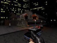
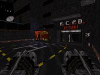
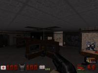
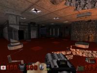
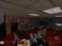
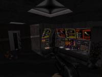
Check out my new map and let me know what you think? If you need a walk through i've posted one here: http://dukerepositor...pic,1202.0.html

RCPD2.map Is an updated map using the latest TROR technology. =) It is included in the RCPD.zip file attached.

Thanks and happy fragging!
-Paul

Attached thumbnail(s)

  • Attached Image: duke0001.jpg
  • Attached Image: duke0006.jpg
  • Attached Image: duke0002.jpg
  • Attached Image: duke0003.jpg
  • Attached Image: duke0004.jpg
  • Attached Image: duke0005.jpg

Attached File(s)

  • Attached File  RCPD.zip (236.11K)
    Number of downloads: 272


This post has been edited by Paul B: 12 November 2011 - 10:18 PM

6

User is offline   Helixhorned 

  • EDuke32 Developer

#2

I enjoyed it. Would have voted 'good' if that option existed. Hope to write a lengthier review soon.
0

User is offline   Micky C 

  • Honored Donor

#3

I don't have time to play it for the next week but I will later. Is this your 2nd or 3rd map?
0

User is online   Mike Norvak 

  • Music Producer

#4

Hey Nice to see you here! It's a good map, it has its flaws but is very funny. :(
0

User is offline   Paul B 

#5

 Helixhorned, on 21 July 2011 - 02:10 PM, said:

I enjoyed it. Would have voted 'good' if that option existed. Hope to write a lengthier review soon.


Awesome, its an honor to have you play my map! Thank you!
0

User is offline   Paul B 

#6

 Norvak, on 21 July 2011 - 02:24 PM, said:

Hey Nice to see you here! It's a good map, it has its flaws but is very funny. :(


Would you mind citing some examples of the flaws so i can learn for next time. I've noticed a few people have said it was sloppy but never elborated on what they meant by that.

Much appreciated,
Paul
0

User is offline   Hank 

#7

at this moment, I can't play anything. our house is like 43 C, - I ran it through mapster, and like the layout.

Cheers and thanks for making maps Posted ImagePosted ImagePosted Image
0

User is offline   Micky C 

  • Honored Donor

#8

Ok I played it, it was in the average to good range and I voted good. I played it with the HRP in polymost, I'm not sure whether you designed it for classic or not but it looked ok.

The good points:
It had sufficient detailing
Complex level design with multiple stories
Shading was implemented well in some aspects
Level was destructable (fire extinguishers left holes in the wall, there were cracks to blow up, and I love how the entire upper floor got demolished! I love fire extinguishers)
Secret areas and vents (it's always fun when you find a secret :( )
Lots of fun exploring
Action was fun and not too hard

Bad points:
It was a massive key card hunt, which promoted lots of back tracking which I don't like beyond a certain amount (that's my personal taste)
There were no shadows implemented. You had some nice contrast with your shading, but you need to make it so that 'light' can hit something like a pillar and leave a shadow behind. I'm talking about floor shadowing. For example after you go inside the building at the start by pressing the phone, there's a spot where there's a shadow on the wall, but the floor is the same shade as everything else so it looked weird. Shadows are good because they create contrast, although like I said you already had contrast with ambient shading so it wasn't as big a deal.
Another point on the key cards, or just levels in general which are as complicated and non-linear as this (this is again my personal taste) I like to know roughly where to go. It's ok to have several routes and have to do some trial and error to get the right path, but if you've explored a map and still don't know where the exit/key card is, the fun factor drops. You had some viewscreens of some areas, which was nice, but they didn't reveal any details about how to get to the areas.
With your cameras, they always looked horizontally forward, when some of them should have been angled down. Give the cameras a shade to make them angle up or down.

But don't worry, the good points well outweigh the bad points, which are really only minor things that you'd want to consider when making your next map, and please do make another map :(

This post has been edited by Micky C: 22 July 2011 - 04:18 PM

1

User is offline   Paul B 

#9

Wow! Micky thanks so much for the review and pointing out things I wasn't aware of. I didn't know I could angle security camera's with a shade. Very cooll! I'll play with it and try to make the security camera's more useful in helping find the key cards. This is my first map so I'm still learning a few things about the engine with the sample maps. Unfortunately my shading has been limited as I've reached the maximum sector count for the map in build. I am trying to keep the map as original as possible i'm not ready to graduate to mapster just yet.

But thanks again man!

This post has been edited by Paul B: 22 July 2011 - 10:11 PM

0

User is offline   Micky C 

  • Honored Donor

#10

This is your first map? You're kidding right? It's excellent for a first map! As you can tell in my first post in this thread, I was asking if this was your second or third map, because that's what I thought it was judging from the screenshots. Then, after I started playing I was like "wow, minus some small shading issues, this must be this guy's third or forth map at least" due to the level's complexity and details. I was pleasantly surprised with several things in the level, which I won't spoil in case some people haven't played the map, and it's at least on par with the second map that I made.

However I do recommend you step up to using mapster32. As far as I'm aware, the controls are exactly the same apart from the extra stuff that's been added in, and if nothing else, the sector limit is 4 times bigger (just in case you weren't aware). It's true that only eduke32 and jfduke3D will be able to play the map, but when it comes to singleplayer, eduke32 is the only port anyone who's been in touch with the community in the past 5 years would be using. So it'll allow you to add those extra sectors for lighting. Although I actually think you did a damn good job with the lighting considering you ran out of sectors Posted Image

And don't take my word for it, the poll shows that basically everyone thought the map was good. These days there are some REALLY good Duke maps out there by very talented and experienced mappers, so after comparing this to those, and still being voted good, that's quite an achievement. :(

This post has been edited by Micky C: 22 July 2011 - 10:34 PM

0

User is offline   Paul B 

#11

Still haven't figured out the security camera angle thing my shading doesn't appear to do a whole bunch... but no worries nothing a utility pole can't fix ! LOL

I've made some serious changes to help the player find their way to the key cards by labelling rooms and having the camera's point to all keycards. Hopefully i didn't get too carried away with sprites and labelling in the process. I am shooting for an improvement with these modifications. Further opinions would be great. Thanks to all who have taken the time to play and post feedback it is definitely appreciated.

-Paul

This post has been edited by Paul B: 23 July 2011 - 03:52 AM

0

User is offline   Hank 

#12

Two suggestions
A Have you read the FAQ from J. Bishop ? It does explain the camera angle.
B Issue first maps as beta first. It opens the door for reasonable suggestions.
0

User is offline   Micky C 

  • Honored Donor

#13

Well here's the page on how to manage security cameras and talks about how the shade affects angle: http://infosuite.duk...e=ae_sprites_a1
Edit: remember, shade is a value that goes all the way from -128 to 128, that's a range of over 250, you'll need a largish shade to have a noticeable difference.

If you haven't seen that guide before, it's a great resource.

This post has been edited by Micky C: 23 July 2011 - 04:08 AM

0

User is offline   Merlijn 

#14

I've played the map and I pretty much agree with the points of Micky C. Although I didn't have that much trouble navigating the map, I can see how it can be confusing. I really liked the concept here - the 3 floor system worked very well and I enjoyed the non-linearity of the map very much. Some of the texture work could be refined a bit more I think, but for a first map this is quite impressive. Even the last battle was pretty cool.
0

User is offline   Paul B 

#15

Wow I can't believe I did the entire map and had no clue about the Apostrophe (') + S) key. To do any form of shading I was using the plus and minus key from a visual perspective within build however it is very deceiving because build always shows the sector darker than it is in the actual game. =S

I'll play around with this new key stroke. Thanks a bunch that was a very useful link =)
0

User is offline   Micky C 

  • Honored Donor

#16

 Paul B, on 23 July 2011 - 01:40 PM, said:

Wow I can't believe I did the entire map and had no clue about the Apostrophe (') + S) key. To do any form of shading I was using the plus and minus key from a visual perspective within build however it is very deceiving because build always shows the sector darker than it is in the actual game. =S

I'll play around with this new key stroke. Thanks a bunch that was a very useful link =)


It's definitely a very useful link; everything I learned about mapping I learnt from that guide, and even though I'm a lot more experienced now than then, I still find myself coming back to it.

Yet another reason to come to mapster is that you can shade anything in 3D mode by pointing the cursor at it and using the scroll wheel. It's fast and accurate :(
Now that eduke32 has TROR, you can do a real 3 story building without having to rely on SEs or lifts :(

This post has been edited by Micky C: 23 July 2011 - 06:31 PM

0

User is offline   Helixhorned 

  • EDuke32 Developer

#17

OK, here's my attempt at a review.

First off, the strong part about the map is its geometry and the texturing. It's really great to see the often-neglected third dimension to be put to good use. The places themselves have a nice variation while always keeping the overall "police station" theme. Also, I didn't find the keycard hunt that bad because there are always places to explore, so while you may come across a particular area many times, it doesn't get boring because there are no dead-ends. My main gripe with the map by itself is that it suffers from a typical issue when starting out with mapping: many things are scaled improperly!

Now about the gameplay. At my first run, I tended toward ditching it because I found the lack of weapons frustrating. But later on I explored the surroundings more carefully, and managed to play it to the end, which took me 25 minutes. Still, the weapons/monsters ratio make it a pretty challenging map and I died various times.
Spoiler

Finally, a nitpick (also for other mappers): hidden switches should be made invisible nowadays ([' I] key combo in Mapster). This way, they won't be visible as models and will also not emit light.

So... pretty damn good map for a first one :(
0

User is offline   Paul B 

#18

Radar1013 you rated my map Average??? I will beat you down !!! LOL! Thanks buddy, thanks for being the one and only voter who voted average! Way to be average! =D
0

#19

I rated very good. Helixhorned could you please point out a few improbably scaled things for me? Maybe pictures. I saw a few things, but nothing to worry about.
I found the keycards very fast but couldn't find the doors for them >.> hehe nice map. Very nicely put together.

This post has been edited by rasmus thorup: 14 August 2011 - 03:41 PM

0

User is offline   Paul B 

#20

 rasmus thorup, on 14 August 2011 - 03:40 PM, said:

I rated very good. Helixhorned could you please point out a few improbably scaled things for me? Maybe pictures. I saw a few things, but nothing to worry about.
I found the keycards very fast but couldn't find the doors for them >.> hehe nice map. Very nicely put together.


Thank you for your generous vote and awesome feedback! Come to think of it, I made a point of using the surveillance cameras to point out where the locations of the keycards are but I never thought people would have had a problem finding the doors to unlock. When I made the map I used a lighting system to highlight the keypads so they would stand out more than just a regular door. Perhaps I need to give more thought on how to properly display the keyed locked doors.

It's one thing to know where they are because I designed it. Its really refreshing to hear someone whose not familiar with the layout post comments. Thanks for your help and i'll give this more thought on how I can make the locked doors more obvious. How did you find locating the secret areas? Were they difficult? Did you have problems entering in the front door and shrinking yourself to let yourself into Dispatch? Or did you use the alley as I find most attempt to do which is why I've made the alley the most difficult battle to gain access hehe!
0

User is offline   Micky C 

  • Honored Donor

#21

I found the entrance to the front door right away. If you play enough Duke maps you always know to use the phone Posted Image

I found a few secret areas. I don't know how I found them, probably my spidey sense was tingling when I was near a wall with a secret behind it. The shrinking I had more trouble with, I didn't really know what to do when shrunk, because there were a few doors I wanted to get through but they automatically closed before I could reach them, thereby being cut off.
0

#22

I don't think you made a mistake on highlighting the keycard doors. It was just me who forgot where the doors were. About the secret areas. The map felt really big so i had no idea where i was. I just ran around and luckily i found a key card :) And just so you know. For the cheap guys, there is a bug where you can crouch into the holes where you are supposed to be shrunk. I'm gonna see if i can find a way to prevent that and post it.
0

User is offline   Paul B 

#23

 Micky C, on 15 August 2011 - 03:06 AM, said:

I found the entrance to the front door right away. If you play enough Duke maps you always know to use the phone Posted Image

I found a few secret areas. I don't know how I found them, probably my spidey sense was tingling when I was near a wall with a secret behind it. The shrinking I had more trouble with, I didn't really know what to do when shrunk, because there were a few doors I wanted to get through but they automatically closed before I could reach them, thereby being cut off.


Okay Micky, the trick to getting into the front door is to go into the observation room, close the observation window after it opens. Shrink yourself in the mirror and run through the washrooms to the mens washroom. The men's stall will automatically open allowing you to enter the ventilation system. Now you just need to find the secret room where the shrinker is stored. =P

You don't ever need to open doors when shrunk. The map has small vent holes all over the place for you to run around and is quite useful for escaping a hairy situation from the new enemy. =)

This post has been edited by Paul B: 15 August 2011 - 02:24 PM

0

User is offline   Paul B 

#24

 rasmus thorup, on 15 August 2011 - 04:52 AM, said:

I don't think you made a mistake on highlighting the keycard doors. It was just me who forgot where the doors were. About the secret areas. The map felt really big so i had no idea where i was. I just ran around and luckily i found a key card :) And just so you know. For the cheap guys, there is a bug where you can crouch into the holes where you are supposed to be shrunk. I'm gonna see if i can find a way to prevent that and post it.


can you describe which vent hole that might be? I'm pretty sure I set the vent hole height all the same for all vents. There shouldn't be any area you can crawl in that is meant for being a shrunken duke unless you're running some type of mod that makes Duke squeek into small places. =S
0

User is offline   Radar 

  • King of SOVL

#25

 Paul B, on 13 August 2011 - 06:41 PM, said:

Radar1013 you rated my map Average??? I will beat you down !!! LOL! Thanks buddy, thanks for being the one and only voter who voted average! Way to be average! =D


I just saw this. I guess since I rated it the lowest, I'll explain.

I want you to get better at mapping. I don't want to just BS you so that you think everything you make is the greatest, because it isn't. That being said, I can't wait for you next map to see how much you improve.

It's been awhile since I've played the map, so my memory of it isn't too sharp. My biggest memory is going through the cramped, vent textured room that had no detail at all. Lots of architecture seemed very simple, I especially remember a lift that was only one sector with no other detail. Sprite work also wasn't too impressive. Not to mention the tri-level elevator, the most impressive thing in the map, wasn't even made by you and was taken from another map. Either way, this was a great debut map. The only reason I rated it average is because a "very good" map imo is Roch 8, Red 5, etc., a "good" map is Meat Ball Sub Makin', Wipeout, etc. So what's the other choice left? Average.

I see that you have uploaded a new version though, and I will definitely check it out.


Also, it looks like you aren't taking my criticism too well. Retorts like "way to be average" make it obvious. I didn't mean to offend you in anyway. This is a great debut map, and much, much better than my debut map in the NCBP project. I want to be truthful so that you understand what some people thing and improve. I also thought the poll was anonymous. :)
0

User is offline   Paul B 

#26

 Radar1013, on 16 August 2011 - 12:40 PM, said:


Also, it looks like you aren't taking my criticism too well. Retorts like "way to be average" make it obvious. I didn't mean to offend you in anyway. This is a great debut map, and much, much better than my debut map in the NCBP project. I want to be truthful so that you understand what some people thing and improve. I also thought the poll was anonymous. :)


Don't read too far into my average comment. I was being really sarcastic and said it in a joking way. I appreciate your honesty =)

Just so you are aware this map was built using Build.exe. I ran out of available sectors to add more detail and shading to the map preventing me from having more eye candy and trimming work. That's why you will notice more detail in some areas more then in others. My max sector count on this map is 1023 out of 1024 possible sectors. Because of this limitation and me reaching the maximum amount of sectors I have been experiencing map corruption among other anomalies preventing me from polishing this map completely. Also adding the 3 story elevator uses up a considerable amount of sectors just on its own.

This post has been edited by Paul B: 16 August 2011 - 07:01 PM

0

User is offline   Danukem 

  • Duke Plus Developer

#27

 Paul B, on 16 August 2011 - 02:39 PM, said:


Just so you are aware this map was built using Build.exe. I ran out of available sectors


By now you probably know this, but mapster32.exe (which comes with EDuke32) allows you to build maps of 4096 sectors and 16384 walls. At first it shows the limits as being the old ones, but you can pass those limits and then it will show the new ones.


 Paul B, on 16 August 2011 - 02:39 PM, said:

I built this map with the intentions of competing with the Roch series and from what I remember of the Roch series there weren't many good maps out of the bunch but they seemed to significantly improve as they went forward. I'll have to replay them to see which ones I didn't mind playing as it has been 8 years since i've loaded a Roch map.


That's quite ambitious considering how good the ROCH maps are. Roch1 is the only weak map in the series, in my opinion (although they all have flaws).
1

User is offline   Paul B 

#28

 DeeperThought, on 16 August 2011 - 02:57 PM, said:

By now you probably know this, but mapster32.exe (which comes with EDuke32) allows you to build maps of 4096 sectors and 16384 walls. At first it shows the limits as being the old ones, but you can pass those limits and then it will show the new ones.


Yep I believe i remember you mentioning that in an earlier post somewhere. However I was trying to keep the game as original as possible without any enhancements. Once a map is saved using mapster it is no longer backwards compatible with build. I have dabbled in mapster and I definitely like the improvements they have made in the editor. Definitely a huge step forward. But I wasn't ready to map in something that wasn't shipped with the original game. However, I'm finding that EDuke and Mapster have much richer features then the original game and infact they run so much better too. So one of these days I may consider migrating to Mapster. I did try and play around with that ROR but that's pretty tricky stuff I was having a tough time aligning stuff and joining floors and when I did manage to make something work it usually was by accident and I wasn't sure how i finally ended up with the final result because I was trying so many different things. haha!

I'm really longing for the day Co-op play works in Eduke!

This post has been edited by Paul B: 16 August 2011 - 03:20 PM

0

User is offline   Paul B 

#29

I take back what i said about the Roch maps. I've just finished Roch 1 to 4. while the first one was ok to play it had a lot of character and unique and creative potential, I loved how he's tying the entire series together seemlessly. They just keep getting better and better. Very challenging maps, I found they could have used more ammo in them, I hate having to conserve ammo. That or i'm just not doing a good enough job finding all the secrets. I really like Roch 4 what an amazing map. Pascal is definitely talented for making well thought out and detailed maps. Now onto Roch 5 =) I realize now that my map isn't on the same playing field as Pascal's series. I wonder if he still plays this game or frequents the forms? After making so many decent maps one must think he must return at some point even just out of curiousity.

This post has been edited by Paul B: 16 August 2011 - 07:12 PM

0

User is offline   Danukem 

  • Duke Plus Developer

#30

 Paul B, on 16 August 2011 - 07:05 PM, said:

I wonder if he still plays this game or frequents the forms? After making so many decent maps one must think he must return at some point even just out of curiousity.


I don't think so. I had an e-mail exchange with him about 4 years ago. I showed him how it was possible to make his maps play as an episode using EDuke32 (it wasn't possible in DOS Duke for some reason that I don't even remember now), and I showed him a mod that I was working on that used his maps. He was nice about it and expressed some interest, but it was also clear that he had no intention of ever coming back to the community. There's a story behind why he left which someone will probably bring up if I don't. A map, named "Dogville" was released which was heavily inspired by his style and had certain constructions which appeared to be derivative of stuff in Pascal's maps. Pascal was very unhappy about it, and has not released a map since (Dogville is a very good map, by the way). If you look at Roch maps in an editor, you'll notice that he moves them off the grid, making them difficult to edit or even examine, so clearly he is very protective of his work.
0

Share this topic:


  • 2 Pages +
  • 1
  • 2
  • You cannot start a new topic
  • You cannot reply to this topic


All copyrights and trademarks not owned by Voidpoint, LLC are the sole property of their respective owners. Play Ion Fury! ;) © Voidpoint, LLC

Enter your sign in name and password


Sign in options