Help
Help
 Duke4.net
 DNF #1
 Duke 3D #1


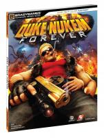
Old cover vs new cover:

And the differences I spotted:
1) Obviously the background now has proper perspective.
2) new mushroom cloud
3) Duke's hair is longer on top
4) Duke shades have better lighting and also does the overall model of Duke.
5) The laser sight and also more detail on it.
6) The gun now has more detail overall with more markings and engravings
7) Duke's bullets on his straps now are properly placed on the shape of his pecs
8)Overall the models have a few more polies now and hard edges have been rounded up nicely.
9) Of course the enemies have been reposed and with their correct perspective.