Oh boy, thats a long read.
 ck3D, on 04 March 2026 - 10:47 AM, said:
Ah that's nice the water teleport thing is intended, was hoping it would stay as even if it were accidental is one of those things that indirectly adds a lot of timeless charm to a map or game.
I know right? Maps benefit from such little touches, no matter how absurd it might look.
ck3D, on 04 March 2026 - 10:47 AM, said:
About the train ceiling bug, assuming the train car is a free-floating sector (island in the middle of a larger one), what happens if you lower the parallaxed sky of that sector to the height of the sprite ceiling, wouldn't just that be see-through and block any taller collision altogether, and then you could declutter the map of the invisible sprites. Might be worth considering trying if you ever update the file, or keeping in mind for the next similar set-up. Again I didn't even try to break that part, it just kept happening with that Commander spontaneously pressing me against the stuff, but I did try and replicate it on purpose after that and noticed it wasn't so easy by just jumping.
I cant touch the sky of that sector as its part of the massive TROR connection. With it the entire map would go down too. It is what it is, I dont consider it a big issue. Sprite clipping is just normal occurrence in the engine and I'm sure everyone who plays Duke or other Build engine games is used to it. I did try to minimize the chances of it so it doesnt get in a way too much.
ck3D, on 04 March 2026 - 10:47 AM, said:
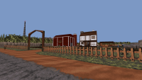
I have quite a bit to say about this one, it's difficult to hold my thoughts for until I've gone back to the boss but in general I think it's a brillant map, I love the way the TROR is used in a practical way that is focused on serving layout and not just to show off as though we would be on a timeline where Quake never existed. I think TROR is at its best that way when put to use to embellish and push sector-over-sector driven constructions and not just to make little platforms. I have some minor issues with collision but not so much with the scale, most likely will expand on that later. You are underselling your placement of the enemies and weapons - it is all super well done until the last part that is just mayhem, but the pond trick remaining in indeed is a huge relief when one figures it out, and whilst I would have hoped for less chaotic combat as climax (maybe more oriented around the features of the terrain being affected by the passage of time similarly to what happens to the crops) it's also a valid step-up from the difficulty of the first phase, makes sense to go out hard. I think I would have been warier with enemy type diversity though; the first half of the map does it well with specific types reserved to distinct areas, and some clever spots too, for instance those two Enforcers on the train that can hitscan you from across the map are awesome and a real threat if low on HP. Goes well with the world building throughout that the level establishes but then at the end suddenly is fireworks cacophony, maybe could have done with one or two less enemy types (phase two tanks for instance felt a bit redundant and foreign and could have been replaced with greater numbers of one of the other encounters). Anyway that part reminded me quite a bit of my own Rural Nightmare map (super ancient one) except a better take on it, loved it.
Thank you! I knew you would like it, the crazyness of combat with that more open layout is similar to your Blast Radius maps, with occasional reinforcements of enemies every now and then. I wish I could do more with nighttime changes but the wall limit is very strict on me as I still trying to get a good feel of how much walls should I spend on this and that. Playing recent Cliffs of Dover really blew me away with how massive that map is but doesnt suffer from lack of detail or being too empty. In my map a lot of ideas had to be cut to fit 2 copies of same area into 1 file, though I managed to add some nice changes like destroyed barn or different angle to shading.
Enemy variety is interesting thing to consider, I'll take it more into account in the future.
ck3D, on 04 March 2026 - 10:47 AM, said:
It is interesting seeing you mention inspiration from Spacetronic - to me it feels a lot more like a BobSP map (which invented the 'motherboard' trick), or Domino (which I wouldn't be surprised to also be Bob's works seeing as it's now been established he uses aliases). Blown Fuses atmosphere also sensible (design-wise one of my favorite maps) but only so much, I would say this style would be closer to a unique mix of Gambini's and Alejandro's. Another oldie that instantly came to mind is Dave City 2
https://msdn.duke4.n...otdavecity2.php because of the general vibes of the environment (albeit the progression is nothing like in your map) but also the relatively narrow scale. Welp I guess this is the perfect transition so might as well mention the scale now; I've noticed you seem to enjoy building on what I would call the L.A. Meltdown scale that would be realistic to Duke's sprite dimensions (relative to doorways etc.), but from experience this works better paired with a smaller enemy count like the original maps themselves were designed to hold. Otherwise generally works better to inflate things a little, especially width of things if one is going to throw swarms of strong enemies in. Now, in this map that actually was never a problem outdoors at all because it isn't just open, but really well optimized for all of the quick footwork and jumps the player has to improvise in order to make it to the guns (because yes I didn't find most weapons including the shotgun for a little while but really enjoy when levels do that). It is indoors or in narrower nooks and crannies that now instead of decorating space, all of the detail sort of closes in on the player. Hotel in Weather Report had the same issue, and I remember people complaining about that in Locked and Loaded too (can't believe it is so many months old already) although personally it didn't bother me in that map, maybe because I expected narrow settings from the theme. Maybe gradually getting used to say making your interiors 20% the scale you currently make them would help playability all the while allowing you to keep all of your fine detail. I keep mentioning it these days but maybe you would enjoy and be inspired playing Mister Sinister's Death Drive episode for its efficient way of articulating tons of enemies:
https://msdn.duke4.net/hotddrive.php
Spacetronic is mentioned as inspiration because thats where I got the trick to make quest items from, the design between mine and that map is very different. Those other maps you mention, I havent played them so I got to fix that at some point, thanks for recommendations.
I like making realistic spaces but there is a big issue in all my 3 maps so far with them being a bit too cramped in places. It mostly comes from my maps being built looks first and combat second, unless its some specific combat setup like it happened in some areas of Weather Report. I will defend it a tiny bit by saying that there is toggle run option in Duke, and my maps feel much more 'atmospheric' when you explore them at slower pace or with enemies turned off by cheats. Speaking of enemies there is another common issue in all my maps is that I try to make them longer by spamming enemies
everywhere, I am sorry. I am trying to learn from mistakes and hopefully in the future these issues wont be as common.
ck3D, on 04 March 2026 - 10:47 AM, said:
Design is mostly excellent by the way, bar the scale thing. You have a cool way of using fogpals that is the polar opposite from a lot of people's (from mine at least), which may be why you think they clash with the rest of the base palette, they are designed to be applied to whole regions of map with large scale dynamics but instead you use them in very fine ways to come up with precise color touches, not that no one's ever tried that before but I think most everyone who did promptly gave up (and went back to reserving them to big blocks, or not using them at all) and so that is an interesting particularity of your style.
yeah something I learned from making Locked and Loaded is that fogpals are great to set a specific additional colour to a texture without turning it monotone with default pals. A green EDF ammo box can have blue or red hue and without those terrible stray pixels that plague most textures when affected by palswaps. I didn't use it much in this one, don't remember anything with fogpal at all, but I wanted to use blue fog pal for the nighttime act. It didnt look natural so I went with pal1 instead and despite some textures having those corrupt pixels it turned it fantastic.
ck3D, on 04 March 2026 - 10:47 AM, said:
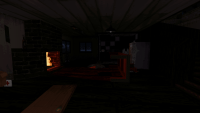
Guess I'll get the collision complaint out of the way too; there are a couple of places where you can blow holes into walls but then can't throw pipebombs through those as the TROR seems to block the trajectory, and since those spots have enemies around that can be a bit frustrating. It really just ties back to the scale thing honestly, as in if the holes were higher and didn't look in reach of pipebomb then it wouldn't be a problem. Merely just noting that because it made me realize that that was a thing and I should be on the look out for it when making my own maps; would suck to design a whole complex puzzle around the idea if it may not work. Some normal windows also will block pipebombs a lot in spite of being open invitations, since they are so narrow and packed with sprites. Died a few times trying then stopped, but lamented it because would have worked really well. In general never a fan of plain invisiwalls to block unreachable areas (adding a little barrier, signage or justification never hurts) but only that one end of the road got me (perhaps it originally had sprite barriers the tanks blew up before I could see them). Some of the roofs blocked my jumps but somehow I still haven't found one secret IIRC so it is all the more intriguing where they might be. One aspect of the design that caught my attention was how relatively small and low the map was and yet felt so vertical because the entirety of the Z axis gets utilized when playing with no filler or gaps in space (which would be more typical for a big city to have, but not work so well here). Enjoyed having to dive through all of the barrels and trash cans for sustenance.
A collision issue was not something I saw during testing. There's only 2 destructible walls (actually one of them is a sprite to save on walls) and I didnt experience such issues with pipebombs, it could be the duke jank and weird throw angle. The windows are too tiny to hit through but there is not many aliens in Duke's house for it to be a problem though. Invisiwalls had to be done for roofs because looking from high up players would notice more unfinished far away scenery and TROR glitching out, also wall limit again being a pain in the ass. The road does have explanation for blocking, but those RV's are bit farther away then the block lines. If only you'd knew how much time I wasted trying to figure out how to block out the map... That weird train is all I could come up with it.
Also if you looking for secrets it might be the one on the roof of Duke's house. Normally you cant just jump up there but during testing I found a funny clipping bug in the chimney that teleported you up there, I kept it in as a secret because I found it funny. This roof secret and another one are double counted, since you can get them again during nighttime. The freezer is a secret too but you can miss the trigger in the hole of the barn.
ck3D, on 04 March 2026 - 10:47 AM, said:
Done rambling for now but might keep going later, it really is a fun, fresh map, nice work and thanks for sharing.
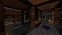
edit - oh yeah, progression was rather straightforward, didn't remember the plot from that specific Simpsons episode and so the screen actually helped. I was a bit confused about where to insert the green tube at first, the machine is complex and originally I was trying to use the wrong sector for it (off memory, the one where the '!' marker is; if that's the right one, then a different one that looks like it could also be it). The power sign on the page also confused me because there is that one back alley with the same signage and broken switch and so for a second I went back there wondering if it would be relevant. Maybe it was and I didn't realize I activated something there? I did notice the electrical sounds, wasn't sure if ambient or cue.
Thanks for playing!
For quest items you need to insert somewhere the respawn sprite spark is used to show 'you can place something here'. So you pick an item and then a sprite will appear near the device ,as I repeatedly call it in manual, to show you where to put it. The power step of the quest doesnt have these visual cues because I couldnt figure the right way for it and was limited by vanilla effects. In the barn there is a blinking light and a power line going back to your house, when you flip a switch in the basement the lights in the barn stop flickering and thats it. Couldve been explained better but there is enemy reinforcements coming in after you flip a switch to show that you did something important.
The thing in the back alley is just decoration, and there is no broken switches there last time I checked. It has sparky noise for ambient and I wanted that sound to play near all other such broken sprites, but to make the sound I need a dummy sector which costs 3 walls each...
 Help
Help
 Duke4.net
 DNF #1
 Duke 3D #1


 Could be due to the TROR layers, the intricate amount of details or a combination of both. But mostly just my laptop being old :\