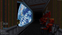
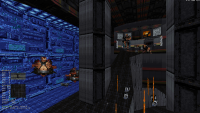
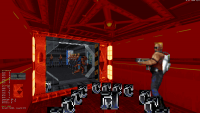
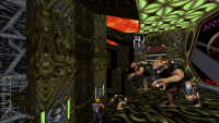
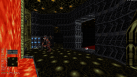
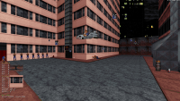
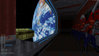
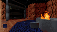
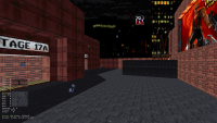
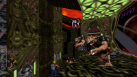
The palette used in LameDuke is different from the one used in the final game. LD's palette is a bit darker and the colors look a bit more saturated (in particular the blues).
Now I have read that the palette in LD is compatible with the final game's graphic (that is the game doesn't have garbled colors when LD's palette is used) but I haven't managed to find any mod out there that replaces Duke3D's palette with LD's. If there doesn't exist any mod like that, how should I go on to make/edit the palette to look like LD's.
Page 1 of 1
About Lameduke's Color Palette "How to put LD's palette in Duke3D"
#1 Posted 04 April 2021 - 11:30 AM
#2 Posted 04 April 2021 - 03:56 PM
It could be somewhat converted but LD one is not completely compatible as it has an extra light-blue hue range that doesn't exist in the final game, this means that you will lose a range of tones when converting.
It still is possible to remap but I think you'd have to run a pass against the ART in order to remap colours to the closest matches.
To get the best results, you'd have to hand tweak these.
It still is possible to remap but I think you'd have to run a pass against the ART in order to remap colours to the closest matches.
To get the best results, you'd have to hand tweak these.
#3 Posted 04 April 2021 - 04:29 PM
I think what ReaperAA is asking for is replacing the palette in final Duke with the one from LameDuke, not converting LameDuke art to the final palette.
#4 Posted 04 April 2021 - 08:18 PM
Phredreeke is correct. I want to replace the palette in final Duke with the one from LD.
#5 Posted 05 April 2021 - 12:18 AM
I think the layout in PALETTE.DAT for LameDuke is different than it is for the final game (redundant entries entries in the transparency table omitted) so it can't outright replace that one. Might be possible to copy the first 768 bytes from one to the other though
#7 Posted 05 April 2021 - 07:16 AM
Yes, to replace the palette in the final so that the artwork looks right, you will have to edit ART as well.
It will look garbled without this, although mostly will work.
Pixels in ART are just indexes to the palette entries themselves (how 8bit indexed palette works). There is no RGB there.
As in, palette files are not a reference palette that each pixel gets "colour reduced" against on the fly.
While some shades make for a good direct match and can end up in a more saturated look, that's more to do with there being a rather high compatibility as matching ramps largely remained the same between early and retail duke.
But while some of the pixel data gets fairly close and some has even been designed when the old pal was in use, there is a ton of art that has been made with the "modern" less saturated one in mind, not to mention the bright blue/teal ramp not simply existing in the final palette. These de-saturated shades can map to jarring bright shades instead.
To add some to the mix, there was a transitional palette between LD and retail as well, although I believe this was very similar to the LD one.
You will have to run the ART through a tool that finds the closest match from palette A to palette B (palette conversion, just like converting from i.e. doom/sw/etc.. to Duke).
This is definitely doable and I've done something similar myself.
It also depends on what look you want to go for, if you want to do a direct "conversion" then a light brown building that looks more orange/brown in LD can end up looking something different from either as LD palette might not have a close match (i.e. if closest match is closer to greyscale).
You'd have to manually pick & choose what you want to accomplish, should some textures have a saturated look or should they be skewed towards a more colder tone to match the intended look.
#8 Posted 05 April 2021 - 10:31 AM
In that case, what is the best tool to view and edit the palette in Duke3D.
I am not necessarily trying to go for 1:1 palette accuracy with LD, just want to make the colors look closer to LD's to make the game's atmosphere look a little closer to LD.
#9 Posted 05 April 2021 - 11:02 AM
I created my own which likely wont produce the best results, I can do a test to get a screenshot or two out of it.
This would still require that per tile you pick what you think looks better.
Remember, if i.e. colour #4 is "red" and "saturated red" then it might end up picking some completely different index number in case it think something else is closer to original "red"
This is why you can't just bluntly apply the palette and call it a day. Some textures might even need skewing per component.
#10 Posted 05 April 2021 - 11:11 AM
Just for fun, I decided to apply the LameDuke palette to the final game's tiles. Some came out looking good enough
However, others end up looking like a mess
#11 Posted 05 April 2021 - 11:25 AM
Yup, that's when the indexes don't match. Light blue that you're seeing here is one offender.
#12 Posted 05 April 2021 - 11:27 AM
oasiz, on 05 April 2021 - 11:02 AM, said:
I created my own which likely wont produce the best results, I can do a test to get a screenshot or two out of it.
This would still require that per tile you pick what you think looks better.
I would love to see the in-game screenshots with such a palette.
Phredreeke, on 05 April 2021 - 11:11 AM, said:
Just for fun, I decided to apply the LameDuke palette to the final game's tiles. Some came out looking good enough
The building tiles look really neat and they definitely give that LD feel I was looking for.
It's a shame that not all tiles end up looking great in LD's palette.
#13 Posted 05 April 2021 - 12:02 PM
Well, it wouldn't be too hard to make a mod that loads just the building tiles preconverted to lameduke palette as hightiles (and as such keeping everything else the standard duke palette)
#14 Posted 05 April 2021 - 12:09 PM
Even with the crappy converter, some things will obviously need hand touching as mentioned.
This basically picks the closest match in a naive way.
Many tiles would still need to be "forced" for a brown tile instead of being a lighter tone as the conversion wouldn't be aware of "LD look".
You can still boost the saturation artificially.
It would have to be a mix of both techniques and manual hand picking but it's definitely doable.
Some of these look quite nice while some obviously need work.
#15 Posted 05 April 2021 - 12:18 PM
And here is with some saturation bias, where the source material is treated as extra saturated and helps with finding the closest match... however some things get overblown.
In theory one could cook up an algorithm that boosts up the "weaker spots" to something more safe and leaves some things alone.
#16 Posted 05 April 2021 - 02:02 PM
Unnecessary chime in: If you have imported the LD palette into the DAT file for the retail one and you wanna fix the ugly shade tables (the turquoise part of it at least), I'd recommend using OpenGL Build Touch if you can get your hands on it. It's the only thing I know of that lets you edit shade tables.
If you want to fix transparency tables, use TRANSPAL, but don't use it for shades; it creates some god-ugly shades.
This post has been edited by Slap McBald: 05 April 2021 - 02:03 PM
#17 Posted 05 April 2021 - 02:07 PM
For some reason, I really dig how the saturated blue "motherboard" tiles behind the commanders in that Dark Side shot turned out!
#18 Posted 06 April 2021 - 07:17 AM
I always felt there's a ROTT vibe in LameDuke's palette. And no, I did not get this impression solely because FASTWAY.MID is playing in all levels
#19 Posted 10 April 2021 - 01:00 AM
MrFlibble, on 06 April 2021 - 07:17 AM, said:
I always felt there's a ROTT vibe in LameDuke's palette. And no, I did not get this impression solely because FASTWAY.MID is playing in all levels
Yeah, I always felt the same. Even without the screenshots posted above I thought LD had a very strong red bias just like ROTT. Everything looks redder (or more like salmon colour), and that doesn't help most of the textures.
The saturated blue is interesting though, I think it would have been great to see that in the final game. Also a proper cyan colour would have added an extra perspective, particularly in techbase style maps.
This post has been edited by The Watchtower: 10 April 2021 - 01:03 AM
Share this topic:
Page 1 of 1