Duke4.net Forums: Blast Radius WIP/discussion thread - Duke4.net Forums

Jump to content

  • 17 Pages +
  • 1
  • 2
  • 3
  • 4
  • Last »
  • You cannot start a new topic
  • You cannot reply to this topic

Blast Radius WIP/discussion thread  "while it's brewing"

User is online   ck3D 

#31

View PostPerro Seco, on 08 December 2020 - 04:08 AM, said:

Not Blum, not good. :D


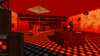
Ha, from map 2:

Attached Image: map2blum.png
4

User is offline   Ninety-Six 

#32

View PostPerro Seco, on 08 December 2020 - 04:08 AM, said:

It's a joke. In my case I always liked ck3D style, even though some of his maps are sometimes a bit difficult (Anarchy City X, Poison Heart) or too dark (Anorak City). This new episode is looking great and I think these futuristic-looking cities fit very well into Duke 3D.


FWIW ck3d said that he was aiming for a gameplay style more like the base game. I'm not sure what that means for difficulty but I'm guessing it won't entail running unarmed against ever-advancing battlelords (I have yet to beat that map, actually).

And based on some of his more recent output he seems to have moved past using ultra-darkness. I think I remember him saying something to the effect at one point but I can't source it.

This post has been edited by Ninety-Six: 08 December 2020 - 04:48 AM

2

User is offline   Ninety-Six 

#33

View Postck3D, on 08 December 2020 - 04:21 AM, said:

Ha, from map 2:

Attachment map2blum.png


I don't know what it is but there have been a lot of really exquisite uses of red sector light lately. Between a lot of the BR screenshots and Epicenter there's been some excellent looking stuff.
1

User is online   ck3D 

#34

Yeah, I'm kind of trying to break my own tradition of dark maps with this; all the dark levels really had to do with me not knowing jack about visibility back in the day (my only logic then was 'if it looks bright enough on my screen, then it'll look bright enough on other people's' which really should be a no-no); basically when mapping you have two things to keep track of, brightness (the actual shade values of each wall, floor, sky etc.) and visibility which is how badly the game will generate dark fog when rendering the map in-game, and I used to overlook the latter. In fact, like I was saying earlier, recently I've been carrying the experiment of just bumping visibility all the way up (or close) in all those old maps only to realize that that's in fact how I always kind of intended them to be played. If I ever go back to retouch some of them, getting rid of the annoying dark fog will be the first thing I do. Sucks for navigation and also hides a lot of the detail that's actually already there.

I totally understand The Watchtower not being into the screenshots, especially since I've mostly been posting colorful sandbox style looking stuff. Eventually I'm thinking he might see things he likes in the layouts though, as well as in the eventual monster placement and general progression, especially in the smaller maps; in general I've been trying to focus on the player's experience here to try and present them with a classic Build game feel, maybe ramped up here and there with some 'new' takes. Now I'm taking liberties with looks because in a way, that's what fun and allows me to question how 'visual' things really have to be to feel like Duke 3D in the end. I'm constantly second guessing this and that aesthetic too, for instance one thing I don't like about current map 5 is how Roch it's looking when I'd like the final piece to feel more like Cathedral, but I only started that one two days ago so it's bound to change a lot (sky included). What's cool if I can pull things off the way I envision them (so far so good) is every level should look different all the while really relying on the same Build-specific strengths.

This post has been edited by ck3D: 08 December 2020 - 05:08 AM

3

User is online   Aleks 

#35

Judging by what ck3D has showed so far of his episode, this actually does feel as close to original Blum maps as possible, especially that 4th "red-sunlit" map, which has a design that could almost easily be connected to one of the dead-end walls of Hollywood Holocaust. The levels do seem big (probably far bigger than original maps), but then they seem to be essentially within the same spirit (just with addition of modern engine tricks, such as larger resources and not having to care that much for performance/framerate issues). Even the mentioned visibility fog was probably made for this reason originally - to cut the visibility distance not to fuck up the game's performance by drawing too many objects at once, so getting rid of it in larger maps does sound like a reasonable "next step".

As for the screenshots, I have no idea if I'm more impressed at the pure conceptual grandnessâ„¢ of that coliseum-like structure, or by the fact you just created like 800 sectors and 6000 in just a couple of days - and judging by the screens, it doesn't look like you're yet to go to 3D mode for the first time either, everything looks well-thought and consistent, and there's room for some quite creative texture choices. I can understand why you're still considering the change of sky texture though - this one looks a bit weirdly panned, with too large horizontal stretch.
2

User is offline   Ninety-Six 

#36

View Postck3D, on 08 December 2020 - 05:04 AM, said:

In fact, like I was saying earlier, recently I've been carrying the experiment of just bumping visibility all the way up (or close) in all those old maps only to realize that that's in fact how I always kind of intended them to be played. If I ever go back to retouch some of them, getting rid of the annoying dark fog will be the first thing I do. Sucks for navigation and also hides a lot of the detail that's actually already there.


I wish I had known that before playing some of your older works. I'll have to keep that in mind the next time I dive into your older catalogue.
1

User is online   ck3D 

#37

View PostNinety-Six, on 08 December 2020 - 06:10 AM, said:

I wish I had known that before playing some of your older works. I'll have to keep that in mind the next time I dive into your older catalogue.


And I wish I had known about visibility before releasing those works; really, it's my bad. Chatting with RunningDuke in PM's, I've been rather inspired to clean up all that old mess and repackage and rerelease some of it. Right now my focus is on new stuff, but that's been on the back of my mind and shouldn't be *that* much work, honestly. Ideally, if it were just me and I had unlimited time, I'd just remake a lot of those maps from scratch, though. For instance an Anarchy City 4 remaking the first three would probably be better than going through the old ones again, with their inherent flaws, to try and fix detail amongst an ensemble that's generally wrong to begin with, but at the same time people also liked those maps for what they were and there's no point in denying them as such. Still kind of waiting for the thought to mature.

Aleks, what you've described is exactly what I'm trying to go for, so if that's the vibe you got from the screenshots and what I've shown you of the actual maps then I'm happy to hear that. And about the resources I know, I was just talking about my 620-sector spree from a few weeks back the other day and then the next day I kind of did it again, without that much copy-pasting too this time. I hope everything else I want this map to have will turn out to be less resource intensive, though, as I can already tell it's going to be one of the big ones in terms of sheer size. It'll probably be good for vertical action too; I'm almost tempted to make it 'the jetpack map'.

Ah and about the sky, I'm kind of waiting to see how the whole thing looks like once I've actually designed the boundaries of the map and I can actually sort of see the full texture, to really be able to judge the final look. Right now I can only see so little of it before the landscape is just towering black silhouettes. Truth be told, this particular tile I'm using right now has always fascinated me a bit because it's semi broken (or so it looks), yet a lot of people have used it in the past - despite a 'better' equivalent to a similar scenery being available in the 1.4+ tiles - and made it look decent.

This post has been edited by ck3D: 08 December 2020 - 10:46 AM

0

User is offline   NNC 

#38

View Postck3D, on 08 December 2020 - 04:21 AM, said:

Ha, from map 2:

Attachment map2blum.png


Actually I like this screenshot much better than the ones on the opening page. I always prefer screenshots from inside and from player perspective as aerial views can be highly misleading, and you don't see any of them playing the level.

Another thing, just for curiosity: do the maps need so many wall aligned sprites everywhere? I'm pretty sure the visual narrative wouldn't be worse with out of place stuff like KTIT flipped on its head for example.

This post has been edited by The Watchtower: 08 December 2020 - 11:21 PM

1

User is offline   NNC 

#39

View Postck3D, on 08 December 2020 - 05:04 AM, said:

Yeah, I'm kind of trying to break my own tradition of dark maps with this; all the dark levels really had to do with me not knowing jack about visibility back in the day (my only logic then was 'if it looks bright enough on my screen, then it'll look bright enough on other people's' which really should be a no-no); basically when mapping you have two things to keep track of, brightness (the actual shade values of each wall, floor, sky etc.) and visibility which is how badly the game will generate dark fog when rendering the map in-game, and I used to overlook the latter. In fact, like I was saying earlier, recently I've been carrying the experiment of just bumping visibility all the way up (or close) in all those old maps only to realize that that's in fact how I always kind of intended them to be played. If I ever go back to retouch some of them, getting rid of the annoying dark fog will be the first thing I do. Sucks for navigation and also hides a lot of the detail that's actually already there.

I totally understand The Watchtower not being into the screenshots, especially since I've mostly been posting colorful sandbox style looking stuff. Eventually I'm thinking he might see things he likes in the layouts though, as well as in the eventual monster placement and general progression, especially in the smaller maps; in general I've been trying to focus on the player's experience here to try and present them with a classic Build game feel, maybe ramped up here and there with some 'new' takes. Now I'm taking liberties with looks because in a way, that's what fun and allows me to question how 'visual' things really have to be to feel like Duke 3D in the end. I'm constantly second guessing this and that aesthetic too, for instance one thing I don't like about current map 5 is how Roch it's looking when I'd like the final piece to feel more like Cathedral, but I only started that one two days ago so it's bound to change a lot (sky included). What's cool if I can pull things off the way I envision them (so far so good) is every level should look different all the while really relying on the same Build-specific strengths.


You know, I always played your maps, and liked some of them very much (like the Pleaser one :P), and will play this one too. There are some stuff on my shopping list, ie. Xtinction for example, and I'm still not given up on Alien Armageddon.
0

User is online   ck3D 

#40

View PostThe Watchtower, on 08 December 2020 - 11:18 PM, said:

Actually I like this screenshot much better than the ones on the opening page. I always prefer screenshots from inside and from player perspective as aerial views can be highly misleading, and you don't see any of them playing the level.

Another thing, just for curiosity: do the maps need so many wall aligned sprites everywhere? I'm pretty sure the visual narrative wouldn't be worse with out of place stuff like KTIT flipped on its head for example.


I'm with you when it comes to keeping screenshots relatable. I've posted quite a lot of indoor ones in the What Are You Working On For Duke? thread over the past year and a half, but now that you mention it I've been sort of sleeping on them in this one, to instead highlight the scale of the levels, subconsciously. It's probably a mapper's thing to be into showcasing the 'sum' of the work at least if the aim is to give a general impression, and I also like the idea of people needing to play the final thing to reveal all the finer detail and individual rooms I actually like. I also like to think I'm designing those 'places with a view' with the intention of actually letting the player up there, too. Every window or rooftop location and angle I've been making sure aren't random openings and actually provide the player with the best sights possible on certain key parts of the map like I was composing a photo every time. Lots of elevators, high ledges, floors; cameras and secret places in otherwise unreachable areas allowing for 'secret views'. That's not the main focus either, I'm really focusing on gameplay first and foremost but I guess this kind of practical osmosis is bound to happen when one accepts letting form follow function, in the end the settings become practical themselves. That's why it really wouldn't surprise me if L.A. Rumble really did originally have a proper rooftop ending towering over the rest of the map that was cut for instance (even though I may be the only one on Earth under that impression) - the whole set-up is too perfect be it from the 2D or 3D perspective, when you're doing what feels coherent then that's just how it tends to come together.

About the wall-aligned sprites, I've actually been toning down my use of them because watching YouTube videos of user map playthroughs, I've gradually realized how much players liked to try pressing use on every single piece of decoration - since the base game essentially programmed them to do that for rewards - and when they almost never get a reward in return, it's just so much wasted potential and time. So if you see a wall sprite that catches your attention here, then there are odds that it either serves some kind of purpose be it in the level itself or the narrative (no matter how secondary), doesn't feel distracting to me when playing and thus feels like the appropriate kind of decorating, or is a placeholder.

Don't worry about justifying yourself too, I'll always read and appreciate your thoughts on, and your unique grasp of Build games and logic, the respect is mutual.

This post has been edited by ck3D: 09 December 2020 - 09:23 AM

1

User is online   ck3D 

#41

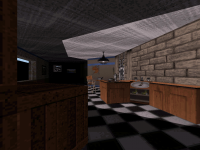
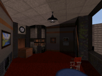
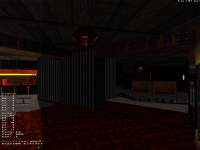
More map 5, now in the 950 sectors/7000 walls. Mostly some simple instances of shading and little indoor detail as it's hard to show more of this one without spoiling too much. I know about the crate texture on screen 1 being a bit off but I really just wanted to show the moka pot, it's simple but with the steam hissing and the bubbling ambiance it's just perfect (and now I kind of want the player to blow one up somewhere, I know exactly I'd go about the whole sequence too). Screen 3 is bound to evolve quite a bit, although that angle is already concealing some cool stuff on the right. Also, both screen 1 and screen 4 have secret places in them (and all these locations probably will eventually).

Attached Image: 5-1.png Attached Image: 5-2.png Attached Image: 5-4.png Attached Image: 5-5.png

This post has been edited by ck3D: 09 December 2020 - 09:23 PM

2

User is offline   NNC 

#42

View Postck3D, on 09 December 2020 - 07:43 AM, said:

I'm with you when it comes to keeping screenshots relatable. I've posted quite a lot of indoor ones in the What Are You Working On For Duke? thread over the past year and a half, but now that you mention it I've been sort of sleeping on them in this one, to instead highlight the scale of the levels, subconsciously. It's probably a mapper's thing to be into showcasing the 'sum' of the work at least if the aim is to give a general impression, and I also like the idea of people needing to play the final thing to reveal all the finer detail and individual rooms I actually like. I also like to think I'm designing those 'places with a view' with the intention of actually letting the player up there, too. Every window or rooftop location and angle I've been making sure aren't random openings and actually provide the player with the best sights possible on certain key parts of the map like I was composing a photo every time. Lots of elevators, high ledges, floors; cameras and secret places in otherwise unreachable areas allowing for 'secret views'. That's not the main focus either, I'm really focusing on gameplay first and foremost but I guess this kind of practical osmosis is bound to happen when one accepts letting form follow function, in the end the settings become practical themselves. That's why it really wouldn't surprise me if L.A. Rumble really did originally have a proper rooftop ending towering over the rest of the map that was cut for instance (even though I may be the only one on Earth under that impression) - the whole set-up is too perfect be it from the 2D or 3D perspective, when you're doing what feels coherent then that's just how it tends to come together.

About the wall-aligned sprites, I've actually been toning down my use of them because watching YouTube videos of user map playthroughs, I've gradually realized how much players liked to try pressing use on every single piece of decoration - since the base game essentially programmed them to do that for rewards - and when they almost never get a reward in return, it's just so much wasted potential and time. So if you see a wall sprite that catches your attention here, then there are odds that it either serves some kind of purpose be it in the level itself or the narrative (no matter how secondary), doesn't feel distracting to me when playing and thus feels like the appropriate kind of decorating, or is a placeholder.

Don't worry about justifying yourself too, I'll always read and appreciate your thoughts on, and your unique grasp of Build games and logic, the respect is mutual.


You're welcome mate. ;)

Just another thing I want to point out: colours. I saw this last picture you posted and thought about the chair is red but the table is blue, which is a big no-no in real life, most decorators won't recommend that. And with that said, overriding the base palette rarely works for the game, it only looks good when the entire room gets a colour (like in your picture on the top of the page, which looked awesome), and even that only in some "very special" areas, and if the base colour is blue, more colours can be applied accordingly. I often saw in general that trashcans or fake doors for example got red colour and it doesn't exactly look great. Also I'm not a big fan of palette monsters, luckily people nowadays stopped using them, it was a big error in 90s mapping, but palette monsters should only appear if they add special attack type. Maybe they can work if all of them are replaced in a map, ie. a pitch black in a horror map looks good, or special ones in snow maps.

Also, seeing your wall sprites on your initial shots, sometimes I got the impression you should use custom textures in your maps. I know it's not an easy job and you might need help for that, but it would make these areas more interesting and special, maybe some stuff from ROTT or LameDuke can be used here and there.
1

User is online   Aleks 

#43

I think MRCK's style is largely based on creative use of base-game textures and that (along with the awesome layouts) is what impresses me the most in it. Don't think using custom textures would be a good idea for his maps TBH (I also know he's quite "conservative" in this matter as well). I still quite often end up bumping into something in his maps that I can't tell which tile was used unless I start meticulously checking it in Mapster, which usually works better than new textures.

@MRCK, love the new screenshots, especially the outside one with some nice detailing on that wall! Is the moka thing in there going to be some little cute sequence of effects?
1

User is offline   Merlijn 

#44

Yeah no offense The Watchtower, but it almost sounds like you want Ck3D to ditch his own style in favour of something more generic.
Which is kind of the opposite of what a mapper should do IMHO.

Coming up with original and clever ways to use the original tile set is one of the most creative and fun things about mapping for DN3D.
Screens look good as always, love the coffee pot!
4

User is online   ck3D 

#45

View PostThe Watchtower, on 09 December 2020 - 11:34 PM, said:

Just another thing I want to point out: colours. I saw this last picture you posted and thought about the chair is red but the table is blue, which is a big no-no in real life, most decorators won't recommend that. And with that said, overriding the base palette rarely works for the game, it only looks good when the entire room gets a colour (like in your picture on the top of the page, which looked awesome), and even that only in some "very special" areas, and if the base colour is blue, more colours can be applied accordingly. I often saw in general that trashcans or fake doors for example got red colour and it doesn't exactly look great. Also I'm not a big fan of palette monsters, luckily people nowadays stopped using them, it was a big error in 90s mapping, but palette monsters should only appear if they add special attack type. Maybe they can work if all of them are replaced in a map, ie. a pitch black in a horror map looks good, or special ones in snow maps.


Honestly, in just three posts, by spotting something odd about the colors of the settings here and there (in this case the chair and table) you're actually closer to figure out certain background elements about the project I never really disclosed publicly, but have been secretly waiting for people to piece together from the screenshots eventually (that's a passive and anecdotal wait though, as it's nothing important), and that's since I started the project over a year ago. For now, I'll just say I don't disagree and you're actually onto something unknowingly, which says a lot about the sharpness of your observation. Those objects are indeed those colors for a reason. It's not the first time too, for instance you were also onto something with the example of the KTIT sign.

Generally speaking I feel like over the recent years I've been learning to use colors for two purposes, 1/ color coding certain areas of the levels for the player to easily identify which place is crucial or just secondary (also punctuating the area with visible landmarks to guide them around the bigger levels), as in a way they will be drawn to bright colors and lights just like insects (I just thought of the analogy but maybe we're actually talking the very same instinctual pattern?), and 2/ establishing a base color theme for the level which I find takes a bit of science (and subtlety) if you're trying to build up and nurture a unique vibe as opposed to clashing against the base game's default vibe all the time (which is probably what's generally off-putting in palette abuse).

Using only the strong, 'complete' palettes like 1, 2 or 8 for whole rooms (usually paired up with strong shading and stark contrast, maybe with some flashing or Cyclers) is what the base game traditionally did but lately I've actually been getting some cool results using pal 17 and 19 for more subtle touches here and there that I don't think look out of place and actually work with the environment, including the surrounding light effects and either stronger or more plain tones, which in a way feels like it adds an extra layer of depth to the original graphics and rhythm to the navigation, at least the way I've been doing it so far for this project. Not falling into the world of abominations is a fine line, but I've been trying to watch my step walking it (I guess sometimes I may still trip). Funnily enough, I'm a lot less drawn to the most 'brutal' palettes these days like pal 7 and 24 that really ruin most sceneries instead of embellishing them (even the red bushes in this current map are pushing it to me, but I needed the variation and their position will signify the one of items), when ten years ago they were my go-to's.

This leads me to a random observation I was just making to myself about how palettes are generally incompatible with working light effects (the first light change will effectively cancel it in-game, ruining the coherence unless the effect is put to good use on purpose), and that's probably why the base game never really does odd palettes - part of that is because the textures were tailor-fit to the intended vibe to begin with anyway with no need for the mappers to look for alternatives, but part is also because at the time Build as a whole was new and exciting to work with - a craft which didn't comprise just doodling little rooms and hallways, but also using the power of the new light effects that we actually might be taking for granted now, after seeing them for years. I actually feel like those light effects got old (not tired; done right, they're timeless) and lost their flashy aspect - no pun intended - not long after the release of Duke 3D, possibly around the time Quake dropped, so a lot of user mappers past 1997 just stopped caring so much about them - like an old toy - and instead naturally started favoring the possibilities of palettes in their approach to making unique pieces. Now the habit has kind of established itself as a tradition over time and practice but since it'll always be incompatible with working lights per se, those have become underused in turn. When you think about it though, in 1996 every user map no matter how shit at least had a couple of light effects thrown in and, funnily enough, usually those were the best part of them since they're essentially pre-programmed with only minimal intervention required from a fallible human author (which just comes down to defining the trigger - if any - and contrast). Then as soon as tech moved ahead, it's as though a lot of people got bored of them and focused on a different direction.

Anyway, I was thinking that to myself because over the course of this past year I've been noticing a natural shift in my style where I'll design more sections in my maps around the idea of working lights, and I find it to be a completely different approach from the common, more explicit detailing style. Before you even implement it, you have to work the areas around the limitations of the effect (and there are plenty; sectors only being able to keep track of one base value for all walls, floors and ceilings is quite the big, annoying one), shade everything first and only then you think textures and colors, which is the opposite of settings that would primarily aim at being descriptive, yet an aspect that should never be neglected when working on a scene. Placing wall sprites and all is the function of a set dresser when as an author it's important to remember how you're not just that but also the director of the whole cinematic experience.

View PostThe Watchtower, on 09 December 2020 - 11:34 PM, said:

Also, seeing your wall sprites on your initial shots, sometimes I got the impression you should use custom textures in your maps. I know it's not an easy job and you might need help for that, but it would make these areas more interesting and special, maybe some stuff from ROTT or LameDuke can be used here and there.


It's cool seeing you point this out as I've been debating the issue for a while myself, in the end for this project I don't want new textures because a big part of the charm here for me is to reinterpret the old ones in contexts that feel different every time yet aren't that much of distorted stretches and do feel credible in-game, but your point about palette'd up aliens is a hot one as I would like a few new enemies in there (I know exactly which ones) and could use a hand for those, except I don't even know where to begin to edit .art and so far that's not been my priority yet, the mapping has been, I haven't even coded shit. Jimmy might or might not be on it sooner or later. For now I was thinking of just using colored enemies with different behavior as placeholders, but what I have in mind would work a lot better. Spending three years on the maps just to release them with colored fucks in them as opposed to real bonus content would be a bit of a downer even though I think I could make that work too.

This post has been edited by ck3D: 10 December 2020 - 07:47 AM

2

User is online   ck3D 

#46

View PostMerlijn, on 10 December 2020 - 06:51 AM, said:

Yeah no offense The Watchtower, but it almost sounds like you want Ck3D to ditch his own style in favour of something more generic.
Which is kind of the opposite of what a mapper should do IMHO.

Coming up with original and clever ways to use the original tile set is one of the most creative and fun things about mapping for DN3D.
Screens look good as always, love the coffee pot!


Style isn't going anywhere generic, don't worry about it. I do enjoy reading about people's different perspectives on the game and what everybody considers good and bad taste and design, in the end it's just more clues to pick up. And thanks!

@Aleks if I do end up implementing a segment where the player needs to use one to blow shit up then yes, I've thought about it and already have the full sequence planned potentially. If I do make another one the player is meant to use, though, then for consistency I'd need to find some kind of purpose for this one too and make it equally functional somehow.

This post has been edited by ck3D: 10 December 2020 - 09:08 AM

0

User is offline   NNC 

#47

View PostMerlijn, on 10 December 2020 - 06:51 AM, said:

Yeah no offense The Watchtower, but it almost sounds like you want Ck3D to ditch his own style in favour of something more generic.
Which is kind of the opposite of what a mapper should do IMHO.

Coming up with original and clever ways to use the original tile set is one of the most creative and fun things about mapping for DN3D.
Screens look good as always, love the coffee pot!


Well, I played all ck3D maps so far (well, maybe missed a few early ones), and he was fine with all my rants and didn't turn into something else. Of course the screens are great, and talent is top notch. Top notch talent needs most nitpicky feedbacks though I guess.

This post has been edited by The Watchtower: 10 December 2020 - 11:59 PM

1

User is online   Aleks 

#48

View Postck3D, on 10 December 2020 - 06:52 AM, said:

This leads me to a random observation I was just making to myself about how palettes are generally incompatible with working light effects (the first light change will effectively cancel it in-game, ruining the coherence unless the effect is put to good use on purpose), and that's probably why the base game never really does odd palettes - part of that is because the textures were tailor-fit to the intended vibe to begin with anyway with no need for the mappers to look for alternatives, but part is also because at the time Build as a whole was new and exciting to work with - a craft which didn't comprise just doodling little rooms and hallways, but also using the power of the new light effects that we actually might be taking for granted now, after seeing them for years. I actually feel like those light effects got old (not tired; done right, they're timeless) and lost their flashy aspect - no pun intended - not long after the release of Duke 3D, possibly around the time Quake dropped, so a lot of user mappers past 1997 just stopped caring so much about them - like an old toy - and instead naturally started favoring the possibilities of palettes in their approach to making unique pieces. Now the habit has kind of established itself as a tradition over time and practice but since it'll always be incompatible with working lights per se, those have become underused in turn. When you think about it though, in 1996 every user map no matter how shit at least had a couple of light effects thrown in and, funnily enough, usually those were the best part of them since they're essentially pre-programmed with only minimal intervention required from a fallible human author (which just comes down to defining the trigger - if any - and contrast). Then as soon as tech moved ahead, it's as though a lot of people got bored of them and focused on a different direction.


Just dropping my 2 cents here, but I've recently noticed that SE8 does keep the palettes intact both for switching on and off the lights. The shading is more of a bitch with working lights though - as it requires masking the ceilings of shadows cast from different object with sprites or elaborate ways for actually working wall shadow contrasts. But I agree that having some dynamic light effects is always cool in a map!
1

User is online   ck3D 

#49

View PostAleks, on 11 December 2020 - 01:33 AM, said:

Just dropping my 2 cents here, but I've recently noticed that SE8 does keep the palettes intact both for switching on and off the lights.


Does it? I remember having to forget about palettes in one specific room in map 2 because of the incompatibility with working lights (which didn't matter in the end as retexturing the room actually led to better results). I think it was working lights, off the top of my head; maybe it was a flickering light effect, or flickering lights when shot, but otherwise I'm quite certain. I was using my prehistoric version of Mapster so maybe that's a thing that was fixed in newer builds. I still have trouble trusting most everything that doesn't seem like its original behavior in the base game, for silly compatibility concerns (that I have no problem suddenly forgetting about when the time comes to make 1024+ sector maps, of course).

Either way I agree with you, the basic problem is that the base game struggles at keeping track of the respective values for each floor, wall and ceiling independently. The Infosuite describes its 'routine' with them quite well, with the first activation of the light the brightness for each individual wall gets offset properly and then with it's first de-activation everything uniformly takes the shade value of the floor. It's pretty heartbreaking to go through the effort of shading a whole room (or more) meticulously only to then think of adding a light switch and boom, in game, two clicks in your room is uniform-looking already. That's why I think areas with dynamic light effects have to be planned in advance; if you listen to your map it will just tell you in which position this or that one would look good or be purposeful from distance, and then now that you know you want one there you should go and design the area with the optimal values for the intended result in mind (exact same values for the floor and ceiling of the same sector seems to be a great basic rule, albeit artistically restrictive). You can't really improvise just adding them somewhere you've already built, or you'll most likely end up having to tweak mad stuff and ruin something you had already established. I only sort of realized that recently and now that I'm actually getting results that I like with those effects, I've become quite the addict.

View PostThe Watchtower, on 10 December 2020 - 11:59 PM, said:
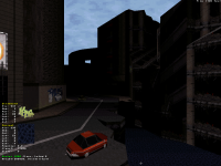
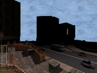
Well, I played all ck3D maps so far (well, maybe missed a few early ones), and he was fine with all my rants and didn't turn into something else.


If anything, I turned into someone who makes better maps. I suspect I'm not the only one your posts have helped intellectualize and verbalize the qualities of the game a bit better, too. In general there's just nothing to lose and everything to win in honest communication.

This post has been edited by ck3D: 11 December 2020 - 07:42 AM

1

User is offline   Nukem1994x 

#50

This looks amazing!
1

User is online   ck3D 

#51

^ Thank you!

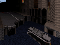
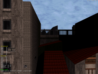
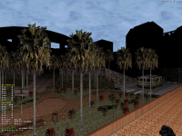
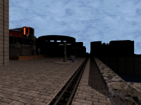
Map 5 is starting to get shapes. Enclosed a good quarter of the map today, built an extra street as well as a huge surrounding area I originally meant as an obvious unreachable, but actually opens up so many possibilities in the layout, in the end I'll definitely be letting the player wander in there and about. The silhouettes of some of the buildings are starting to pop up; I've also changed the sky texture for one that may or may not be temporary too, but does the trick so far. Those super basic accessible roofs with the little back alley and shadow play on screen 3 are so simple yet may be my personal favorite place in the map. Screen 6 is some fancy indoor bullshit where I've been pushing the palettes a bit. 1100+ sectors, 8300+ walls and half of what I have in mind left to build so this may be a tight one unless I scrap or repurpose some ideas, as the level already seems to want to compete with map 3 in terms of size.

Attached Image: 5-6.png Attached Image: 5-13.png
Attached Image: 5-11.png Attached Image: 5-12.png
Attached Image: 5-10.png Attached Image: 5-9.png

This post has been edited by ck3D: 11 December 2020 - 11:09 PM

4

User is offline   Merlijn 

#52

Again, nice to see you making so much progress in a relatively short amount of time! The scenery looks really good, with a lot of variation in terrain and buildings.
Looks like it's going to be fun to explore!

I like this sky texture better, so I would say keep it (unless you find an even better alternative).
BTW I wonder why you still keep the fog effect if you intend to remove it in the end? The outdoor shading would be easier to implement with full visibility.

Also, the angle of the shadow in the last shot is inconsistent, I wonder if that's done on purpose?
1

User is online   Aleks 

#53

I'm in love with that plant thing next to the stairs in 2nd screenshot, looks so awesome! Also the park on 4th screenshot looks great, has a similar vibe to Park Guell in Barcelona with the stairs and all the fancy structures around it. It's crazy how it seems like you're outdoing yourself with each map. And your building speed is insane too!
1

User is online   ck3D 

#54

View PostMerlijn, on 12 December 2020 - 01:23 AM, said:

Again, nice to see you making so much progress in a relatively short amount of time! The scenery looks really good, with a lot of variation in terrain and buildings.
Looks like it's going to be fun to explore!

I like this sky texture better, so I would say keep it (unless you find an even better alternative).
BTW I wonder why you still keep the fog effect if you intend to remove it in the end? The outdoor shading would be easier to implement with full visibility.

Also, the angle of the shadow in the last shot is inconsistent, I wonder if that's done on purpose?


Thanks Merlijn!

About the fog, that's a good question, I think it comes down to several things: first it allows me to post more screenshots as it keeps a lot of the detail out of view until I allow myself to reveal a tiny bit more with the full vis screenshots after I'm done with each map, now that's not especially crucial but here I can use that strategy since, well, it's there. Another reason is I'm a bit paranoid about ending up with involuntary inconsistencies from sector to sector or area to area in the final product if I tweak visibility here and there as I go and then keep adding more locations to the map, thinking about it I generally like to structure work in 'layers', when it comes down to one specific task I'm much more comfortable handling a full piece than progressively doing it in a fragmented effort. Keeping that atmosphere in a WIP environment also helps me realize how exactly classic Duke would handle it by default, which always remains a useful indicator if anything (if only to be able to judge whether or not I will need to boost the visibility in the end and if yes by exactly how much). Finally, there's a huge sense of satisfaction in finishing a map built with the default visibility and then raising it even if it's just to get an overview or preview, like all the little isolated detail everywhere suddenly forms a coherent ensemble that just slaps you in the face as one big mammoth, even as the author who's supposed to know exactly what they've built before but for the longest time didn't really get to see the complete sum of it at once, I find it very akin to shooting film where you think you know what you're doing but have no practical way of checking until you finally develop it, sometimes weeks if not months later and you end up surprised yourself by the qualities of your own product. Now it's quite personal and I wouldn't necessarily recommend that people should adhere to that process at all, it's probably just how I like doing things. It never bothered me in the slightest when it comes to shading anything (I'm not even sure how it could; do you mean by ruining the eventual contrast between lit and shaded areas?), if it really hindered me somehow I would definitely change my approach but I don't feel like it does.

I did spot that weird shadow when posting the screenshot (which we all know is the best time ever to realize mistakes), thanks for pointing it out though, it indeed looks a bit off and I will fix it. The room on the left has a few odd angles with different light sources so making it that way felt right in the moment but this particular perspective makes it obvious how it should really just be one diagonal. On a side note, making a daytime map is an excellent excuse to go even harder on the shading everywhere outdoors and I'm loving it. I'm also happy with the structure of the space, I still want some of those backgrounds to be less empty and have more vertical and diagonal debris protruding out of them in the end though. Just because of the first few instances of those already, some sections of the map are starting to remind me of Warzone quite a bit (Andras Piroska was an interesting mapper).

And thanks Aleks, that little plaza with the planters was one of the first things I built in this map, just outside the amphitheater, the screenshot is actually taken from one of the lower 'balconies'. I've never been to Barcelona but it's really cool you can sense that vibe from that little park thing. To be honest I'm quite happy with that segment of the level, it's too big to do justice to in screenshot form but there's quite the terrain variation with big slopes and dark shadows in general around these parts, in a way it's kind of like those little roofs, a lot of times simple works best.

The building speed is kind of scaring me too (what am I doing with my life?) but I'll just attribute it to lockdown and less work, might as well put that spare time to use. On the other hand it does give me hope - if I can maintain the groove and pace, and every map left only takes me about a month on average, then this may be out of the door at least a year earlier than I was originally expecting. I still need to make tons of stuff though.

This post has been edited by ck3D: 12 December 2020 - 08:55 AM

1

User is offline   Merlijn 

#55

Thanks for explaining the process behind the fog and visibilty, it's always nice to hear the train of thought behind something.
The comparison with film is a very nice one, I never considered that.

Quote

(I'm not even sure how it could; do you mean by ruining the eventual contrast between lit and shaded areas?)


Yes, but that's also down to personal preferences. Removing the fog sometimes makes areas too bright and too flat for my taste.
So that's something I want to adjust on the spot until I'm satisfied.

This post has been edited by Merlijn: 12 December 2020 - 09:48 AM

1

User is online   ck3D 

#56

View PostMerlijn, on 12 December 2020 - 09:48 AM, said:
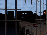
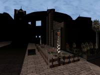
Yes, but that's also down to personal preferences. Removing the fog sometimes makes areas too bright and too flat for my taste.
So that's something I want to adjust on the spot until I'm satisfied.


Ah I see, yeah I observed that tendency when making the full bright screenshots of some maps from earlier (I've mentioned it before) and I don't always like it too, that's what I meant by ruining the contrast. Sharp shadows start looking dull unless seen from afar, etc. Plus when you do away with literally all the fog, that can take away from the mood of some locations quite a bit, and even alter the look of the warmer tones especially (some reds turn into oranges). Still personally I prefer to have a solid base product relying on the original settings, though, and then if something generally bugs me later it's easy to just go and offset the values, visibility-wise or shade-wise, at once or in blocks. It allows me to keep a raw version of the map around so I can always go back and do that if needed, whereas were I setting up visibility everywhere as I went I wouldn't feel nearly as comfortable with mass editing after the raw design is done. That's probably just not being at complete ease with the visibility function yet though, had I learned about it earlier (on the same basic level as pure shading for instance) I'd probably have your approach too as it would be naturally entangled in my technique. My current ways here probably have to do with the size and structure of those particular levels too, spontaneously and maybe naively it just seems like the natural approach to me to first work on the ensemble's individual components and then add an extra layer on top of the ensemble itself to wrap it up, as though to try and dip every map in more of its specific coherence.

This post has been edited by ck3D: 12 December 2020 - 12:11 PM

0

User is online   ck3D 

#57

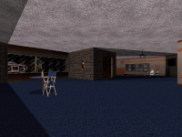
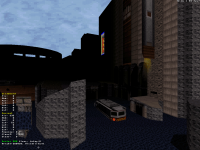
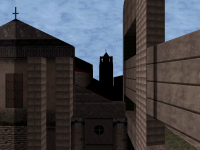
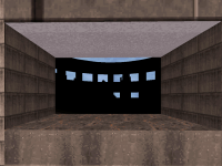
WIP map 5, now with a cathedral and tower visible from most everywhere else in the level. Back of the arena (right part) in screen 3 isn't shaded yet and will be a lot darker eventually. Screen 6 is another recent-ish location just thrown in there for good measure, in game you can also see the cathedral from there, just not from that angle. 1432 sectors/11128 walls/3416 sprites (I'm not scared yet).

Attached Image: ok1.png Attached Image: ok5.png Attached Image: ok3.png
Attached Image: ok2.png Attached Image: ok6.png

This post has been edited by ck3D: 17 December 2020 - 08:30 PM

4

User is offline   NNC 

#58

These are my favourite screens so far. I actually like how everything points towards that central colosseum building, and the church tower in the middle one looks very good too. It seems we are getting some formidable stuff here.
1

User is offline   Merlijn 

#59

Looks really promising, the amount of sprites for the arena must be insane!
The cathedral and the church are very good additions, looks like this map will have a very distinct feel compared to the others.
1

User is online   Aleks 

#60

I'd love to see these with full visibility, but even the blacked-out shapes of the coliseum or cathedral look marvelous! Also I've missed it from the previous bunch of shots, but seems you've found a better sky texture (at least more appealing to me). Not even sure what is it (pal 1 Atomic yellow "lava" thing static frame?). Also love using the flag sprite as a closed parasol in that 2nd screen - I was also thinking of doing something like that in Casino Carnage unreachable little outside sitting area of the bar, but couldn't find any appropriate sprite and dropped the idea eventually. This certainly does the job here though!
1

Share this topic:


  • 17 Pages +
  • 1
  • 2
  • 3
  • 4
  • Last »
  • You cannot start a new topic
  • You cannot reply to this topic


All copyrights and trademarks not owned by Voidpoint, LLC are the sole property of their respective owners. Play Ion Fury! ;) © Voidpoint, LLC

Enter your sign in name and password


Sign in options