Jimmy, on 13 November 2020 - 06:07 PM, said:
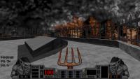
Minimal HUDs often look bad to me (usually because they are designed purely through code with no new art) and are missing important info.
A great example of this IMO is Shadow Warriors minimal in VoidSW, which is missing the Armor counter. That literally sometimes kills me.
Quote
Another favored HUD is eDuke's custom minimal hud (that adds more information than the default minimal hud), but with the row of weapons on the bottom plus their ammo counts that tend to be seen in any mod TrooperDan has a hand in. Then you get the best of both worlds, tactically speaking.
Hmph, yes. I will have to concede that eduke's minimal HUD is all right I suppose.
Quote
However, I also really enjoy the minimalist and functional variations of HUD found in games like Quake 3. BARE minimum. What you need to know and nothing else.
In Quake 3 I may be able to accept this one exception. In MP visibility is essential to victory.
 Help
Help
 Duke4.net
 DNF #1
 Duke 3D #1


 or are you team "mini"mal HUD