Duke4.net Forums: Mansion CBP - Duke4.net Forums

Jump to content

Page 1 of 1
  • You cannot start a new topic
  • You cannot reply to this topic

Mansion CBP

User is offline   Sixty Four 

  • Turok Nukem

#1

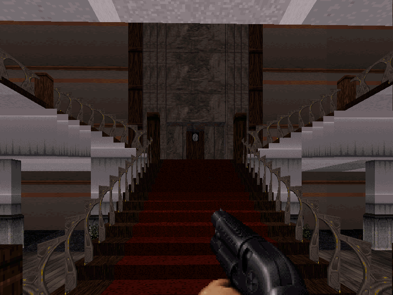
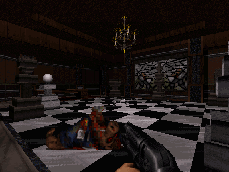
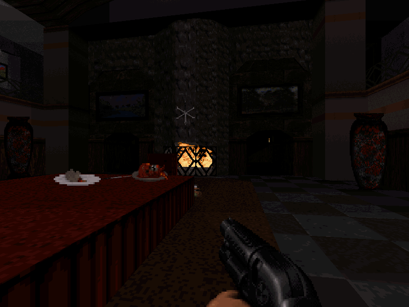
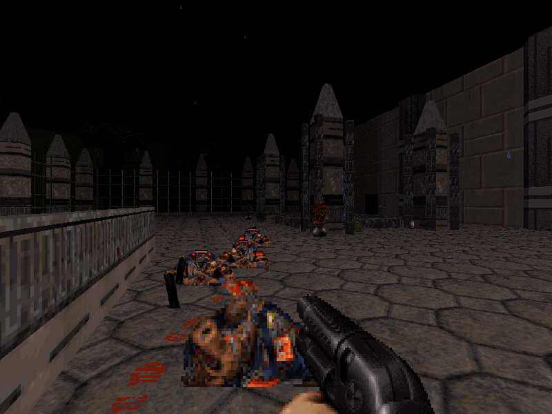
Haunted Mansion community cbp map. In spirit of Halloween.

Posted Image
Posted Image
Posted Image
Posted Image

Mappers:
St1ll_Wanted
JMW
Sixty Four (Duke64)

Download: https://turoksanctum...ad/mansion-cbp/

Steam: https://steamcommuni.../?id=1552497732

This post has been edited by Sixty Four: 31 October 2018 - 12:49 PM

16

User is offline   Sanek 

#2

It looks like you guys have a knack for making spooky-themed maps. Judging by screenshots, is it inspired by E2M4 from Blood?
0

User is offline   max_nukem 

#3

Thanks!
I try it today!
0

User is offline   Forge 

  • Speaker of the Outhouse

#4

played it. it was mostly fun. A couple instances of throwing a switch and having to figure out which of the one thousand doors just unlocked, but it wasn't all the way on the other side of the map, so it wasn't too annoying.
Looks nice. Lots of little details and touches.
1

User is offline   MetHy 

#5

These two first screenshots look very Resident Evil like (RE1 and RE0)! This looks cool, I'll check it out.

A long time ago I started a map inspired by RE too, I recreated some of the corridors and small rooms of the mansion, that I wanted to use for a CBP, and then later to fully finish, but never did. I even wanted to make a puzzle with a floor chessboard like your 2nd screenshot. It's a shame because those old bits of maps I'm never gonna finish may have fitted well with this CBP.

This post has been edited by MetHy: 01 November 2018 - 01:49 AM

0

User is offline   Sixty Four 

  • Turok Nukem

#6

Yes hope you enjoy thanks all. For me there's never a wrong time to release a darker style map.

CGS: http://www.scent-88....ncbp/mancbp.php

Has a great review there too.

View PostMetHy, on 01 November 2018 - 01:48 AM, said:

These two first screenshots look very Resident Evil like (RE1 and RE0)! This looks cool, I'll check it out.

A long time ago I started a map inspired by RE too, I recreated some of the corridors and small rooms of the mansion, that I wanted to use for a CBP, and then later to fully finish, but never did. I even wanted to make a puzzle with a floor chessboard like your 2nd screenshot. It's a shame because those old bits of maps I'm never gonna finish may have fitted well with this CBP.


Was this map you mention put in an old unfinished maps thread some time ago? I think I remember it could be something else I kind of forget.

This post has been edited by Sixty Four: 01 November 2018 - 07:24 PM

0

User is offline   Paul B 

#7

Well, Forge beat me to the chase. Played the map and really enjoyed the atmosphere. The map was very creative, well detailed and well joined. While I was a bit harder on the rating than Forge, I found some things could have been easily addressed before the public release. I imagine if there wasn't a Halloween dead line these minor details could have probably been taken care of. Anyway, I just wanted to let you know the maps is also published here as well: http://www.dukemaps.net/?p=10599

At first glance some of the detail and creative sprite usage made it seem as though new art was used. To my surprise it was still all the default tiles.

Nice effort by all!

This post has been edited by Paul B: 01 November 2018 - 11:19 PM

1

User is offline   MetHy 

#8

Finished the map now and I enjoyed it for what it was, good job. Good layout and fights.

I do have some nitpicks though. It's a little old that the scale of rooms are so different from one area to the other, some corridors are huge, and some really cramped, had it been more consistent it'd been less obvious that it's a CBP. The main entrance for instance has this extensive spritework but which leads nowhere...

The chess puzzle is a little odd, especially considering that some switches make sound, which is the same sound as the one when you do solve the puzzle. Considering that the result of the solving is not in sight, you can understand it can be misleading.

View PostSixty Four, on 01 November 2018 - 07:20 PM, said:

Was this map you mention put in an old unfinished maps thread some time ago? I think I remember it could be something else I kind of forget.


Probably yes. I don't intend to steal your splotlight it's just that this map reminded me of it and my old stuff which I'll never do anything with may have fit well in this map with some a lot of work.
I just digged it up and there isn't nowhere near as much as I remembered it, + I'm really ashamed of how it looks looking at it now. Bare in mind this was all made in 2006-2009.
You can probably recognize the Resident Evil inspired places.


This post has been edited by MetHy: 02 November 2018 - 06:38 AM

2

User is offline   Sixty Four 

  • Turok Nukem

#9

Nice review Paul nice to see you, so that is your site? Looks neat.

I agree with the nitpicks MetHy and I'm not concerned with any spotlights. Its just good to get any feedback these days I think lol. I know I make my corridors a little larger than then the others but I learned to dislike those cramped feelings in maps.

Actually, I really like that second picture quite a bit. How its simple yet effective and just wide and tall enough to be a good corridor. The green wall with the wood trims is very nice imo.
0

User is offline   Paul B 

#10

View PostSixty Four, on 02 November 2018 - 12:48 PM, said:

Nice review Paul nice to see you, so that is your site? Looks neat.


Yes, that's my own personal website dedicated to the EDuke32 / Duke Nukem community. I've been fairly busy lately so its all I can do to publish maps let alone review them. I was hoping someone might have been interested in volunteering, but I've yet to receive any offers. Eventually, I hope to get around to playing and reviewing each map. Once the maps get rated then sorting by rating in the maps table will start to work properly and I'm really looking forward to seeing that sort function work as it is suppose to.

This post has been edited by Paul B: 02 November 2018 - 02:25 PM

0

User is offline   Forge 

  • Speaker of the Outhouse

#11

I almost never give an opinion on a new map.
I prefer letting them ferment at least 6 months.
0

User is offline   HotGun 

#12

I really liked this map. The scary atmosphere is really scary. The chess puzzle was unnecessary.
0

User is offline   Nacho 

#13

Well, since you bumped this and reminded me that there is a thread for it, here's the live stream link I did back in October where I played this. I think the Chess puzzle was a great idea, and visually great, but the execution for the hint did make me overthink it a tad more then I needed to, at least that's how I felt after beating it and realizing the solution was straightforward.

All in all, I really like the idea of a CBP like this where different sections of a map are made by different people. It makes it feel like a different playground for each area and really makes the "hub" concept work.

https://www.youtube....e7wW_3JoiYenm2q
0

Share this topic:


Page 1 of 1
  • You cannot start a new topic
  • You cannot reply to this topic


All copyrights and trademarks not owned by Voidpoint, LLC are the sole property of their respective owners. Play Ion Fury! ;) © Voidpoint, LLC

Enter your sign in name and password


Sign in options