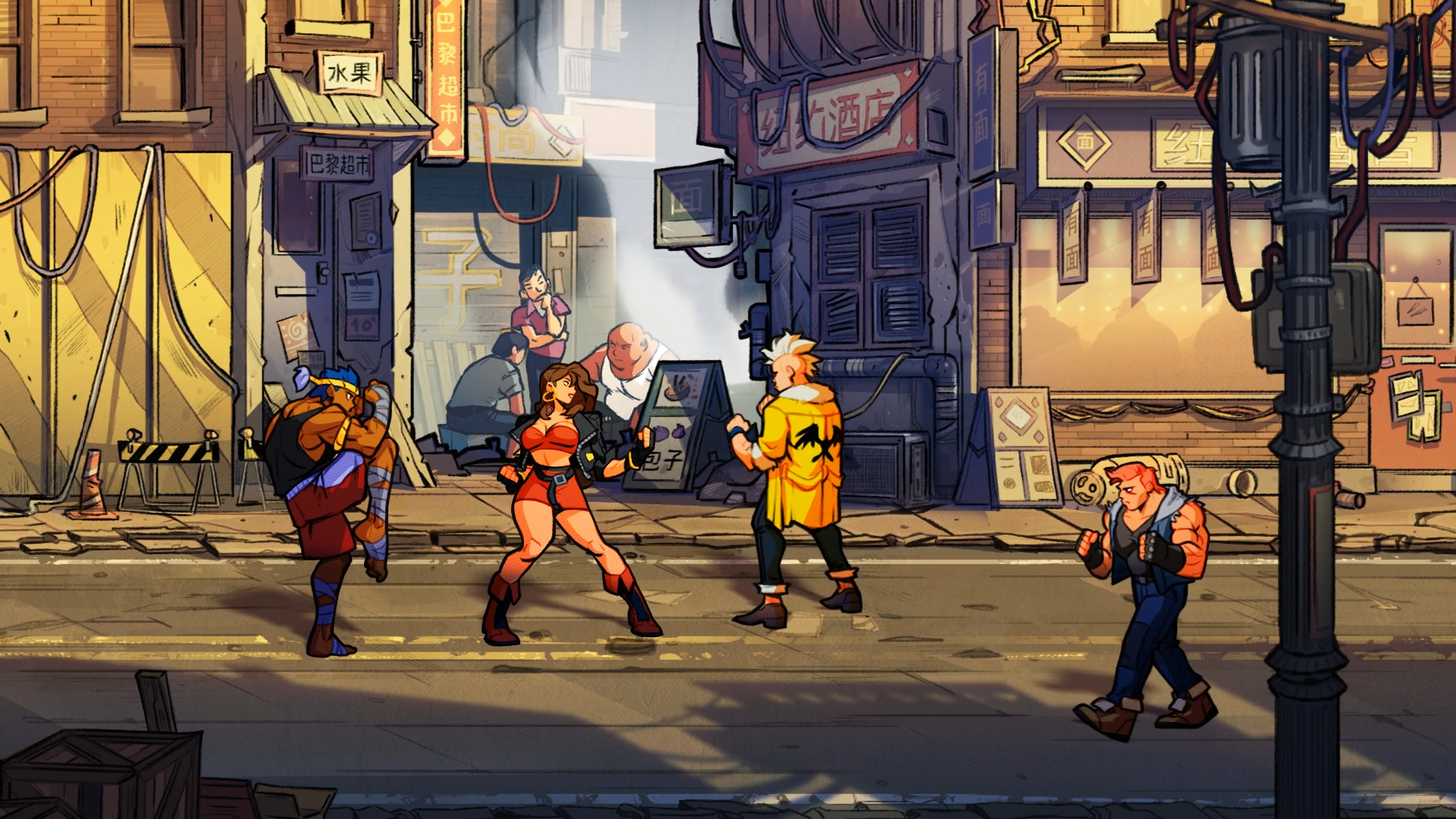
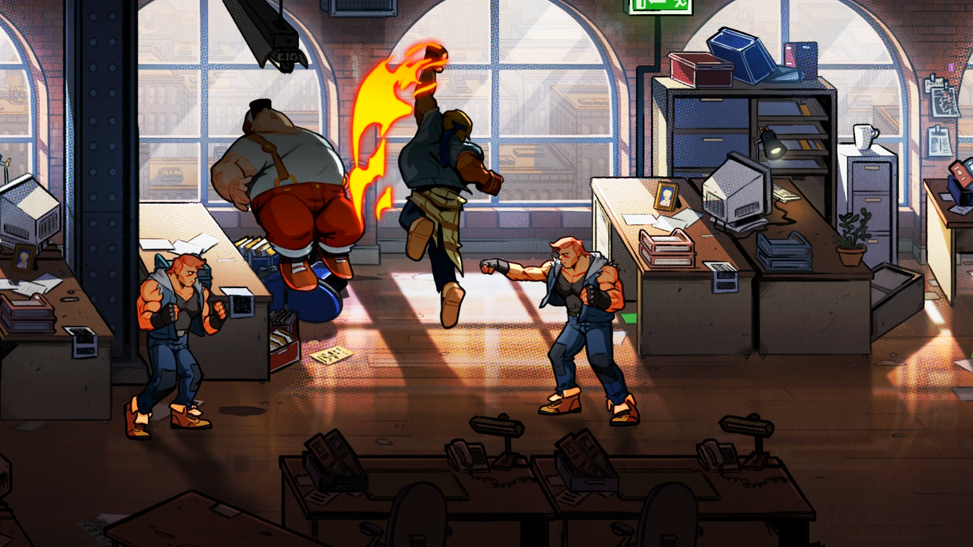
Hey, after SEGA trying at least 5 times to make a new Streets of Rage game SoR 4 is finally happening:
Love the 80s feel, let's hope the gameplay will be just as good as the art style.
Page 1 of 1
Streets of Rage 4
#1 Posted 29 August 2018 - 07:43 AM
#2 Posted 29 August 2018 - 10:19 AM
The frames of the enemies and how they react seem very spot on with SoR2, like they actually used SoR2 as a base to make them.
Not too found of the artstyle however.
Either way it can't be worse than Double Dragon 4.
Not too found of the artstyle however.
Either way it can't be worse than Double Dragon 4.
#3 Posted 29 August 2018 - 11:19 AM
Art definitely looks flatter than oldschool games. Why is it that oldschool pixel art has more shading than modern 2D cel-shaded art? As if the lack thereof is better. I like shading. Bring back gradient shading.
#4 Posted 29 August 2018 - 05:12 PM
I don't dig the art style for a Streets of Rage game, but it could've easily been a crappy 2.5D game.
Also hope its better than Double Dragon 4.
#5 Posted 29 August 2018 - 06:15 PM
MusicallyInspired, on 29 August 2018 - 11:19 AM, said:
Art definitely looks flatter than oldschool games. Why is it that oldschool pixel art has more shading than modern 2D cel-shaded art? As if the lack thereof is better. I like shading. Bring back gradient shading.
You can see on the screenshots what kind of shading they went with. For example if you look at on this shot you can see that instead of the characters having some "baked-in" contrast (which is essentially what gradient shading is and compared to this that's pretty primitive) how dark of bright they are depends on the environment:
http://www.thedragon...fRage4-0001.png
The guy who's standing in a shadow is partially darker while the characters that are in sunlight are brighter, it almost looks like some kind of bloom effect.
And here everyone's bit darker because the light comes from behind them and I really like this "sun effect" on the thug on the right:
http://www.thedragon...fRage4-0005.png
As for self-shadows you can see in this second shot that even those look different depending on the environment (the thugs on the left and on the right use the same character models but their self-shadows are different).
I think we need to see some longer gameplay footage to see how it will really look like in motion but I think this stuff looks very promising. I really like the strong contour on characters and that little "point-effect" in the colors, it looks like if the game was colored by hand. And Sure, pixel art has its advantages but it's so overused these days that I'm really happy they went with this instead.
#6 Posted 29 August 2018 - 09:18 PM
I'm fine with it not being pixel art. I just want some gradient shading. Not flat and cel-shaded. As in more levels of shading than just two or three.
This post has been edited by MusicallyInspired: 29 August 2018 - 09:20 PM
#7 Posted 02 September 2018 - 07:02 AM
I would've preferred it had it been polygonal like Spikeout. Oh well, I can still go back and play Spikeout.
#8 Posted 02 September 2018 - 10:15 AM
No way, if it would've gone 3D/polygonal, they should make it a different IP.
The Warriors is one of the best brawlers out there, but I wouldn't want a Streets of Rage or Double Dragon in that style. They tried with Final Fight and it was real meh.
#9 Posted 02 September 2018 - 12:10 PM
HulkNukem, on 02 September 2018 - 10:15 AM, said:
No way, if it would've gone 3D/polygonal, they should make it a different IP.
The Warriors is one of the best brawlers out there, but I wouldn't want a Streets of Rage or Double Dragon in that style. They tried with Final Fight and it was real meh.
Even Double Dragon Neon looked like crap if you ask me. I don't care about the presentation as long as the art style is coherent and the art itself is nice but keeping it in 2D is really the best choice.
#11 Posted 02 September 2018 - 07:23 PM
Double Dragon Neon visually looked okay-ish but it played bad. It felt off and very basic. I appreciated what they were going for but bleh. Especially considering the pixel art those guys were capable of it was extra disappointing.
Double Dragon Advance is still the ultimate Double Dragon game.
Share this topic:
Page 1 of 1