DN3D stuff under-used in usermaps ?
#1 Posted 12 July 2014 - 04:07 AM
Some that I thought of :
- functioning lightswitches
- the jetpack
- giving a use to items like nightvision goggles, steroids, protective boots; even if it's just a simple use. Would be nice to see the holoduke more often too since it CAN be useful in some SP situations.
- the pigtank. You see them, but not so often, probably because mappers think they are useless due to the button on their back; but it all depends how you use them, you just have to put them in places where the button can't be reached yet; like behind a couple blocked walls (fences, invisible walls etc); or far away in the distance so you have to avoid the shots while making your way closer.
- X-axis SOS : several rooms at the same physical space. It's something unique to the Build engine yet how many maps make use of it? 0,01% ?
- moving sectors / walls
- mirrors in places other than boring bathrooms
This post has been edited by MetHy: 12 July 2014 - 04:37 AM
#2 Posted 12 July 2014 - 04:14 AM
Overall I'd like to see more vertical level design in Duke, especially in city-based maps. Makes things a lot more interesting than relatively flat layouts.
#3 Posted 12 July 2014 - 04:31 AM
Also, viewscreens. Viewscreens are often used to display text, or to show the player where to go/what a switch did ; but its original use, showing the levels and enemy placement in rooms you haven't been yet, is nice and not used so often, either.
This post has been edited by MetHy: 12 July 2014 - 04:32 AM
#4 Posted 12 July 2014 - 07:10 AM
This post has been edited by Nancsi: 12 July 2014 - 07:10 AM
#5 Posted 12 July 2014 - 07:24 AM
IMO it's simply the layouts themselves that make them memorable.
The right amount of non-linearity and scripted events.
The perfect balance between abstract and realistic/relatable.
Enemies tied into the progression to make it seem like they were smarter and attempted to actually hinder you.
In fact that's something that's missing from user maps: In the original game there were several instances where enemies were made out as though they were pressing switches to close doors and stuff to get in your way. Usually they're just arbitrarily placed around the levels, but they need to be tied into the progression/story more.
#6 Posted 12 July 2014 - 07:37 AM
This post has been edited by Gambini: 12 July 2014 - 07:38 AM
#7 Posted 12 July 2014 - 07:57 AM
#8 Posted 12 July 2014 - 08:25 AM
Gambini, on 12 July 2014 - 07:37 AM, said:
this^
especially in rooms with a lot of sector work and "fading wall" shading.
e.g. like Gambini mentioned - a dark bedroom with several dressers, a bed, other various furniture, and the initial lighting coming through some windows.
you either have to have the shading flat initially or flat via SE when the lights turn on. you can't have it both ways without throwing things off and making areas look bad (i.e. dark/light spots on the walls, floors, and ceiling that don't match the surrounding sectors)
it can be done, but it's incredibly tedious and not worth the effort unless gameplay calls for the player to find a lightswitch to turn on in order to see something relevant to progression
This post has been edited by Forge: 12 July 2014 - 08:30 AM
#9 Posted 12 July 2014 - 09:12 AM
#10 Posted 12 July 2014 - 11:15 AM
Micky C, on 12 July 2014 - 07:24 AM, said:
IMO it's simply the layouts themselves that make them memorable.
The right amount of non-linearity and scripted events.
The perfect balance between abstract and realistic/relatable.
Enemies tied into the progression to make it seem like they were smarter and attempted to actually hinder you.
In fact that's something that's missing from user maps: In the original game there were several instances where enemies were made out as though they were pressing switches to close doors and stuff to get in your way. Usually they're just arbitrarily placed around the levels, but they need to be tied into the progression/story more.
Yep, I wasn't accurate enough. The 2D complexity (including X axis SOS) is one important part that made those maps great. The smart shading and the use light switches are another. The balanced use of weapons and items are another (not your typical shotgun first, chaingun second, RPG before boss etc).
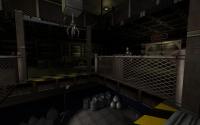
But you're spot on with monster placement. It was used very cleverly. Not just Liztroops first, Pigcops second, Enforcers third, Bosses before the end etc. In fact, most of those maps used a specific set of enemies, and didn't mix them too often. For example if you look carefully, out of the 40 retail maps, only 1 (yes, ONE, and that is Raw Meat) use all the 4 basic enemies (Liztroop, Pigcop, Enforcer, Octabrain) in escalated numbers (more than 3 from each in Let's Rock skill). In most user maps, they are used frequently in big numbers, which often give the actual map a pedestrian, generic feel, even if it looks fantastic otherwise, and has neat effects.
The use of respawn was also very clever in the original levels. They're not just used in places with a keycard or a button, that opens a door somewhere else. They spiced up the gameplay a lot with an unique, and sometimes surprising use. Like the pigcop that spawned behind along with a trapdoor sound in the start of Death Row. Or the simple RPG ammo room that spawned a Drone and an Enforcer in the start of Warp Factor. Or the Enforcer that jumps at you at the start of Raw Meat, and two more as you goes inside. Or the two Newbeasts that spawn in the air to fall in front of you in Derelict. Or the 3 Pigcops that explosively spawned in front of you in RLD. And so on. These minor things are quite rare these days. There are some nice touches here and there in usermaps. For example I liked when the Enforcers spawned at the start of Construction Destruction (Duke Hard level 3) in the window cleaner platform. Or Red 3 have an excellent enemy placement overall including Commanders in unreachable area, or the last couple of levels of LRWB episode 2 had a great use of them, with a great mix of Drones/Newbeasts/Turrets/Slimers. But it could be more...
Also, am I the only one who thinks the Sentry Drones are underused? Just look at E2 and even E3, and compare that to user levels. I think the original mappers snubbed them in E4, because back then the roaming sound often crashed the game, not because these things sucked.
#11 Posted 12 July 2014 - 02:02 PM
#12 Posted 12 July 2014 - 03:34 PM
The main pitfall is making the jumping too difficult. I would give the player a lot of room for error.
#13 Posted 12 July 2014 - 05:51 PM
#15 Posted 06 August 2014 - 12:27 PM
#16 Posted 06 August 2014 - 12:38 PM
Also Geoffrey's dm map "Dm_ducts" uses it a lot.
BTW I thought this kind of stuff was only possible in Build but I just learnt it's also possible in some other games like Marathon.
#17 Posted 08 August 2014 - 05:17 AM
This post has been edited by Duke64Nukem: 08 August 2014 - 05:19 AM
#18 Posted 19 August 2014 - 06:04 PM
Unused doors. This is over-used.
There's plenty maps where you find tons of decoration doors, and of course, you'll try them. And Duke is always grunting, no matter is wall or a decoration door.
I would like to see more people using external sound effects, there's plenty unused voc files that can be easily added without affecting the game. And there's tons of SFX databases with samples that can be used, in this case, locked doors. A different sound when you tries to open it would be awesome, as well you see in many games. Just a few mins at pond5.com for example and I got many cool samples:
https://www.pond5.co.../lock-door.html
https://www.pond5.co...0/doorlock.html
https://www.pond5.co...1/doorknob.html
https://www.pond5.co...4/doorknob.html
https://www.pond5.co...3/doorknob.html
https://www.pond5.co...-s011fo226.html
https://www.pond5.co...-s011fo238.html
Or even a "half life locked door" sound : http://fastdlcstrike...ons/button2.wav
People should use these, or less unused doors.
#19 Posted 19 August 2014 - 06:11 PM
#20 Posted 20 August 2014 - 06:31 AM
Shadow Warrior does it differently, it has a sprite that says "NO ENTER", it wasn't used for doors in the original game, but in the last map of Wanton Destruction they used it on doors that can't be opened, so you don't even have to press use on the door to know you don't have to bother with it.
#21 Posted 20 August 2014 - 06:59 AM
IMO there are usually a few tells that can help people out. For example, if there are a bunch of doors that are close together and look identical, and one of them doesn't open, then chances are they all don't open. If one of them does, the mapper should put a visual cue to indicate this.
#22 Posted 20 August 2014 - 08:33 AM
#23 Posted 22 August 2014 - 06:35 AM
AFAIK the only original level which used decorative doors was Duke Burger. I remember I was really confused by them back in those days.
This post has been edited by Nancsi: 22 August 2014 - 06:36 AM
#24 Posted 22 August 2014 - 09:18 PM
On the topic of doors though, the Moonbase Alpha and Moonbase Beta maps are both very good about making sure all areas you can explore are worth your time and that every door can be opened.
This post has been edited by Colon Semicolon: 22 August 2014 - 09:20 PM
#25 Posted 23 August 2014 - 04:23 AM
Nancsi, on 22 August 2014 - 06:35 AM, said:
I think it's a fine line: you don't want to have too many unreachable locations, because that would suggest the map is very open and big while it really isn't. I've played several maps where the huge amount of invisible barriers were really disappointing, so many locations that looked inviting turned out to be unreachable. On the other hand, I wouldn't want go back to 3DR-styled grey concrete walls either. I prefer to add at least some hint of a larger world outside of the player area, it makes a level so much more immersive when used properly.
As for the original question:
- viewscreens showing some previews of what lies ahead. It's still used, but not very much. I thought this was always a nice touch in the original maps.
- cool secret areas. The roch maps always had great secret areas that were worth finding, not many mappers seem to bother with adding those anymore. (and I don't mean a poster that hides a small room with steroids, I mean proper, well thought out locations).
As for the jetpack: I'm always reluctant to use those, since they can so easily break progression. Especially in my levels, since Y-axis progression always plays a huge part in those. And I think having to climb your way up is more interesting then simply using a jetpack.
This post has been edited by Merlijn: 23 August 2014 - 04:24 AM
#27 Posted 23 August 2014 - 06:14 PM
zykov eddy, on 23 August 2014 - 05:29 PM, said:

i can find you several hundred pre-1999 maps that over-use this tile & that's why there's a stigma against it
This post has been edited by Forge: 23 August 2014 - 06:15 PM
#29 Posted 23 August 2014 - 07:05 PM
Also, it would be nice to have more classic style, dark, moody space station maps.
Seems that 95% of the maps released these days are city maps.
#30 Posted 23 August 2014 - 07:50 PM
This post has been edited by Mark.: 23 August 2014 - 07:50 PM

Help
Duke4.net
DNF #1
Duke 3D #1


