Doom Corner "for all Doom related discussion"
#33 Posted 29 March 2014 - 09:46 AM
#34 Posted 29 March 2014 - 01:48 PM
Jimmy, on 28 March 2014 - 06:14 PM, said:
It does not. That link only has links to version 1.2 which is now old.
Cage, on 29 March 2014 - 09:46 AM, said:
Noted. Storming that Japanese/Chinese castle up on the cliff looks to be great fun.
This post has been edited by RunningWild: 29 March 2014 - 01:51 PM
#35 Posted 29 March 2014 - 01:55 PM
RunningWild, on 29 March 2014 - 01:48 PM, said:
He told you it's called HacX 2.0. The DRD Team link is the second result for the search term "doom hacx 2.0".
#36 Posted 29 March 2014 - 02:04 PM
Jimmy, on 29 March 2014 - 01:55 PM, said:
That's different from a link. I asked him since he posted the images so I don't know why you're choosing to take issue with it. I've searched in the past for this upon discovery and found nothing. The actual site for HacX notes that their forum server was taken down at one point, so this is probably why.
Quote
Hacx is still in production. Unfortunately, we lost the old forum for those of you who may have been keeping track of the team's project. DRDTeams has been nice enough to offer us forum space for continued chatter and development on the new versions of Hacx. Since DRDTeams is a Doom community, this new forum should promise to be much more active. See you there!
This post has been edited by RunningWild: 29 March 2014 - 02:07 PM
#37 Posted 29 March 2014 - 02:05 PM
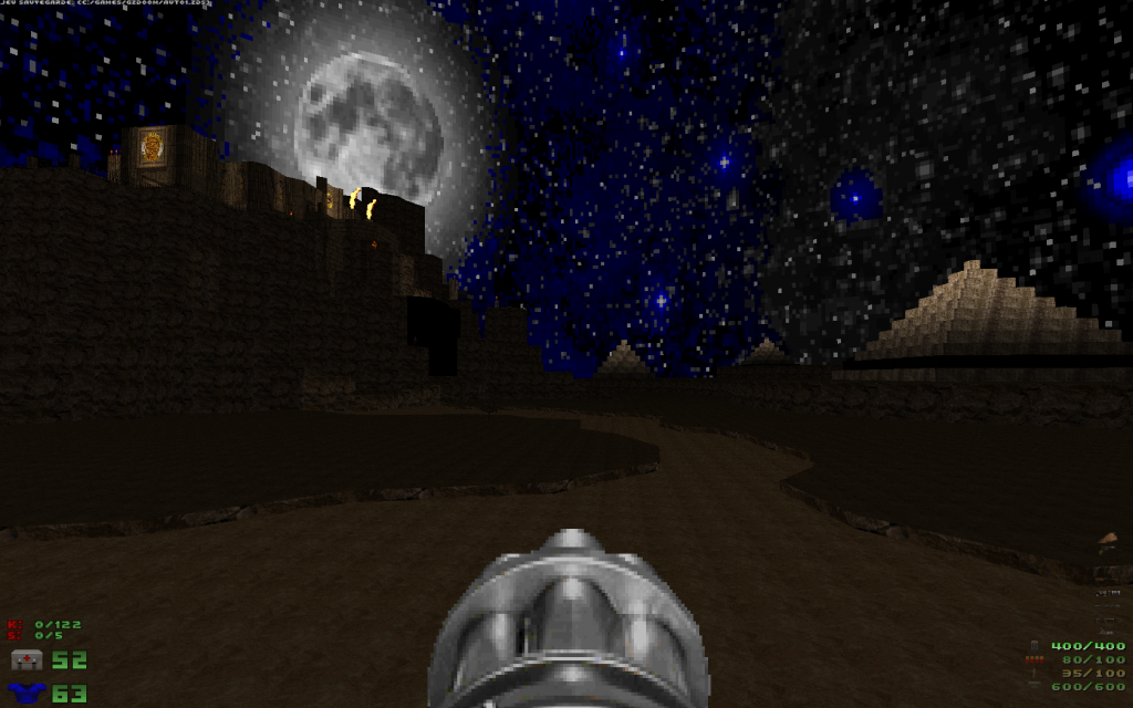
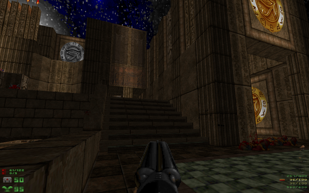
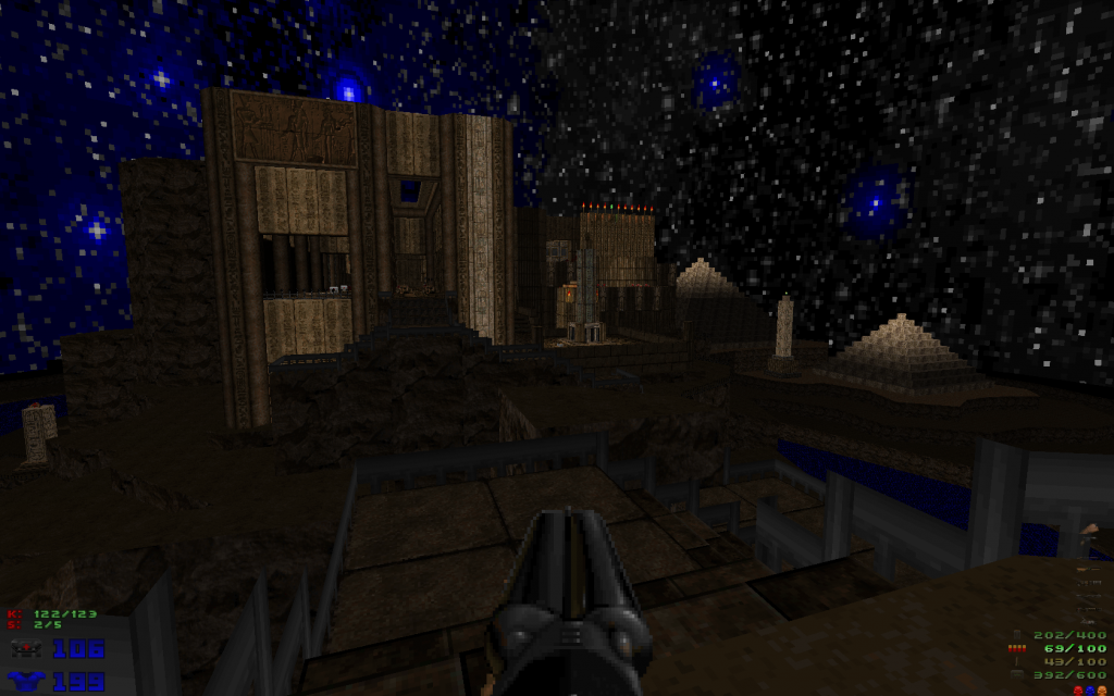
So instead I kept playing Deus Vult II, and holy shit was this map awe-some.
#38 Posted 29 March 2014 - 02:14 PM
This post has been edited by RunningWild: 29 March 2014 - 02:22 PM
#40 Posted 01 April 2014 - 01:34 PM
#41 Posted 02 April 2014 - 12:09 AM
#42 Posted 02 April 2014 - 12:51 AM
Tea Monster, on 27 March 2014 - 02:43 PM, said:
Good job, but they are quite different from the originals.
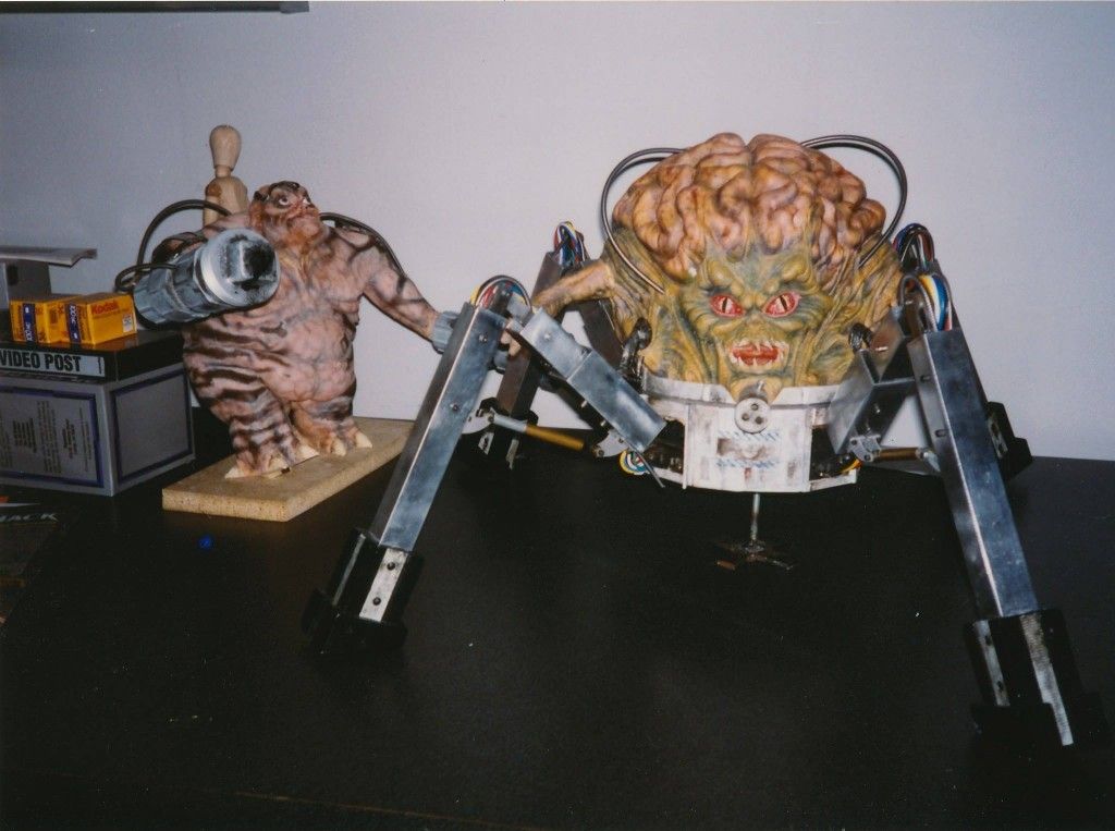
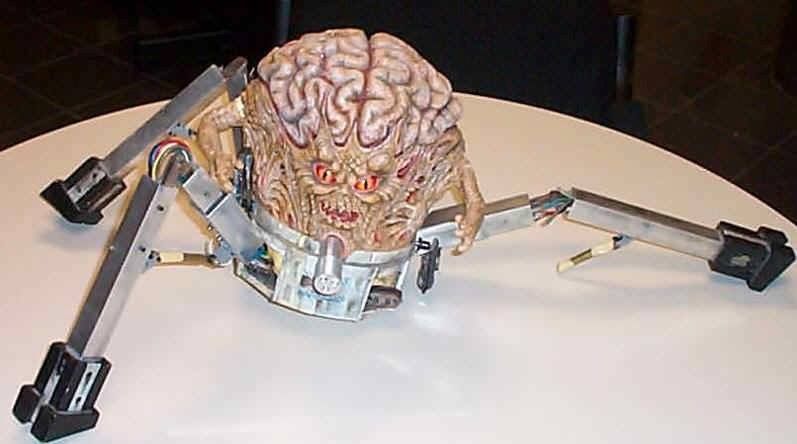
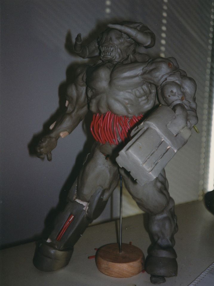
Here are some pictures of the Spider Mastermind clay model that was photographed to make the sprites. The chaingun and articulations are a bit different.
And here is a high resolution image of the Astral Dreadnought.
This post has been edited by Fox: 02 April 2014 - 12:57 AM
#43 Posted 02 April 2014 - 04:16 AM
#44 Posted 02 April 2014 - 08:49 PM
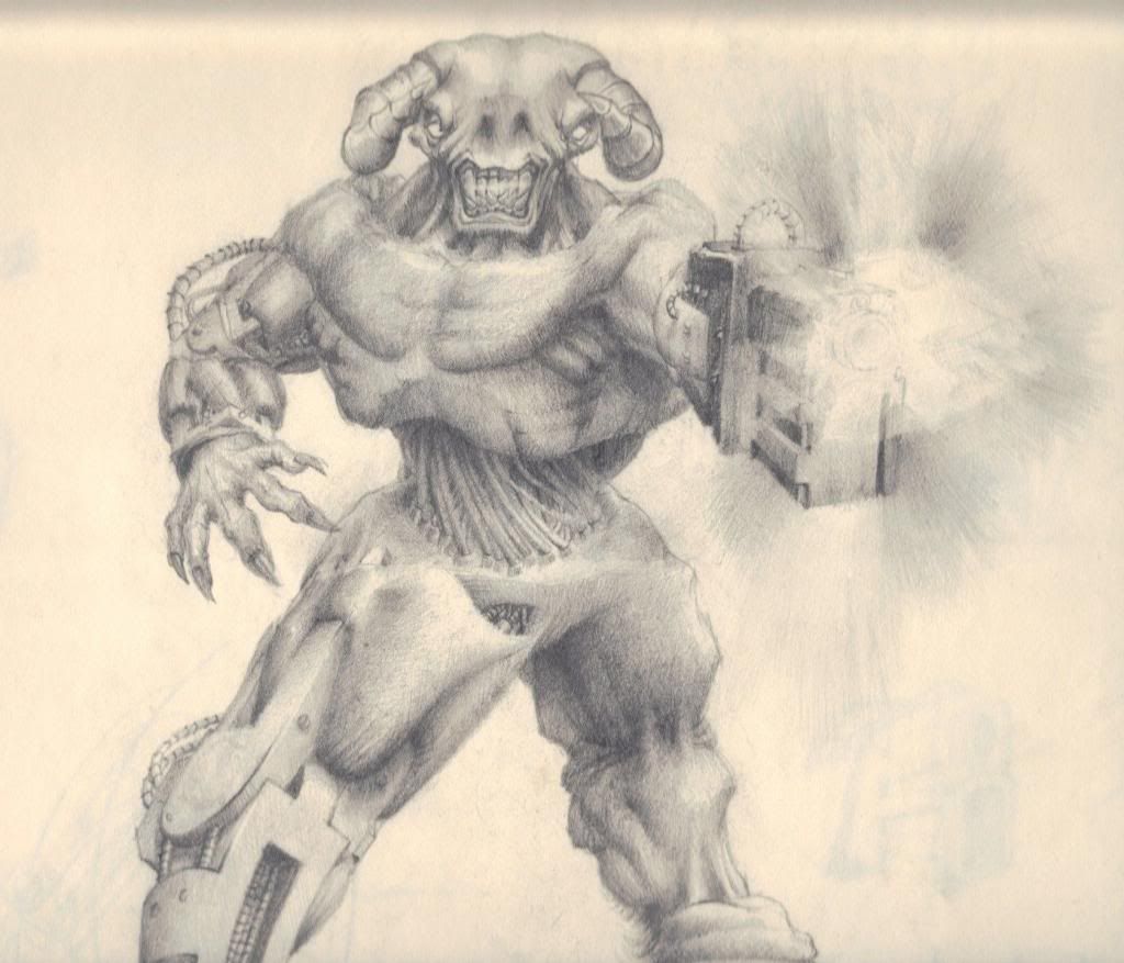
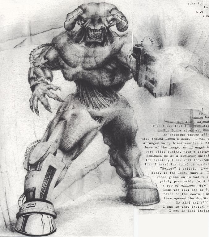
I see in Tea Monster's Photobucket that he is making a Cyberdemon model too. Despite Doom II title screen, Cyberdemon's sprites and model doesn't have a nose, just nostrils.
Cyberdemon original sketch and unfinished model:
#45 Posted 03 April 2014 - 05:48 PM
#46 Posted 03 April 2014 - 07:52 PM
#47 Posted 03 April 2014 - 08:01 PM
This post has been edited by MetroidJunkie: 03 April 2014 - 08:03 PM
#49 Posted 04 April 2014 - 01:21 AM
MetroidJunkie, on 03 April 2014 - 05:48 PM, said:
Jesus that just looks terrible. Both in terms of looks and gameplay. So out of place.
Also I just don't see the point, if I wanted to play Mercenaries, there is enough mercenaries to play in between RE4 and the DS game.
#50 Posted 04 April 2014 - 01:58 AM
Normally, I try to use the sprite as a guideline. I've got those pics of the Spider Mastermind. I hadn't noticed the side pipes. I'll put them in. I thought that it looked rather like the model was kind of falling apart to be honest with you, with those animation connectors poking out of the bottom shell where the legs connected. Also, the shell is very very plain, with just some blue stripes on it for panel detail. For the legs, I've gone with the added details of the sprite which has black (plastic?) caps on the top of the legs to cover those wires poking out on the model.
My usuall approach to thsese things is to say to myself "What would they have done if they had today's tech when this was first made?" I don't usually want to stick slavishly to the sprites, I like to add some extra detail, if only just to add stuff that you could imagine was there (panel details, muscles, etc) that you can't see due to the resolution of the sprite. I also try to make the anatomy as realistic as possible within the confines of what sort of creature it is. I keep wishing I'd put proper 'goat's legs' on the Cyberdemon as trying to get those backward bendy legs to look like they actually have working muscles and bones inside is a pig. I imagine that trying to animate them is going to be a complete pain in arse.
So normally I don't tend to shy away from what I would think of as an 'upgrade'. I've got a partner on this who is like you in that the sprite is the last word so I've toned it down for this pack. I wanted to give the pinky demon some decent teeth and he wanted the old 'tombstones'. I thought it looked just rediculous like that so we compromised on something in between.
#51 Posted 04 April 2014 - 02:13 AM
MetHy, on 04 April 2014 - 01:21 AM, said:
Also I just don't see the point, if I wanted to play Mercenaries, there is enough mercenaries to play in between RE4 and the DS game.
He's done some other 'interesting' mods.
#52 Posted 04 April 2014 - 02:23 AM
Donkey Kong? In Doom? I think it would be more interesting to have him chucking Imps off the top of the building. I can just see a level of that with him on top of the Empire State building, trying to fend off circling cacodemons!
#53 Posted 08 April 2014 - 01:38 AM
Malgon, on 02 April 2014 - 12:09 AM, said:
Ah didn't see this post. I actually gave up on this wad because I couldn't figure out what to do in the unholy cathedral. I went to both aisle of the cathedral, pushed some buttons, even went up to the bell tower and killed the cyberdemon and then killed the couple of new bosses (the red flying barons). After that, I'm clueless or what to do and been turning in round for ages. Do you remember what you did?
I also gave up because, while looking for what to do (which I didn't find) I found out that the wad seemed to turn into what looked like badly made slaughterfest, so I decided it wasn't worth it (but the start of the wad is definitly great)
#54 Posted 08 April 2014 - 01:02 PM
Fox, on 02 April 2014 - 12:51 AM, said:
Here are some pictures of the Spider Mastermind clay model that was photographed to make the sprites. The chaingun and articulations are a bit different.
And here is a high resolution image of the Astral Dreadnought.
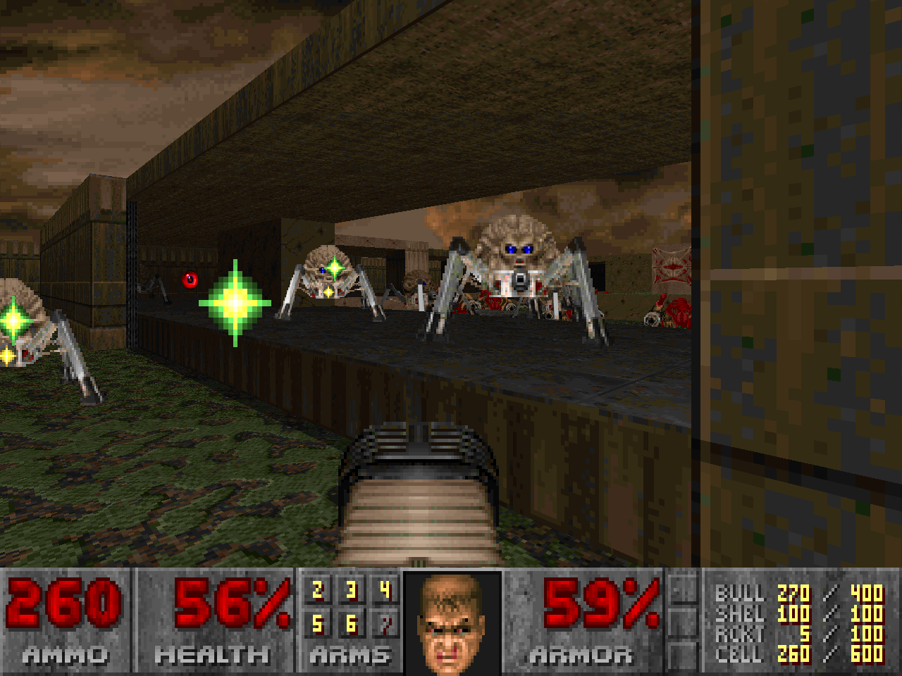
Tea Monster's model looks more like the Arachnotron. Perhaps that's what it's supposed to be? (EDIT: NVM, The eyes on his are red like the Mastermind's... A few little tweaks could make a perfect Arachnotron however.)
This post has been edited by StrikerMan780: 08 April 2014 - 01:27 PM
#55 Posted 09 April 2014 - 02:18 AM
MetHy, on 08 April 2014 - 01:38 AM, said:
I also gave up because, while looking for what to do (which I didn't find) I found out that the wad seemed to turn into what looked like badly made slaughterfest, so I decided it wasn't worth it (but the start of the wad is definitly great)
Just give me a bit and I'll work out how I got through this for you.
Edit: Okay, here we go. I don't think there is a specific order you have to do things in order to complete the level, but I'll give you a rundown of what can be done to get through it. Some of this you may have already done, as you mentioned fighting the Cyberdemon and the Balrog (red flying barons), although it's possible you just did them in a different order to me. Just in case you haven't done it yet, you will need to access the cathedral area to obtain the red key, as this is essential to getting past the first lock at the exit. After that you can get either the blue or yellow key, or both of them if you like finding all the items.
To get into the cathedral area you'll need to lower the barriers which are blocking access to it. These can be lowered by stepping on the star symbols seen below:
(Please note that the symbols are red when they are not activated, and turn black once activated)

From what I have read there are 16 symbols in total throughout the level, but you only need to step on 9 of them in order to lower the barriers.
Once inside the cathedral area you will need to shoot the 2 small square buttons on the organ keys:

This will then bring the barriers back up, trapping you within the cathedral. Prepare for a huge fight with an exorbitant amount of monsters.
In the area directly behind the organ you can see the red key located above you:

Two doors will open either side of the key at a specific point in the battle, allowing you access to the key:

The doors seem to open once the wave of Lost Souls appears above the organ. The barriers should also drop back down allowing you some breathing room to get out of the congestion.
Another area which I'm not sure is essential, but may still be important in opening up previously blocked areas, or allowing you to locate enough of the floor symbols to get the cathedral to open, is through the cross below:

Just fire your weapon at it and it should open for you:

The blue key appears at the mouth of this entrance, after you have first entered into the area behind it:

I can't seem to find the yellow key for you yet, but I'm guessing it only appears like the blue key does after fighting a particular battle or completing a certain sequence of events. I'll let you know once I go back through the level more thoroughly and figure it out. If you still get stuck, or want to know about the exact locations of these screenshots, then let me know. Hope this helps to point you in the right direction!
This post has been edited by Malgon: 09 April 2014 - 05:30 AM
#56 Posted 14 April 2014 - 08:16 AM
Cage, on 24 March 2014 - 12:48 AM, said:
Supplice's visuals are awesome, and the custom textures and sprites look amazing. So do the monsters, but some of them seem to be edits of the original ones from the vanilla game. Do the developers aim to create a megawad that is made of 100% original content?
Anyway, the project is very nice, and also yay for MBF compatibility
#57 Posted 14 April 2014 - 03:29 PM
MrFlibble, on 14 April 2014 - 08:16 AM, said:
I'd love to, no idea if I'll manage though. When it comes to "low-tech" first person shooter graphics, monsters require the most work. I'm slowly working on monsters for Hacx 2.0 and I'm slowly building a workflow, so the chances of custom monsters in Supplice are getting higher!
MrFlibble, on 14 April 2014 - 08:16 AM, said:
Actually, keeping MBF compatibility really started to gave us a lot of headaches, so the project is likely to migrate to ZDoom/Eternity Engine dual compatibility. Don't worry, the idea behind Supplice is pretty much a classic Doom experience, so don't expect any crazy features - we're just going to use superior scripting instead of hackjobbery and custom in-game story texts (Impossible in MBF iirc)
This post has been edited by Cage: 14 April 2014 - 03:30 PM
#58 Posted 15 April 2014 - 03:32 AM
Quote
Would you consider doing a tutorial on that at some point in the future? Either that or maybe even just a video recording of you doing a single frame would be pretty neat/useful!
Quote
As Cage said, fully original monsters are the hardest asset to create for a 2D game. It's not a suprise that the majority of new enemies are either edited from originals or spliced together from different sprites (or taken from other games)
This post has been edited by James: 15 April 2014 - 03:34 AM
#59 Posted 16 April 2014 - 07:54 AM
Cage, on 14 April 2014 - 03:29 PM, said:
Cool, good luck with your work!
#60 Posted 16 April 2014 - 10:43 PM
Which is why HD sprite projects never go forward. And really, I think lowres 2D sprites still look fine to this day. Quake's models aged much more terribly compared to preceding games' sprites.

 Help
Help Duke4.net
 DNF #1
 Duke 3D #1


