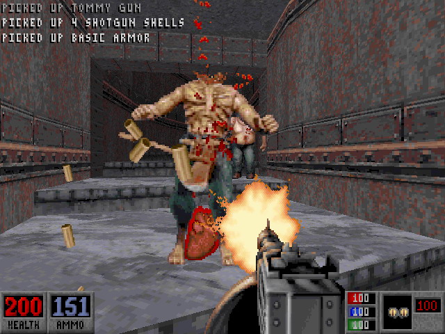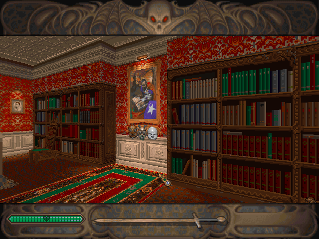
HUD "Pick your favourite one from poll"
#1 Posted 10 October 2012 - 11:38 PM
In good old times when I used to play dos Duke I always choosed classic minimal hud. I know that it was missing armor and keys informations, but I found it much more handy that clumsy full hud that covered entire bottom of screen. I never liked fact that it limited my vertical view and hid portion of my selected weapon.
But after Eduke32 added its brand new modern hud, I quickly scrapped old minimal hud and never returned to it. It finally solved all problems of classic minimal hud (displaying keys and armor) and it didnt obstruct my view.
So what are your opinions?
#2 Posted 11 October 2012 - 04:41 AM
#3 Posted 11 October 2012 - 04:57 AM
This post has been edited by Jinroh: 11 October 2012 - 04:57 AM
#4 Posted 11 October 2012 - 06:26 AM
 DustFalcon85, on 11 October 2012 - 04:41 AM, said:
But that means you never tried Eduke32, right? Because modern is default. It is the one you get when you run Eduke32 first time. For others (full, minimal and none) you have to change settings in game options.
 Jinroh, on 11 October 2012 - 04:57 AM, said:
IIRC (from beta version of Fox's mod, I never had luck to play real one) Duke 64 hud has one little weakness - every time you want to check armor strength you have to select it as inventory item.
BTW - In generally do you prefer minimalist or more elaborate huds? I always had dillema in HeXen II - whether to choose that nice big detailed hud with gargoyle heads at sides or simplistic one with blue and green boxes.
This post has been edited by t800: 11 October 2012 - 06:26 AM
#5 Posted 11 October 2012 - 06:48 AM
 t800, on 11 October 2012 - 06:26 AM, said:
Yes this is true, though I never really check armor so I never really notice it. Though when I play the PC Duke, I always use the full HUD. PC games I usually use the full HUD like Shadow Warrior, Blood, Duke, but I liked the minimal HUDs in Duke Nukem Advance and Duke Nukem 64. Don't really like the PC one though.
#6 Posted 11 October 2012 - 07:03 AM


Shame it doesn't show which keys you have though.
#7 Posted 11 October 2012 - 07:18 AM
This post has been edited by Jinroh: 11 October 2012 - 07:19 AM
#8 Posted 11 October 2012 - 09:13 AM
 Loke, on 11 October 2012 - 07:03 AM, said:
Shame it doesn't show which keys you have though.
IMO this would be much better.

#9 Posted 11 October 2012 - 09:48 AM
#10 Posted 11 October 2012 - 09:53 AM
I loved Realms of the Haunting's HUD. It gave it a cinematic quality (widescreen) while not providing the thread of looking like a generic FPS.

This post has been edited by s.b.Newsom: 11 October 2012 - 09:55 AM
#11 Posted 11 October 2012 - 10:00 AM
#12 Posted 11 October 2012 - 02:28 PM
I do think using no HUD at all can be fun, especially in Deathmatch. It adds more realism to the game. You'd not know how much health or armor you have left, and if you suck at math you'd not know how much ammo you have either.
I think the Blood max HUD was a leftover from the last build in which they had the Beast Mode.. I think the bar with the version number was originally something else (a meter), and when you entered beast mode the 2 beast heads would have glowing red eyes or something, though this is not at all proven, I just really believe it to be the truth. I mean, why would you need to know what version you are playing while playing the game?
This post has been edited by gerolf: 11 October 2012 - 02:32 PM

 Help
Help Duke4.net
 DNF #1
 Duke 3D #1


