Duke4.net Forums: [RELEASE] Launch Facility - Duke4.net Forums

Jump to content

  • 2 Pages +
  • 1
  • 2
  • You cannot start a new topic
  • You cannot reply to this topic

[RELEASE] Launch Facility  "E1L6 remastered version"

User is offline   brullov 

  • Senior Artist at TGK

#1

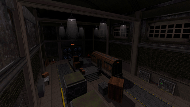
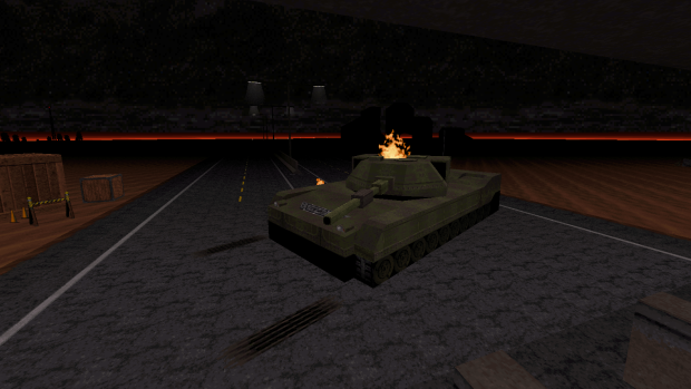
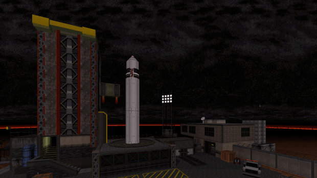
Launch Facility is a remastered version of the original E1L6 secret level. Fight back aliens who captured a spaceport, destroy the infected rocket and find a way to the Abyss!


Posted ImagePosted ImagePosted ImagePosted Image

Download

ModDB

My Twitter

23

User is offline   Polunka 

#2

Damn, such a good remake of the original for sure. The general look of it (including the improved realism of locations and increased attention to detail) and the atmosphere (achieved in part with help of the awesome cover of The Call Of Death, which I'm now having played in the background in a loop because of how much I liked it) kinda reminded me of the first Half-Life (or maybe I've just been playing too much HL lately). I kinda wish someone remade the whole episode in such a manner but that's a tad too much to ask, I guess :rolleyes:

I would also like to report a small glitch (in case it indeed is a glitch). One of the secrets (the pipebomb secret) appears to be unreachable without a jetpack, which I didn't find throughout the map despite looking thoroughly enough, tho I still could miss it. Moreover, you made it to actually register as 2 secrets (both sectors in it have the secret lotag). See the first attachment pic to understand.
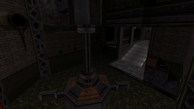
Also, there's a strange one-sided pipe sprite which looks out of place and seemingly accidentally put there. See the attachments 2 and 3.

Thanks for making this map, I enjoyed playing it a lot. It's also nice to see decent mappers like you return to Duke3D from time to time :dukeaffirmative:

Attached thumbnail(s)

  • Attached Image: capt0000.png
  • Attached Image: duke0000.png
  • Attached Image: duke0001.png

2

User is offline   Fox 

  • Fraka kaka kaka kaka-kow!

#3

Very inspiring
1

User is offline   jkas789 

#4

Congratulations on the releases brullov! Also cool trailer mate. :D
1

User is offline   NNC 

#5

The looks are indeed very inspiring and of course the 25 years in Build engine mapping improvement can be seen here, but it also highlights a big issue most modern maps suffer at: better details often confuse the player where to go next, as modern, more detailed FPS games usually hihglight the path (in a very linear way), while in old games like Duke, every detail had a proper meaning, ie. a door means you can push it, and go through it, if you grab the key, the path after is obvious, even if the layout is slightly nonlinear (actually E1 is the most linear episode in Duke, and the most modern in many ways). Even if framerates hadn't been an issue, George would have asked several changes for this map.

First of all, doors. There are way too many fucking useless fake doors, it's unsettling even if you know the layout by heart. The whole gameplay felt like: push the door, it's fake, push the door, it's fake, push the door, it works, a liztroop appears, push the door, it's fake. You can't even tell which doors were fake, and which were real, it's just completely random. If I didn't know the layout, I would have lost quite badly around the window where you activate the rocket with the blue key. Even the original was slightly tricky here, despite being extremely obvious, this time you have to find a random door far far away in the door maze. This place only works because the map is a remake, so we are expected where to go.

Also the map has lots of meaningless Build porn, ie. a control room of sorts next to the rocket entry where you can look inside, but it's just another fake place. The tank is there as well, but it has no function. IMHO design should focus on functional things, not random eyecandy. The secrets also don't work in this version. In the original, you can see very well the vent above you (and it was buggy, originally you didn't need jetpack there before v1.5 release), now, it's just one of the many little details, and the reward finding it is extremely small.

And the gameplay: the map played incredibly dull, monster placement was nerfed (yea, a single octabrain guarded the final nukebutton, unlike in the original), and the retail version monsters were added for all the wrong reasons. In every Allen Blum map, monster placement was a work of art (and in most Levelord maps too), not just a small wave of drones first, a small wave of enforcers second, etc. It just felt user mappy, and it didn't have the punch of the original.

Sorry to be mean (again), but despite your incredible efforts on the visuals, which is indeed very good, this is a miss for me. Soundtrack was awesome though, that was the best part easily.
3

User is offline   brullov 

  • Senior Artist at TGK

#6

Thank you guys for the feedback!

@Polunka

Unfortunately, I had to remove the jetpack, because of TROR glitches. I forgot to remove that secret area and it stays now as an easter egg I guess. Posted Image

@The Watchtower

Fake doors are up to personal taste IMHO, I used them to add a bit of adequate realism: the original map looks too much rushed and abstract compared to other original levels in the episode. Too sad such a thing pissed you off and prevented enjoying the gameplay. I hope you read the readme.txt and played it on CGS.

Spoiler

As for design that lacks functionality. I wish I could implement a working tank! Duke doesn't have a good stock effect list (e.g. Blood and SW have way more opportunities for the interesting gameplay mechanics). Fake places are boundary breaks, using them level starts looking way bigger and alive, realistic. It's just a common psychological trick in level design.

All in all, it's just my vision of the map and your feedback sometimes sounds like I've completely removed the original one. The E1L6 is the best version with all its benefits and disadvantages and direct comparison is not an aim for this level.
4

User is offline   NNC 

#7

I actually agree the original wasn't up to the episode's standards, probably it was the reason it was relegated to a secret. However I still don't like fake places/doors, because I don't see the realism in them, they feel more like window shopping, if you know what I mean. LR is my usual first playthrough, but even that skill seems silent compared to the original LR.
0

User is offline   brullov 

  • Senior Artist at TGK

#8

 The Watchtower, on 21 December 2021 - 03:06 PM, said:

I actually agree the original wasn't up to the episode's standards, probably it was the reason it was relegated to a secret. However I still don't like fake places/doors, because I don't see the realism in them, they feel more like window shopping, if you know what I mean. LR is my usual first playthrough, but even that skill seems silent compared to the original LR.


In Discord, Sangman told me a great solution — using a different texture for the fake doors. I will use this technique in my next projects and this thing won't be annoying anymore. Live and learn! Posted Image
2

User is offline   MC84 

#9

Very nicely done! As others have said, the artistic design/texturing is top notch. I see that unlike your fallout freeze map you used vanilla duke tiles exclusively, but your innovative use of them made the map really stand out. I had a few minor glitches (the spritework above the kitchen, and some of the background scenery behind the rocket from the blue card room) but I enjoyed the map.

I like reading Watchtower's critiques in general, as he has obviously spent a bit of time mulling these things over. I'll say that the gameplay/combat wasn't groundbreaking, but I suspect that this wasn't really the intention of the map. I suppose if someone wanted to be very harsh they could just say that your map is lots of nice set pieces sprinkled with a bit of combat and a few switches to activate. But even still - I don't really see anything wrong with that. I guess we all play 3d shooters for different reasons, and I enjoy the exploratory aspect of maps like yours. I take my time, I enjoy looking at all the cool visuals, and so long as the combat doesn't piss me off and I don't get stuck wandering aimlessly through the level I'll see it through to the end. For the record, I can barely remember the original (apart from the sewer bits and the main rocket setpiece) but I didn't get stuck for even a moment in your map. It flowed in a straightforward manner.

As for the critique about 'pointless build porn' well I interpret all these things as 'environmental storytelling'.. I actually think the tank broken down by the entrance was really well done; implying that the military had tried to intervene in the situation and failed miserably. All of the vehicles and things you constructed felt appropriate to the map. Keep it up - look forward to the next release!
2

User is offline   LakiSoft 

#10

Best... Level... EVER! Keep up good work Brullov. :D
2

User is offline   Sangman 

#11

 brullov, on 21 December 2021 - 10:17 PM, said:

In Discord, Sangman told me a great solution — using a different texture for the fake doors. I will use this technique in my next projects and this thing won't be annoying anymore. Live and learn! Posted Image


To be more precise (and for those who don't read Discord), I brought up a thing the Doom mod Blade of Agony does. In that, (almost?) all decorative doors have a grey colour and all actual doors are brown. It's a middle ground inbetween making a place feel larger while making navigation not too confusing. Worked well IMO
4

User is online   ck3D 

#12

My solution for a while has been to mark my fake doors with a hidden switch all playing the same 'locked door' type of sound (usually the pistol clip sound that sounds like a door handle) when the player attempts to open them. That's usually enough to make the player feel like their effort of checking out that door was appreciated and considered and not as in vain as pressing any other random wall in the level that generates the generic 'ugh, ugh, where is it?'; even more so if you re-use that switch to trigger small-time bonus events or secret places. It's not deception if your action amounts to even as little as a specific sound cue, and an indicator doesn't need to be of the visual type to work. Fake doors can exist but should be treated in advance as a special level feature worth some attention because that's just what it's bound to be going to get from the player by pure design. Then if anyone ends up doing that, I'd argue it's important to consistently re-use the same sound within the same map or episode, otherwise you're really just embellishing nothingness and not creating a recognizable pattern.

Map looks absolutely stunning, concept is great and so I'll add it to the queue of Duke stuff I really, really need to find more spare time to play.

PS.: I still remember that phase in Duke 3D mapping back when marking your fake doors with wall-aligned sprites was a thing. Must have been the mid-00's - I remember so many mappers at the time who would do that, so that whenever a player would spot a door with sprites on them, they would (supposedly) understand that said door couldn't be opened and thus was purely decorative right off the bat. But I guess knowing sprites on doors don't really work is mostly mapper knowledge and so that trend died as soon as most authors realized the logic didn't translate to everyone.

This post has been edited by ck3D: 22 December 2021 - 07:33 AM

4

User is offline   Merlijn 

#13

I usually try to add something distinctive to fake doors, usually blood splatters or some kind of visible damage. But I've been cutting down the number of fake doors in my maps anyway, like Sang said it's about trying to find a middle ground. :)

Back on topic: this map looks frigging fantastic! Regardless of taste, it's cool to see someone make such a modern, realistic looking interpretation of a classic. If this map was redone on a modern engine, I'd imagine the layout would be quite similar to this. As a fellow mapper I must praise the great usage of textures and all the nifty little tricks that went into this (I especially love what you did with the sky in the background, really cool idea). The level of detail is impressive to say the least. I had to play on classic mode and yeah you'll see some graphical glitches but nothing that ruined the experience for me.

I played on CGS and combat was solid all the way through, actually the outdoor fights were more challenging than the original (at least from what I remember).
Spoiler
.

I do get where The Watchtower is coming from, this is pretty far removed from the original design and the philosophy that comes with that. And the level of detail does have some drawbacks, for instance the environment feels a bit more static compared to the original game and finding secrets is harder because there's so many extra panels and doors to try out. But you set out to create a modern version of Launch Facility and you succeeded IMO. Thanks for the early Christmas present! :)
3

User is offline   Mark 

#14

Always the rebel, I played with the HRP. My test folder uses by it by default. I resisted the urge to leave the Polymer box ticked and played in Polymost.
Looks fantastic and I'm guessing I'm about half way thru the map.

I'm used to a certain amount of doors that don't open and unplayable areas for eye candy. I have both in my projects so I found that to be no big deal. Once again I bow to a master of sprite constructs in a map. I thought the amount of detail was good. My only minor complaint is not having blocking around tables, counters, etc... in tight places. I prefer the player to stay on the floor instead of unintended jumps on top of stuff. Unless of course its needed to progress thru the map.

Great job.

This post has been edited by Mark: 22 December 2021 - 11:57 AM

2

User is offline   NNC 

#15

When we talk about fake doors, we should imagine the place for real and even check the map on the 2D plane. Are those doors hiding actual rooms that can make sense construction wise? For example in High Times, which is an uncharacteristic Blum map, we see some fake doors outside that couldn't hide anything, because the coffee shop and the toilet is on the other side. A rare error from the master. Also no such facility in real life has so many doors with functional rooms behind, unless it's an office building with offices or something like a hotel or hospital, when they separate many similar rooms from the main corridor. We shouldn't forget that people use these facilities, and like we, Duke players, who are navigating ourselves in these stylized locations, they prefer clear and navigable places, and wouldn't be happy with such a maze of a construction. Especially a place with lots of toxic and other dangerous stuff, the locations have to reach some safety standards. But that's just a small addendum to my earlier post.

This post has been edited by The Watchtower: 22 December 2021 - 01:02 PM

3

User is offline   Jimmy 

  • Let's go Brandon!

#16

Short disclaimer: I still don't have a PC and I can't play this. But I did watch Radar's playthrough on YouTube (which is unfortunately in AMC TC but I don't think that affects what I'm going to say.)

It's a very well made map, hands down. You can tell a lot of work was put into it. But unfortunately, I'm not sure how much thought was put into it. For a remake, it follows the original map too closely to build its own personality. In places where it should diverge and do it's own thing (like the aforementioned nonsense toxic pools and stuff I have a hard time believing would actually be in a launch facility) it just doesn't. I feel like the overuse of closed doors in the beginning of the map is an attempt to add detail to a place that didn't make any sense to begin with (no fault of yours.) Some of the new areas like the mainframe room are a great idea and stand out. It's an improvement over something like Hollywood Holocaust Rethinked, which I think isn't worth playing because the good areas are just less good versions of areas already in the original map, all of the new stuff is not needed and forgettable. This map has some standout value on its own, but I can't help but wish it went further and did it's own thing. This is why the ending is so anticlimactic and lackluster. The usage of enemies not from Episode 1 (including the Battle Lord mini boss) is a further attempt to up the ante I think, but falls flat. You deserve accolade for the effort, but I think you are capable of much more. People should play this, if only so they're wondering what you'll do next. This map shines as an example of Build Porn, the subtle usages of TROR, clever texturing, perfectly designed sector vehicles, and appropriate sprite work stand out.

This post has been edited by Jimmy: 22 December 2021 - 03:25 PM

2

User is offline   brullov 

  • Senior Artist at TGK

#17

Thanks for the feedback guys!

I'd like to sum up that making any sort of remake is not interesting for me anymore. I understood this during the last 6 months working on this map, there are stupid limits I can not go beyond and no matter how you make the remake it will still be your personal vision unless you are the original content creator. I'm also tired of Build Engine. It's very dear to my heart, but TROR glitches and its pain-in-ass editing, a small number of stock effects make me want to try something else. First of all, I am an artist and my next picture will require much more complex architecture. I'm thinking about Unreal or GoldSrc. This is also some kind of a call for the next step in my level design career.

Oh God, it's evolving!

This post has been edited by brullov: 22 December 2021 - 08:33 PM

4

User is offline   Mark 

#18

You could team up with a model maker and con coder to expand on the graphic and effects limits and stay with Build. I would hate to see another talented modder move away.

This post has been edited by Mark: 23 December 2021 - 05:26 AM

2

User is offline   keiron 

#19

I logged in just to tell you this map is beautiful.
0

User is offline   brullov 

  • Senior Artist at TGK

#20

@Mark

I can create models by myself, that's not a problem. I'm staying, just changing the technology.

@keiron

Posted Image
0

User is offline   quakis 

#21

 brullov, on 22 December 2021 - 08:33 PM, said:

I'm thinking about Unreal or GoldSrc. This is also some kind of a call for the next step in my level design career.

Have any interest in Quake mapping? Either way I'm curious what you'll cook up for either engine(s), be sure to keep us posted on those future works.
0

User is offline   brullov 

  • Senior Artist at TGK

#22

 quakis, on 27 December 2021 - 09:14 AM, said:

Have any interest in Quake mapping? Either way I'm curious what you'll cook up for either engine(s), be sure to keep us posted on those future works.


What a coincidence, just watched the dumptruck_ds video on YT about Quake mapping. I really love Quake aesthetics, but I'm not sure it matches my next project art direction, gonna investigate more. That's a cool side of a personal project — no deadlines! Infinite time for learning.
1

User is offline   DNSKILL5 

  • Honored Donor

#23

I quite enjoyed this level, brullov. It is very reminiscent of the original E1L6 but there are a lot of well thought out twists that make this level still feel unique. I especially enjoyed the server room and the switch design that opens the gate to the area with the rocket. This feels like it would be the launch facility that would lead into William Gee's Abyss episode. Well done and keep up the great work!
2

User is offline   Ninety-Six 

#24

Just finished this. That was a good map. I loved all the new fancy details and the genuine attempt to take the original level and make it make more sense (it was one of the few levels outside episode 2 that made almost no kind of real-world sense). And it mostly succeeded. I also loved the new atmosphere, being set in a twilight rainstorm. For as surprisingly simple as the effect is, it's amazing how well it conveys that idea with stock assets. The remixed song was also pretty cool.

Honestly the thought that kept running through my mind during the entire playtime was "Damn I really want a community remake of the original campaign now." With this, Bank Roll 2000, one of the several dozen Hollywood Holocaust remakes, and maybe one Red Light District remake I may or may not have seen at some vague point in the past... we'd still have a long way to go. But damn would a whole build porn remake of the original levels be really cool.


If I had anything to complain about, it would probably be the surprising lack of difficulty. With the E2+ monsters joining in, I was expecting a bit more meat to justify the flaming tank and such.

But that's really just a minor complaint. It's obvious this was a visuals-first map, which is fine. It did at least have good flow, and if you're not gonna go for challenge, at least go for flow. Which this did. Granted maybe some of that can be attributed to the original level, but the end product still has it regardless of where it came from, and that's what's really important.


Encountered a few bugs, though. I see the vent secret is acknowledged, so if the jetpack broke the map, what if there was a secret elevator instead? There's a unique texture right below the grating, and to be honest for a while I thought that was actually the case.

Another bug I encountered was being able to go out of bounds. It's completely possible to jump up to the actual rocket platform, and from there the outer ledge has no barrier. On the bright side, I got to investigate some of the effects first-hand, like the radar dishes with the lights, and of course the dusk under-sky.
3

User is offline   Aleks 

#25

 Ninety-Six, on 25 January 2022 - 02:15 AM, said:

Honestly the thought that kept running through my mind during the entire playtime was "Damn I really want a community remake of the original campaign now." With this, Bank Roll 2000, one of the several dozen Hollywood Holocaust remakes, and maybe one Red Light District remake I may or may not have seen at some vague point in the past... we'd still have a long way to go. But damn would a whole build porn remake of the original levels be really cool.

Don't forget WG The Abyss! There's also a bunch of XXX Stacy remakes, Arzca's X3 Studio and FBSP02 come to mind first. Arzca's Restaurant Conspiracy was a fair take on the Freeway idea too, however I believe a lot more could be done with this one. Nevertheless, it would be neat to make a reimagining of the whole campaign like that actually, was thinking about remaking one of the original levels myself some time, but currently don't have time to engage in any new projects, so let's just let this idea grow for a bit maybe ;)

Still haven't played this map, been intending to for a while though. BTW, Brullov, are you going to re-release it with some of the bugs mentioned here fixed or this one is here to stay?
2

User is offline   Ninety-Six 

#26

 Aleks, on 25 January 2022 - 03:39 AM, said:

Don't forget WG The Abyss!


I was actually going to mention that while I was formulating the review, but forgot.

The others mentioned, while they are definitely reminiscent of vanilla levels, I don't think they're quite remakes. They're more using the inspiration as a base before going off and doing their own thing. Which is perfectly fine, of course, but I wouldn't call them remakes.

Technically speaking, WGAbyss doesn't really copy any layouts either, but the progression is the same, with each level (except the last one) covering one aspect of the original Abyss. You start with the cliffs and the river of slime, following it to some dark and haunted pueblo ruins, before descending further into the earth, catching sight of an alien ship embedded within the lava caverns, and then entering it for the showdown. It just expands each leg of the journey into its own level (which, honestly, I'm alright with since E1's short length against the other standard 11-level episodes always stuck out to me).

Meanwhile, the other mentioned levels don't follow the same progression at all. For instance, Restaurant Conspiracy, as much as I love that level, really has nothing to do with Freeway other than taking place around buildings set beside a freeway intersection. RestCons was about literal corporate warfare, with your ultimate objective being to just blow up a rival restaurant. Meanwhile, Freeway was about............ Okay I don't know what Freeway was about, other than just its name, but I'd describe its urban theming as more industrial, as opposed to RC's commercial theme if that makes sense. Point being, in Freeway your objective is to just literally cross the street to enter the elevator to the showdown, and starting off in a sewer.


Again, I can't stress this enough, none of those are bad levels for it. It's just that, for the purposes of this particular discussion, I wouldn't call those as remakes in the same way Launch Facility-R and Bank Roll 2000 are, or even WGAbyss.

Maybe this should be a thread onto itself, but then again I'm not sure what could all be added without an actual effort and desire to assemble such a large undertaking, which everyone is too busty for at the moment.
0

User is offline   Aleks 

#27

 Ninety-Six, on 25 January 2022 - 10:25 AM, said:

Again, I can't stress this enough, none of those are bad levels for it. It's just that, for the purposes of this particular discussion, I wouldn't call those as remakes in the same way Launch Facility-R and Bank Roll 2000 are, or even WGAbyss.

Maybe this should be a thread onto itself, but then again I'm not sure what could all be added without an actual effort and desire to assemble such a large undertaking, which everyone is too busty for at the moment.

Technically, I think FBSP002 would be similar in terms of being a remake to Bank Roll 2000, both missing some crucial areas (come on, the coolest thing in original Bank Roll are the gears!), but then I agree that probably none of them would be suitable if an actual remake would be to launch.

And yeah, let's maybe wait with the thread a bit ;)
0

User is offline   Jimmy 

  • Let's go Brandon!

#28

I always thought the gears were the worst part. What does any of this shit have to do with a bank? All the Doom-like abstract areas that don't fit into a real world are the worst parts of the game for me.

This post has been edited by Jimmy: 25 January 2022 - 03:07 PM

1

User is offline   Ninety-Six 

#29

 Jimmy, on 25 January 2022 - 03:06 PM, said:

I always thought the gears were the worst part. What does any of this shit have to do with a bank? All the Doom-like abstract areas that don't fit into a real world are the worst parts of the game for me.


I never hated that part but yeah I'd be lying if I said it didn't bother me. That's one thing the N64 version had going for it; it replaced that entire gear section with something that made just a little bit more sense.
0

User is offline   Aleks 

#30

I've never found them really abstract, just like an elaborate way of making a vault-breaking puzzle in the world and scale of Duke. Plus it was a nice showcase of Build engine and one of the more creative puzzle in the game.

BTW, wasn't the N64 change of that part made because of the port limitations?

This post has been edited by Aleks: 26 January 2022 - 01:39 AM

2

Share this topic:


  • 2 Pages +
  • 1
  • 2
  • You cannot start a new topic
  • You cannot reply to this topic


All copyrights and trademarks not owned by Voidpoint, LLC are the sole property of their respective owners. Play Ion Fury! ;) © Voidpoint, LLC

Enter your sign in name and password


Sign in options